Part 3 Analysis: Analyse the relationship between the variables within the dataset.
Analyse: analyse the relationship between the variables within the dataset. You are free to interpret this as you wish — for example, you may analyse all pairs of variables, or select a subset and analyse those.
Part 1 above described the variables in the Tips dataset using statistics and some plots. It used both non-graphical and graphical univariate exploratory data analysis and looked at the distribution of each of the variables. Part 2 looked at the relationship between the total bill amount and the tip using regression. This included looking at how other variables interacted with the total bill in determining the tip amount. Regression plots were used to show the individual effects of sex of bill payer and smoker status on the relationship between the total bill amount and the tip. The effect of the size of the party was also shown to influence the outcome tip amount and rate.
Part 3 now looks at some of the relationships between the different variables in the dataset. The focus will be on multivariate analysis of the dataset using both non-graphical and graphical means but particularly the latter. There is some overlap with part 1 and part 2 so I will try not to duplicate here. I will focus more on the relationships between the sex of bill payer, smoker and size variables.
The time variable represents whether the meal was at lunch or dinner time but there are few if any lunches in the dataset outside of Thursdays with only a small number on Fridays. All meals in the dataset for the weekend represent dinners only. Therefore I don’t think there is much value in looking at the time variable in too much detail for this particular dataset.
Gender and Smoker: How does the characteristics of the customers matter in this dataset?
This section focuses on the two binary categorical variables sex and smoker where the sex variable refers to the gender of the bill payer which has two levels Male and Female. smoker is a binary variable that has two levels Yes and No.
These variables both represent characteristics of the customers.
I would not have thought that smoker status would have an effect on the tip given in relation to the total bill amount but in part 2 when I looked at the relationship between total bill and tip amount, it did seem to have some effect. Sex of the bill payer on the other hand did not seem to matter much unless considered together with smoker status.
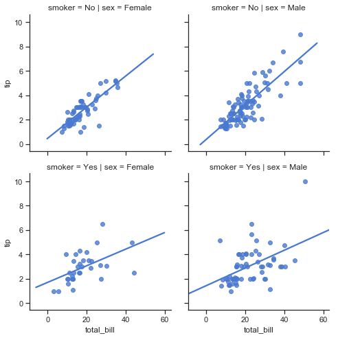
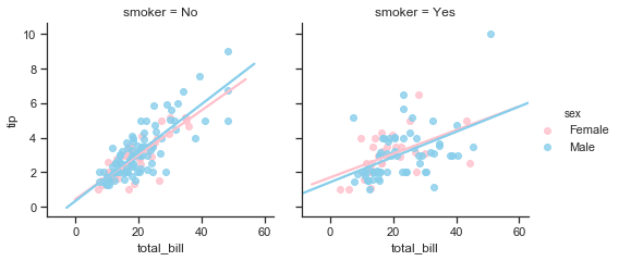
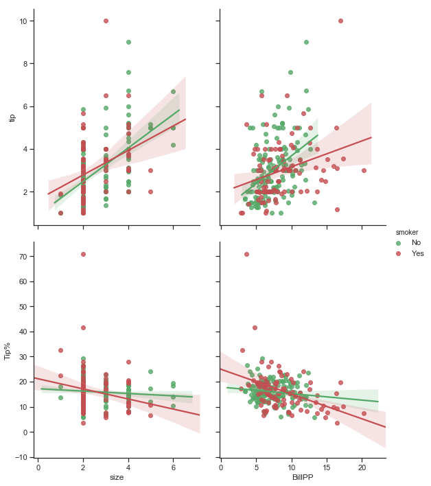
First to recap, the relationship between the total bill amount and tip amount are shown in the following plot broken down by smoker and sex of bill payer.
The plots on the bottom row show that there is a lot more variability in the tips given when smokers are present compared to non-smokers in the top row. Comparing males to females it seems that female non-smokers have the least variability of tip amounts of the 4 groups. The number of points indicate that there are a lot more male bill payers present in this dataset. The higher bill amounts are generally paid for by males, and mostly with no smokers. Apart from one exception male smokers bills tend to be about the mid-range. Their tips are not at all consistent though.
# regression plot of total bill vs tips by sex and smoker status
sns.lmplot(x="total_bill", y="tip", col="sex", row="smoker",ci=False,data=df, height=3.5, aspect =1);
The characteristics of customers in the dataset
The statistics in part 1 showed that there were almost equal numbers of male and female bill payers on weekdays but far more male bill payers than females on the weekends. The boxplots of total bill by day showed that the amounts spent by males were more variable and the median bill was generally higher for male bill payers except on Saturdays when the medians of male and bill payers were similar. Note that there is no information about the makeup of the party other than the sex of the bill payer. Similarly we only know that there was smokers present in the party but not how many and whether the bill payer was a smoker or non smoker. Part 2 showed that size of the party does seem to be a factor in determining the tip amount. There is no way of knowing from the data how many of the customers were males or females as we only know the sex of the bill payer. Similarly with smoking status we know there was a smoker present or not in the group but not how many of the group were actually smokers.
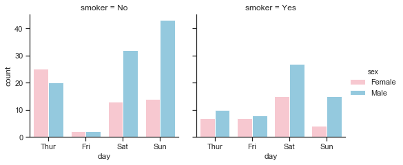
This plot below shows that while the weekends were busiest overall, Saturdays were the busiest of the 4 days for smokers, both male and female. The proportion of smokers on Fridays was highest but the overall number of tables served on Fridays was quite small. There are more male than female bill payers in the dataset, more female non-smokers on Thursdays than male non-smokers.
sns.catplot(x="day", kind="count", data=df, hue="sex", col="smoker", palette=gender_pal, height=3.5, aspect =1, order=day_order)
plt.show()
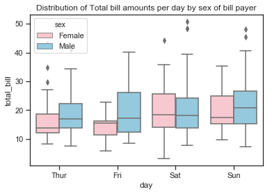
Total bill amounts per day by sex and smoker
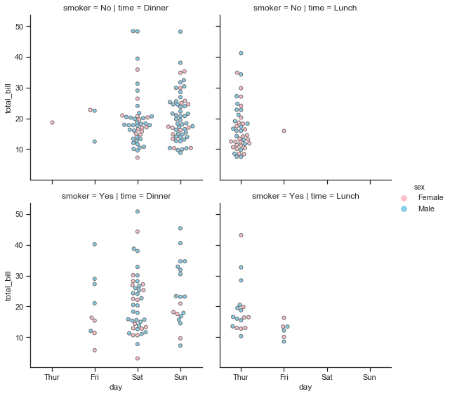
The swarm plot below is a categorical scatter plot where the points are adjusted so that they don’t overlap. The total_bill amount is shown on the vertical axis. The days are shown on the horizontal axis ordered by day as used earlier. We can see that there was only 1 dinner on a Thursday paid for by a female with no smokers in the party. The remaining meals were lunches, mostly with non-smokers only and there seems to have been just slightly more female bill payers than male. One of the most obvious things from these plots above is that Friday is a very quiet day for non-smokers compared to smokers but there were very few customers served by this waiter overall on Friday. On fridays most meals served were dinners, there were more smoking than non-smoking parties and an almost even split between male and female bill payers. Saturday then was busier than the weekdays but only dinners were served. There was quite a few more male bill payers than female bill payers and there was nearly the same number of parties with smokers present as non-smokers. Sundays was again very busy but had less smokers present, the bills were still mostly settled by males.
The swarm plots also shows how the total bill amounts were distributed. The lowest 2 bills were paid for by females with smokers in the party. The largest bill was paid for by male with smoker present. There were a few large bills on weekends paid for by males across both smoking levels. The size of the party is not shown here.
There are no high total bill amounts at all for female non-smokers and just one observation for a female smoker on a Saturday. Where there are male bill payers with smokers in the party, the total bill is more variable whereas male non-smokers total bills are clustered in the low-mid price bill range.
# building up a plot to show
sns.set(style="ticks")
g= sns.catplot(x="day", y="total_bill", hue="sex",row="smoker", col="time", data=df, palette=gender_pal, height=4,
               aspect =1, kind="swarm", linewidth=1, order=day_order);
The boxplots show that there is greater variability in the total bill amounts by males. The median bill amount is generally lower for female bill payers except on Saturdays when it is just slightly more than that on male bill payers. Females tend to be less variable than males but there is no substantial difference between the total bills paid by females smokers and non-smokers. There are some smaller bills by female smokers and a few outliers but not such a difference as can be seen between the male smokers and non-smokers. Male smokers have a wider distribution of total bills and is skewed towards higher bills.
# total bill per day by sex, showing days in order of day
sns.boxplot(x="day",y="total_bill" ,hue="sex",data=df, palette=gender_pal, order=day_order);
plt.title("Distribution of Total bill amounts per day by sex of bill payer");
sns.set(style="whitegrid")

# set up number of subplots and figure size
f, axes = plt.subplots(1, 2, sharey=False, figsize=(10, 4))

# bill amount by sex, grouped by smoking status
sns.boxplot(x="sex",y="total_bill" ,hue="smoker",data=df, palette=smoker_pal, ax=axes[0])
# bill amount by dining time, grouped by sex
sns.boxplot(x="sex",y="tip" ,hue="smoker",data=df, palette=smoker_pal, ax=axes[1])
# bill amount by dining time, grouped by sex

sns.despine(offset=10, trim=True) # remove the spines
plt.suptitle("Total Bill and Tip by sex and by smoker");
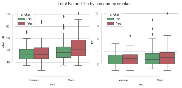
The boxplots above show that while male smokers tend more towards higher bills than male non-smokers or females (smokers and non-smokers), the median tip amount does not seem to rise as much as you would expect relative to the bill.
Average tips paid by sex and smoker:
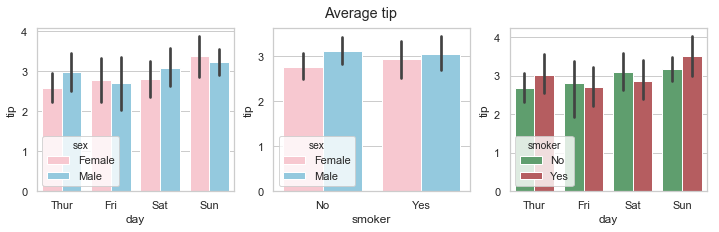
The barplots below show the mean tip amount broken down by male and female bill payers.The vertical lines on top are the confidence intervals showing the uncertainty around the mean. The difference in the average tip paid by male and females was more pronounced on Thursdays and Saturdays with the mean tip paid by male bill being higher than that of females on Thursdays and Saturdays but slightly lower on Fridays and Sundays. There was more variability in the tip by males on Fridays than females. There is a bigger difference in the mean tip between male and female non-smokers than between smokers of both sexes. The highest average tips were paid by male non-smokers.
When looking at the mean tip paid by smoker versus non-smoker, smokers paid on average a higher tip on Thursdays and Sundays. Non-smokers on Fridays were the most variable. Sunday smokers paid the highest average tip.
# a barplot showing the count of total_bill
sns.set(style="whitegrid")
# set up number of subplots and figure size
f, axes = plt.subplots(1, 3, figsize=(12, 3))
order=["Thur", "Fri", "Sat","Sun"] # the order to be shown on the plot

# plot mean tip by day by sex
sns.barplot(x ="day", y="tip", hue="sex", palette=gender_pal,data =df, order=day_order, ax=axes[0]) #

# plot mean tip by smoker by sex
sns.barplot(x ="smoker", y="tip", hue="sex", palette=gender_pal,data =df, ax=axes[1])

# plot number of tips (or total_bill) by smoker using length as the estimator instead of mean
sns.barplot(x ="day", y="tip", hue="smoker", palette=["g","r"],data =df, order=order, ax=axes[2])
plt.suptitle("Average tip");
- There are almost equal numbers of male and female bill-payers on Thursdays and Fridays but the number of male bill-player far out-weighs female bill-payers at the weekend. This could be for any number of reasons and we don’t know the gender of their dining companions.
- There are more non-smokers than smokers on any day but especially on Thursdays and Sundays. While there are much less customers recorded overall for Fridays than any other days, these customers are mostly smokers.
- There are almost equal number of male and female bill-paying customers for lunch but far more males for dinner. There are more male paying customers overall.
This dataset contains only the tables served by one waiter who may just work less hours on a Friday. There is no data at all for Monday, Tuesday or Wednesday.
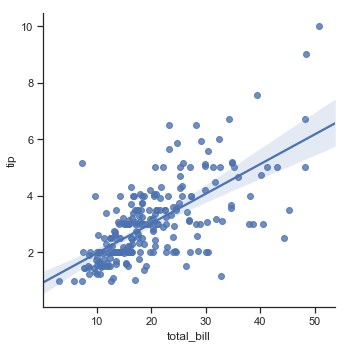
The relationship between total bill and tip amount is stronger for non-smokers than smokers.
The scatter plot of total bill and tip amount with the a regression line plotted. The effect of a smoker being present does seem to impact the slope of the regression line with a steeper line for non smokers suggesting a stronger linear relationship between total bill and tips for non-smokers. The non-smokers are more generous here than smokers and the tip amount increases in line with the total bill.
While there are more male bill payers in the data, the sex of the bill payer does not seem to affect the relationship between total bill and tip amount, unless there is a smoker present.
sns.set(style="ticks")
sns.lmplot(x="total_bill", y="tip", hue="sex",col="smoker",ci=False,data=df, palette=gender_pal, height=3.5, aspect =1); plt.show()
Now some statistics by gender and smoker
Pandas groupby function allows you to aggregate by more than one statistic so in this way I can specify the actual statistics I want to see. Here I select some of the columns of the dataframe, including the new percentage tip column and save to df2
df2= df.loc[:, ['total_bill','tip','Tip%','sex','smoker','size']]
Males versus females:
Higher average amounts spent on bills and tips by males. Less variability in spending of females.
df2.groupby(['sex']).agg([np.mean, np.std]).round(2)
| total_bill | tip | Tip% | size | |||||
|---|---|---|---|---|---|---|---|---|
| mean | std | mean | std | mean | std | mean | std | |
| sex | ||||||||
| Female | 18.06 | 8.01 | 2.83 | 1.16 | 16.65 | 5.36 | 2.46 | 0.94 |
| Male | 20.74 | 9.25 | 3.09 | 1.49 | 15.77 | 6.48 | 2.63 | 0.96 |
Smokers vs non-smokers:
Higher average spend by smokers with more variability in tipping rates.
df2.groupby(['smoker']).agg([np.mean, np.std]).round(2)
| total_bill | tip | Tip% | size | |||||
|---|---|---|---|---|---|---|---|---|
| mean | std | mean | std | mean | std | mean | std | |
| smoker | ||||||||
| No | 19.19 | 8.26 | 2.99 | 1.38 | 15.93 | 3.99 | 2.67 | 1.02 |
| Yes | 20.76 | 9.83 | 3.01 | 1.40 | 16.32 | 8.51 | 2.41 | 0.81 |
Female non-smokers vs Female smokers vs Male non-smokers vs Male smokers
Highest average bills for smoking males but highest average tip for non-smoking males. Female smokers are the most generous in terms of percentage tips. Male smokers the most variable overall and female non-smokers the most consistent.
df2.groupby(["sex","smoker"]).agg([np.mean, np.std]).round(2)
| total_bill | tip | Tip% | size | ||||||
|---|---|---|---|---|---|---|---|---|---|
| mean | std | mean | std | mean | std | mean | std | ||
| sex | smoker | ||||||||
| Female | No | 18.11 | 7.29 | 2.77 | 1.13 | 15.69 | 3.64 | 2.59 | 1.07 |
| Yes | 17.98 | 9.19 | 2.93 | 1.22 | 18.22 | 7.16 | 2.24 | 0.61 | |
| Male | No | 19.79 | 8.73 | 3.11 | 1.49 | 16.07 | 4.18 | 2.71 | 0.99 |
| Yes | 22.28 | 9.91 | 3.05 | 1.50 | 15.28 | 9.06 | 2.50 | 0.89 | |
Does the sex of the bill payer influnce the tip amount?
The number of male bill payers is almost twice the number of female bill payers. When females are paying the bills there is less variability in both the bill amount and the tip amount with smaller ranges of values and smaller standard deviations. The largest bill and tip was paid for by a male and the smallest bill size was paid for by a female. It is important to remember here that while we know the sex of the bill payer we do not know the sex of the individuals in any party. On average, female bill payers give slightly higher tip as a percentage of the total bill amount, in particular female smokers.
Does having a smoker in the party influence the tip amount?
-
Parties with male bill-payer and no smokers represent the largest group of bill payers in the dataset at a count of 97 while parties with female bill-payers and smokers represents the smallest group of bill payers at just 33.
-
When there is a smoker in the party the mean bills and tips increase and the variability of bills and tip increase.
-
The combination of female bill payer and smoker present has the highest average tip percentage rate
-
The combination of male bill payer and smoker has the lowest percentage tip rate.
-
Parties with a male bill-payer and smokers have the highest average bill amount and are the most variable
-
parties with female bill payer and no smokers present have the least variation in bill amount and tips.
It is important to note that we only know whether there is a smoker in the party or not. There is no more information in the dataset regarding how many of the party are actually smokers or whether the bill payer was a smoker or not so of all the variables I think this would be the last variable to use to reach conclusions about tipping behavious on!
How does the size of the parties matter in this dataset?
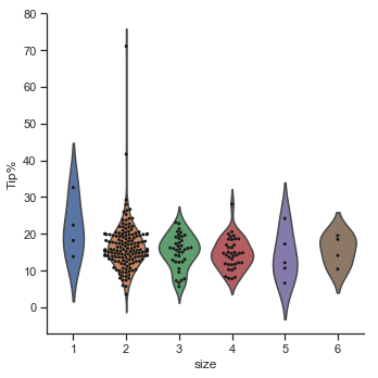
The pairplots at the end of part 1 showed the pairwise relationships in the dataset. The pairplots show how the majority of party sizes are of 2, followed by 3 then 4. There are very few solo diners and very few parties over 4. The two plot below again show that the majority of parties were of size 2. The percentage tip given varies across all party sizes but the distribution of percentage tips is wider for paries of 2 and gets smaller as the party size increases. However there are much less observations in larger party sizes.
As seen in part 2 when looking at the correlation matrix for the quatitative variables in the dataset, the size of the party is positively correlated with both the size of the total bill and with the tip amount, but the correlation with the tip amount is lower. The tip as a percentage is negatively correlated with the size of the party. The case study of restaurant tipping[14] found that the size of the party was the most important predictor of tip rate where the tip expressed as a percentage of total bill actually decreases as the party size increases.
# looking again at the correlation between the numerical variables in the tips dataset.
print(f" The correlation between size of the party and the total bill amount is {df['size'].corr(df['total_bill']):.2f}")
print(f" The correlation between size of the party and tip amount in dollars is {df['size'].corr(df['tip']):.2f}")
print(f" The correlation between size of the party and the bill per person is {df['size'].corr(df['BillPP']):.2f}")
print(f" The correlation between size of the party and the percentage Tip rate is {df['size'].corr(df['Tip%']):.2f}")
 The correlation between size of the party and the total bill amount is 0.60
 The correlation between size of the party and tip amount in dollars is 0.49
 The correlation between size of the party and the bill per person is -0.18
 The correlation between size of the party and the percentage Tip rate is -0.14
The correlation statistics show that party size is positively correlated with total bill amount which makes sense as you expect the amount spent to rise with the number of diners in the party. The party size is also positively correlated with the tip amount but to a lesser extent. These correlation are both positive but not very strong as the range is up to 1.0 and suggest that diners in largers parties are not purchasing the same type of menu items as diners in smaller party sizes. There is no information on the profile of the customers. It could be possible that there could be children in the larger parties who are consuming from a children’s menu. The larger parties show a smaller range of bills per person while pairs or couples dining together have bills per person that span the a wider range of dollar amounts.
# set the figure and subplots

# plot boxplots for bills
# set the figure and subplots
f, axes = plt.subplots(1, 2, sharey=False, figsize=(13, 4))
# boxplots of tips by party size
sns.boxplot(x="size", y="total_bill", data=df, ax=axes[0])
sns.boxplot(x="size", y="BillPP", data=df, ax=axes[1])
# set the ylimits to exclude the extreme outlier squashing the plot down

axes[0].set_title("Boxplot of total bill amount by party size")
axes[1].set_title("Boxplot of bill per person by party size");


f, axes = plt.subplots(1, 2, sharey=False, figsize=(13, 4))
# boxplots of tips by party size
sns.boxplot(x="size", y="tip", data=df, ax=axes[0])
sns.boxplot(x="size", y="Tip%", data=df, ax=axes[1])
# set the ylimits to exclude the extreme outlier squashing the plot down
axes[1].set_ylim(0,50)
axes[0].set_title("Boxplot of tip amount by party size")
axes[1].set_title("Boxplot of percentage tip by party size");
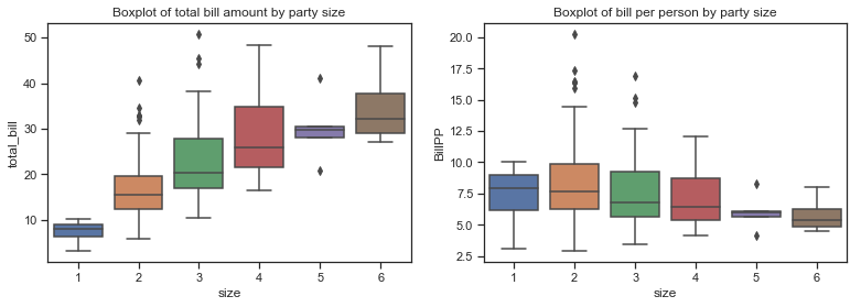
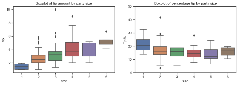
The boxplot below is combined with a swarmplot to show each observation along with a summary of the distribution. There are very few parties of five and six and only a few solo diners. Would this not influence the correlation coefficient and any regression model?
The boxplots above show that total bill amounts and tip amounts rise by party size while the bill per person falls. The percentage tip by larger parties seems to fall in a similar range to those of smaller parties, with the exception of of the few single diners. The median percentage tip does fall a bit for parties of 5 but there are very few observations in this category.
The bulk of the diners are concentrated in small parties.
# plot a catplot of size versus Tip%, use violin plot and show the obsevations within it using swarmplot
g = sns.catplot(x="size", y="Tip%", kind="violin", inner=None, data=df)
sns.swarmplot(x="size", y="Tip%", color="k", size=3, data=df, ax=g.ax);
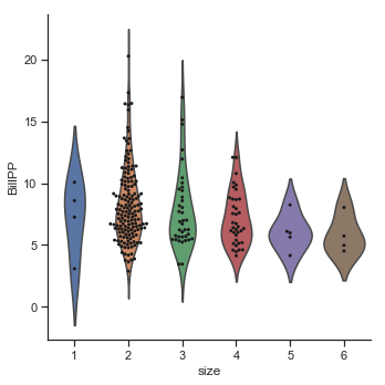
g = sns.catplot(x="size", y="BillPP", kind="violin", inner=None, data=df)
sns.swarmplot(x="size", y="BillPP", color="k", size=3, data=df, ax=g.ax);
Party size and smokers.
The pairplots here show the relationship between Tip amount against party size and bill per person. The second row shows the the tip as a percentage of the bill amount. The tip amount does increase as the party size increases. The smokers seem to be concentrated in the smaller parties. The percentage tips seem to be fairly constant across party sizes for non-smokers but does fall as party size increases for smokers. However the number of larger parties are very few so this must be considered. The bill per person variable (BillPP) represents the total bill amount averaged over each party. The percentage tip actually falls as the bill per person increases for smokers. It also falls somewhat for non-smokers but not to the same degree.
sns.pairplot(df, x_vars=[ "size", "BillPP"], y_vars=["tip","Tip%"],height=5, aspect=.8, kind="reg", hue="smoker",palette=smoker_pal);
Percentage Tips per party size over the different categories of diners:
The table below shows the percentage tips for males and females including smoker and non smoker status. There are no large parties at all of 5 or 6 people with smokers and only 1 group of 5 people.
# pivot table of Tips% over sex and smoker, for each party size, calculate mean of each group
df.pivot_table(values=['Tip%'], index=['sex','smoker'], columns=['size'], aggfunc=np.mean).round(2)
| Tip% | |||||||
|---|---|---|---|---|---|---|---|
| size | 1 | 2 | 3 | 4 | 5 | 6 | |
| sex | smoker | ||||||
| Female | No | 15.98 | 16.02 | 15.50 | 13.94 | 17.22 | 16.29 |
| Yes | 32.57 | 18.49 | 16.87 | 10.93 | NaN | NaN | |
| Male | No | NaN | 16.78 | 14.69 | 15.06 | 18.15 | 14.96 |
| Yes | 22.38 | 15.56 | 14.96 | 14.93 | 8.61 | NaN | |
# df2 excludes a few of the new columns. get mean and standard deviation over each group size
df2.groupby(["size"]).agg([np.mean, np.std]).round(2)
| total_bill | tip | Tip% | ||||
|---|---|---|---|---|---|---|
| mean | std | mean | std | mean | std | |
| size | ||||||
| 1 | 7.24 | 3.01 | 1.44 | 0.51 | 21.73 | 8.03 |
| 2 | 16.45 | 6.04 | 2.58 | 0.99 | 16.57 | 6.68 |
| 3 | 23.28 | 9.41 | 3.39 | 1.56 | 15.22 | 4.55 |
| 4 | 28.61 | 8.61 | 4.14 | 1.64 | 14.59 | 4.24 |
| 5 | 30.07 | 7.34 | 4.03 | 1.44 | 14.15 | 6.77 |
| 6 | 34.83 | 9.38 | 5.22 | 1.05 | 15.62 | 4.22 |
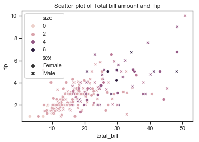
sns.scatterplot(x=df['total_bill'],y=df['tip'], hue=df["size"], style=df["sex"])
# add title
plt.title("Scatter plot of Total bill amount and Tip");
sns.lmplot(x='total_bill',y='tip', data=df)
<seaborn.axisgrid.FacetGrid at 0x1a24329518>