Part 1: Describe the tips dataset using descriptive Statistics and plots
The goal for part 1 is to begin the exploratory data analysis by providing a summary of the main characteristics of the Tips dataset using statistics and plots and to see what the data tells us. As mentioned above, exploratory data analysis was promoted by John Tukey who promoted the use of five number summary of numerical data including the maximum and minimum values, the median and the quartiles which I will look at in this section.
The Tips dataset
The Tips dataset is available in the seaborn-data repository belonging to Michael Waskom - the creator of the seaborn python data visualisation package.
It is one of the example datasets built into the seaborn package and is used in the documentation of the seaborn package and can be easily loaded using the seaborn load_dataset command. The tips csv file is also available at the Rdatasets website which is a large collection of datasets originally distributed alongside the statistical software environment R and some of its add-on packages for teaching and statistical software development purposes maintained by Vincent Arel-Bundock.
According to the introduction to seaborn many of it’s examples use the boring Tips dataset which is considered a “very boring but quite useful for demonstration”. The tips dataset illustrates the “tidy” approach to organizing a dataset. Tidy data is an alternate name for the common statistical form called a model matrix or data matrix which is a
A standard method of displaying a multivariate set of data is in the form of a data matrix in which rows correspond to sample individuals and columns to variables, so that the entry in the ith row and jth column gives the value of the jth variate as measured or observed on the ith individual.
Hadley Wickham of RStudio[3] defined ‘Tidy Data’ as a standard way of mapping the meaning of a dataset to its structure. A dataset is messy or tidy depending on how rows, columns and tables are matched up with observations, variables and types. In tidy data each variable forms a column, each observation forms a row and each type of observational unit forms a table. The Tips dataset does follow the tidy dataset format which I will show below.
According to the tips dataset documentation, the Tips dataset is a data frame with 244 rows and 7 variables which represents some tipping data where one waiter recorded information about each tip he received over a period of a few months working in one restaurant. In all the waiter recorded 244 tips. The data was reported in a collection of case studies for business statistics (Bryant & Smith 1995).[4] The waiter collected several variables: The tip in dollars, the bill in dollars, the sex of the bill payer, whether there were smokers in the party, the day of the week, the time of day and the size of the party.
There is no further information on the makeup of the party apart from the sex of the bill payer and whether there was a smoker in the party. For instance the mix of males and females in a party is not defined or whether there was more than one smoker in a party, if the bill includes alcoholic drinks or not or whether the bill and/or tip was paid in cash or by credit. While some relationships and trends between the variables might be shown throughout this project I think it is important to note that this is a very small dataset containing data for a single waiter in a single restaurant over a few months and therefore it can not be used to draw conclusions about tipping practices in general. Kaggle seems to have a little bit more information and notes that the following: In one restaurant, a food server recorded the following data on all customers they served during an interval of two and a half months in early 1990. The restaurant, located in a suburban shopping mall, was part of a national chain and served a varied menu. In observance of local law, the restaurant offered to seat in a non-smoking section to patrons who requested it. Each record includes a day and time, and taken together, they show the server’s work schedule.
Loading the Tips data file into Python
The tips dataset is available as described above in csv format (comma separated values) at the two urls :
- Vincent Arel-Bundock’s Rdatasets website at http://vincentarelbundock.github.io/Rdatasets/csv/reshape2/tips.csv
- The seaborn-data repository at https://github.com/mwaskom/seaborn-data/blob/master/tips.csv. Here the csv data is actually displayed nicely to the screen in tabular format - to get a link for the raw csv file click the
rawicon which dumps the raw csv file to the browser from where you can copy the url https://raw.githubusercontent.com/mwaskom/seaborn-data/master/tips.csv.
Data that is in csv format can be read into a pandas DataFrame object either from a csv file or from a URL using the read_csv function. A pandas DataFrame is a 2 dimensional data structure with rows and columns that resembles a spreadsheet. The pandas.read_csv() function performs type inferrence to infer the type of data types in each column. A DataFrame can have mixed data types such as numeric, integer, string, boolean etc but each column will have only one data type. There are many parsing options when reading in csv files using the pandas read_csv function.
The Tips dataset is a small dataset so the entire csv file can be read into python in one go without causing any problems.
For larger datasets you could specify how many lines to read in using the nrows argument. You can also preview the file before reading it in using some shell commands but this is not necessary here. This dataset is straighforward to read in to pandas. I am using the csv data from the seaborn-data repository mentioned earlier. (The csv file at the Rdatasets website has an extra column added to it which looks like an index starting from 1 and this could be treated as the row index by setting the index_col argument to be the first column of the csv file index_col =0 or alternatively this column could be dropped by setting the usecols to return a subset of the columns, for example: usecols=[1,2,3,4,5,6,7]).)
First importing Python Libraries
# import libraries using common alias names
import numpy as np
import pandas as pd
import seaborn as sns
import matplotlib.pyplot as plt

# check what version of packages are installed.
print("NumPy version",np.__version__, "pandas version ",pd.__version__, "seaborn version",sns.__version__  )  # '1.16.2'

# set print options with floating point precision if 4, summarise long arrays using threshold of 5, suppress small results
np.set_printoptions(precision=4, threshold=5, suppress=True)  # set floating point precision to 4
pd.options.display.max_rows=8 # set options to display max number of rows
NumPy version 1.16.2 pandas version 0.24.2 seaborn version 0.9.0
Read in the csv file
import pandas as pd  # import pandas library

csv_url = 'https://raw.githubusercontent.com/mwaskom/seaborn-data/master/tips.csv'

## creata a DataFrame named df from reading in the csv file from a URL
df =  pd.read_csv(csv_url)  ## creata a DataFrame named df from reading in the csv file from a URL
Check the DataFrame looks ok
Having successfully read in the csv file into a pandas DataFrame object, panda’s head and tail functions can be used to ensure the file has been read in and looks ok before exploring the DataFrame further below. As it is a very small file it can be quickly checked against the csv file source to check that everything looks ok. tail() is particularly useful for making sure a csv file has been read in properly as any problems usually manifest towards the end of the dataframe, throwing out the last number of rows but all looks well here.
print("The first few rows in the dataset: \n\n", df.head(3))  # look at the top 5 rows of the DataFrame df
print('\n The final few rows in the dataset \n',df.tail(3)) # Look at the bottom 5 rows of the DataFrame
The first few rows in the dataset:

    total_bill   tip     sex smoker  day    time  size
0       16.99  1.01  Female     No  Sun  Dinner     2
1       10.34  1.66    Male     No  Sun  Dinner     3
2       21.01  3.50    Male     No  Sun  Dinner     3

 The final few rows in the dataset
      total_bill   tip     sex smoker   day    time  size
241       22.67  2.00    Male    Yes   Sat  Dinner     2
242       17.82  1.75    Male     No   Sat  Dinner     2
243       18.78  3.00  Female     No  Thur  Dinner     2
Tidy data principles
The tips dataset illustrates the “tidy” approach to organising a dataset. The tips csv dataset has been imported into a pandas DataFrame object. Each column contains one variable and there are 244 rows in the dataFrame with one row for each of the 244 observations.
Again referring to Howard Seltman’s book, data from an experiment are generally collected into a rectangular array most commonly with one row per experimental subject and one column for each subject identifier, outcome variable and explanatory variable. The Tips dataset follows this principle. Each of the columns have either numeric values for a particular quantitative variable or the levels for a categorical variable.
What does the dataset look like?
Once loaded a dataset can be explored using the pandas and seaborn packages which work well together for analysing datasets such as this one. Pandas has many useful functions for slicing and dicing the data and can easily generate statistics such as the five number summary promoted by Tukey. Pandas can also be used to plot the data but this is where the seaborn package shines.
Column and row names:
When the ‘tips’ csv dataset was read in, the column names were assigned using the first line of data in the csv file which is the default treatment with pandas.read_csv() if you have not set a header row or provided column names. You can however provide different column names by setting header=None in the read_csv function and then providing the names to use using the names argument, for example names= 'col-name1', 'col-name2' etc.
print("The index of the tips DataFrame: ", df.index) # the index or row labels of the DataFrame
The index of the tips DataFrame: RangeIndex(start=0, stop=244, step=1)
There are 7 columns as expected and an index that begins at 0 for the first row. If the index of a DataFrame is not set to a particular column or some other value using index_col argument to read_csv , it will default to a sequence of integers beginning at 0 which is fine for the Tips dataset. The index goes from 0 (for the first row) up to 243 for the last row or observation in the dataset. The index is a range of integers from 0 up to but not including 244.
dtypes:
The dtypes (data types) have been inferred by read_csv but it is also possible to pass the data type when reading in the file.
print("The dtypes in the dataframe are:", end='\n\n')

print(df.dtypes) # the data types attributes for each column in df
# df.dtypes.value_counts() # how many variables of each type in the dataset
The dtypes in the dataframe are:

total_bill    float64
tip           float64
sex            object
smoker         object
day            object
time           object
size            int64
dtype: object
There are three numerical columns and 4 non-numerical object columns. The variables total_bill and tip are floats representing US dollar amounts while size is an integer representing the number of people in the party. The remaining columns have been read in as objects. Pandas uses the object dtype for storing strings, other arbitary objects or when there are mixed types in a column.
smoker is a binary categorical variable with two values yes or no. sex is also binary categorical variable with two values Male and Female. The ‘day’ and ‘time’ variables in this dataset could also be seen as categorical variables here as they have a limited number of distinct possible values. The time column here is not an actual time but instead just a binary categorical variable with two possible values dinner and lunch while day has four possible values: Thur, Fri, Sat and Sun for Thursday, Friday, Saturday and Sunday.
When a string variable consists of only a few values, converting such string variables to categorical data variable will actually save some memory. Specifying dtype='category' will result in an unordered Categorical whose categories are the unique values observed in the data. You can also use the astype on the dataframe to convert a dtype in a dataframe.
Converting variables to type category:
df['sex']=df['sex'].astype('category') # convert sex to be a categorical value
df['smoker']=df['smoker'].astype('category') # convery smoker to be a categorical value
df['day']=df['day'].astype('category')
df['time']=df['time'].astype('category')
print(*df.dtypes)
float64 float64 category category category category int64
Checking for missing or N/A values
Next checking to see if there are any missing values or NA’s in the dataset using isna()function and summing up the True or False boolean values to get a count of any missing values which in this case is zero as there are no missing or na values.
# checking if there are any missing values, using * to save printing space
print(*df.isna().any()) # isna returns boolean values 0 or 1, sum them to get count of NA's
False False False False False False False
Pandas has many useful functions for slicing and dicing the data. The data can be sorted and particular rows and columns can be selected in different ways.
Sorting by values:
While the head and tail functions show the top and bottom rows of a dataset as read in from the data source, the values may not be sorted. The sort_values function can be used to sort the dataframe in ascending or descending order by one or more variables to get an idea of the range of values in the dataset.
df.sort_values(by='tip').head() # sort by tip size and look at top 5 tip sizes
df.sort_values(by='total_bill', ascending = False).head(3) # sort by total bill amount and then look at top 3 amounts
| total_bill | tip | sex | smoker | day | time | size | |
|---|---|---|---|---|---|---|---|
| 170 | 50.81 | 10.00 | Male | Yes | Sat | Dinner | 3 |
| 212 | 48.33 | 9.00 | Male | No | Sat | Dinner | 4 |
| 59 | 48.27 | 6.73 | Male | No | Sat | Dinner | 4 |
Describing the Tips Dataset using statistics.
Exploratory data analysis generally involves both non-graphical methods which include calculation of summary statistics and graphical methods which summarises the data in a picture or a plot. These methods can be univariate where one variable is looked at at a time or multivariate where two or more variables are looked at together to explore relationships. Seltman[1] recommends performing univariate EDA on each of the components before going on to do multivariate EDA. The actual EDA performed depends on the role and type of each variable. I will first look at the summary statistics of the categorical variables and then the numerical variables. For categorical variables the range of values and the frequency or relative frequency of values are of interest with the fraction of data that fall into each category.
Univariate non-graphical exploratory data analysis of Tips dataset.
Categorical variables in the Tips dataset:
Panda’s describe function can be used to look at categorical or object type data and present it in a table.
For object data it include the count(the number of non-null observations), unique, top (the most common value) and the frequency of the most common value.
# use pandas describe for the categorical variables in the dataframe
print("Table of characteristics of the categorical variables in the Tips dataset:\n")
df.describe(include=['category'])
Table of characteristics of the categorical variables in the Tips dataset:
| sex | smoker | day | time | |
|---|---|---|---|---|
| count | 244 | 244 | 244 | 244 |
| unique | 2 | 2 | 4 | 2 |
| top | Male | No | Sat | Dinner |
| freq | 157 | 151 | 87 | 176 |
The total count of variables is 244 so there are no missing observations.
-
Sex: There are 157 male bill payers out of 244 observations leaving only 87 female bill-payers.
-
Smoker: There a more non-smokers in the dataset with 151 out of the total of 244 observations having only non-smokers in the party while 93 parties include smokers.
-
Time: The data includes 176 dinners out of 244 meals wuth the remaining 68 meals being lunches.
-
Day: Saturday is the most frequent day in this dataset.
Characteristics of Quantitative variables in the Tips dataset
Univariate EDA for a quantitative variable is a way to make preliminary assessents about the population distribution of the variable using the data of the observed sample.[1]
When looking at quantitative variables the characteristics of interest are the centre, spread, modality (the number of peaks in the pdf), the shape of the distribution and the outliers.
(Seltman notes that the observed data generally represents just one sample out of many possible samples. In the case of the Tips dataset in question, it could be considered as just one sample of measurements out of many possible samples where the values would be different if a different sample was taken by a different waiter maybe or in a different timeframe. The sample statistics below would then be estimates of the corresponding population parameters.)
Tukey’s five number summary include the minimum and maximum which refer to the extremes of the data, the median and the quartiles which unlike the mean and standard deviations are functions of the empirical distribution and are defined for all distributions. The quartiles and median are considered more robust to skewed distributions than the mean and standard deviation.
Pandas describe function generates statistics that summarize the central tendency, dispersion and shape of a dataset’s distribution. (excluding NaN values). It summarise and describe the numerical variables of the dataframe by including the count, mean, standard deviation, minimum and maximum values, median and the 25th and 75th percentiles. These statistics can also be obtained using the various statistics functions such as mean, sd, min, max etc. The only numerical variables in this dataset are the total_bill amount in dollars, the tip amount in dollars and size for the number of people in a party. (These are really just sample statistics).
Summary statistics of the quantitative variables in the Tips dataset
# get summary statistics of the numerical values,
df.describe() # get statistics summary of the tips dataframe df
| total_bill | tip | size | |
|---|---|---|---|
| count | 244.000000 | 244.000000 | 244.000000 |
| mean | 19.785943 | 2.998279 | 2.569672 |
| std | 8.902412 | 1.383638 | 0.951100 |
| min | 3.070000 | 1.000000 | 1.000000 |
| 25% | 13.347500 | 2.000000 | 2.000000 |
| 50% | 17.795000 | 2.900000 | 2.000000 |
| 75% | 24.127500 | 3.562500 | 3.000000 |
| max | 50.810000 | 10.000000 | 6.000000 |
The table generated above shows the summary statistics for the total_bill, tip and size variables. They provide information on the central tendency and spread of the data.
Central Tendency statistics
The central tendency or location of the data distribution is determined by the typical or middle values. The arithmetic mean is the sum of all the data values divided by the number of values. While the mean value is the average value in the dataset it may not be typical of the values in the dataset if there are very small or very large values in the dataset. The median is another measure of central tendancy - it is the middle value after all the values are put in an ordered list. The mean and median are similar for symmetric distributions whereas for unimodal skewed distributions the mean will be more in the direction of the long tail of the distribution. The median can be considered a more typical value in the dataset or closer to some of the typical values and is also considered robust which means that the moving some of the data will not tend to change the value of the median. A few extreme values will not affect the median as they would affect the mean.
Central Tendency statistics of the Tips data:
print("The mean bill amount is $%.3f" %df['total_bill'].mean(),"while the median bill amount is $%.3f" %df['total_bill'].quantile(q=0.5))
The mean bill amount is $19.786 while the median bill amount is $17.795
print("The mean tip amount is $%.3f" %df['tip'].mean(),"while the median tip is $%.3f" %df['tip'].quantile(q=0.5))
The mean tip amount is $2.998 while the median tip is $2.900
The median bill amount is lower than the mean bill amount by approximately 2 dollars. The median tip amounts is lower than the mean tip by 10 cents. When the median value is smaller than the mean value it indicates thats the distribution is not symetrical.
Spread statistics
There are several statistics that are used to show the spread of the distribution of the data which concerns how far away from the centre the data points are located. The variance is a measure of spread which involves calculating the distance (deviation) from the mean for all the data point, squaring each number (to deal with negative deviations)and summing it up before being divided by the number of data points (or n-1 for a sample variance). The variance is the average of the squared deviations of each observation from the centre or mean of the data. Bigger deviations will make a bigger variance. The resulting variance figure will be in squared units of the original units. The standard deviation is the square root of the variance and is in the same units as the data and therefore can be more easily interpreted. The describe function shows the standard deviation rather than the variance but the variance can be found using the var function.
The range of values in the data is shown by the minimum and maximum values and is not considered a robust measure of spread but it is useful for showing possible errors or outliers. The other measure of spread is determined by the percentiles or quartiles of the values.
Panda describe included the 25%, 50% and 75% quartiles although you can specify which quartiles to include or not. These three values divide the data into quarters.
The 25% percentiles is the first quartile and one quarter of the values fall below this. The 50% percentile is the median value where half of the data falls below it and half above it. The 75% percentiles is the 3rd quartile where $\frac{3}{4}$ of the data points fall below it and one quarter above it. These figures are used to calculate the Interquartile range (IQR) which is calculated by taking the 75% percentile or 3rd quartile (Q3) minus the 25% percentile or first quartile (Q1). $$IQR = Q3 - Q1$$
Therefore half of the values are captured by the IQR which are the middle values of the data. Data that is more spread out will have a higher IQR. IQR is considered a more robust measure of spread than the variance and standard deviation. describe function does not show the IQR value itself but it can be calculated by taking the 25% from the 75% values returned. It will be more clearly shown in the boxplots further down.
The skewness of the data is another way of describing data and is a measure of assymetry. The plots will show if there is any skew in the distribution.
Spread statistics of the Tips data
Standard deviation and variance
print(f"The variance and standard deviations of Total Bill amounts are {df['total_bill'].var():.3f} and {df['total_bill'].std():.3f}")
print(f"The variance and standard deviations of tip amounts are {df['tip'].var():.3f} and {df['tip'].std():.3f}")
print(f"The variance and standard deviations of size are {df['size'].var():.3f} and {df['size'].std():.3f}")
The variance and standard deviations of Total Bill amounts are 79.253 and 8.902
The variance and standard deviations of tip amounts are 1.914 and 1.384
The variance and standard deviations of size are 0.905 and 0.951
The standard deviation for total bill is quite high at almost 9 dollars but when the size of the party is taken into account this may not seem as large. (I will add a variable that shows the total bill per person).
The range of the data
print("The minimum bill amount is $",df['total_bill'].min()," while the maximum bill amount is $", df['total_bill'].max(), " giving range of ",df['total_bill'].max() - df['total_bill'].min())
print("The minimum tip amount is $",df['tip'].min()," while the maximum tip amount is $", df['tip'].max(), "giving a range of ",df['tip'].max() - df['tip'].min())
print("The number of people in each dining party varies from",df['size'].min(),"to",df['size'].max(), "people" )
df.var();
The minimum bill amount is $ 3.07  while the maximum bill amount is $ 50.81  giving range of  47.74
The minimum tip amount is $ 1.0  while the maximum tip amount is $ 10.0 giving a range of  9.0
The number of people in each dining party varies from 1 to 6 people
The Interquartile range
print("The median bill amount is ",df['total_bill'].quantile(q=0.5), "dollars and the median tip amount is", df['tip'].quantile(q=0.5),"dollars")
print(f"The total bill IQR is the range from {df['total_bill'].quantile(q=0.25):.2f} to {df['total_bill'].quantile(q=0.75):.2f}")
print(f"The tip IQR ranges from {df['tip'].quantile(q=0.25):.2f} to dollars {df['tip'].quantile(q=0.75):.2f}")
The median bill amount is  17.795 dollars and the median tip amount is 2.9 dollars
The total bill IQR is the range from 13.35 to 24.13
The tip IQR ranges from 2.00 to dollars 3.56
The range of values for the bill amount is quite large varying between roughly 3 and 48 dollars while the tip amounts range from between 1 and 10 dollars. The interquartile range is closer to the mean values.
Describing the Tips dataset using plots.
This section will look at some graphical EDA of the univariate data in the Tips dataset.
While pandas functions were used above to look at a summary statistics of the dataset using statistics, the seaborn package will now be used to create some visualisations of the dataset that can be used to verify these summary statistics.
Plots can highlight any obvious relationships between the different variables in the dataset. They can also be used to identify any groups of observations that are clearly separate to other groups of observations. There are many different ways to visualise this dataset using the seaborn library and no universal best way and many examples at https://seaborn.pydata.org .
Visualising the categorical variables in the Tips dataset
There are four categorical variables in the Tips dataset as seen above. These are day, time, sex and smoker. Here I will show the distribution of the categorical variables using a countplot which is a bit like a histogram but across a categorical instead of quantitative variable. A countplot can be used to show the number of occurences in each category of a variable. I will first look at the number of bill payers by day. The count is not the overall number of people in the restaurant but the number of bill payers. In addition to showing the count of a category, a hue semantic can be used to show the breakdown by the levels of a second variable.
I will create a day_order to store the order in which to display the days on the plots.
Countplot of Tables served by Day.
df.describe(include=['category'])
| sex | smoker | day | time | |
|---|---|---|---|---|
| count | 244 | 244 | 244 | 244 |
| unique | 2 | 2 | 4 | 2 |
| top | Male | No | Sat | Dinner |
| freq | 157 | 151 | 87 | 176 |
#I will create a `day_order` to store the order in which to display the days on the plots.
day_order=["Thur", "Fri", "Sat","Sun"] # the order to be shown on the plot
# countplot showing the count of total_bill
sns.set(style="ticks", palette="muted")

f, axes = plt.subplots(1, 2, figsize=(12, 4)) # set up 1 by 2 plot and figure size 12 by 4
# create a variable to store the order of days to show on the plots
day_order=["Thur", "Fri", "Sat","Sun"] # the order to be shown on the plot

# plot number of tables per day, added in time too
sns.countplot(x ="day",data =df, hue="time", palette=["teal","yellow"], order=day_order, ax=axes[0])
axes[0].set_title("Count of tables served by Day")

# plot number of  tables per day by size of party
sns.countplot(x =("day"), hue="size",data =df, ax=axes[1], order=day_order)
axes[1].set_title("Tables served by Day and by party size");
# hide the matplotlib axes text
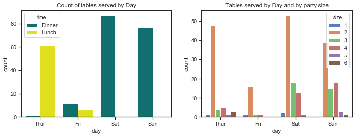
- Fridays are the quietest days for this waiter. Saturdays are the busiest days followed by Sundays so there are more customers at the weekend.
- The mosy common party size by far is 2. There are very few lone diners and very few parties of 5 and 6.
# create a colour palette for plotting times
pal = dict(Lunch="seagreen", Dinner="gray")
# countplots by gender of bill payer and by smoker in the group
sns.set(style="ticks")

f, axes = plt.subplots(1, 2, figsize=(12, 4)) # set up 1 by 2 plot and figure size 12 by 4
order=["Thur", "Fri", "Sat","Sun"] # the order to be shown on the plot

# create a dictionary mapping hue level to colors (as per the FacetGrid plot!)
gender_pal=dict(Female="pink",Male="skyblue")
smoker_pal=dict(Yes="r",No="g")
# plot number of tables per day, use the palette as per the dict pal. specify the order of days on the axes.
sns.countplot(x ="day", hue="sex", palette=gender_pal,data =df, order=order, ax=axes[0])
axes[0].set_title("Count of tables served per day by sex of bill payer")

# plot number of  tables per day by size of party
sns.countplot(x =("day"), hue="smoker",data =df, ax=axes[1], palette=smoker_pal, order=day_order)
axes[1].set_title("Count of tables served per day with smoker(s) present");
#plt.show() # hide the matplotlib axes text
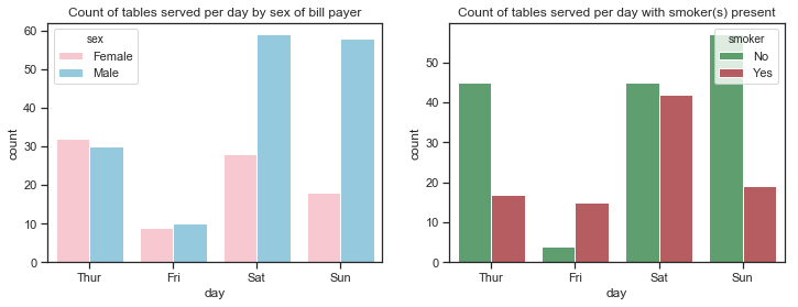
- There are almost equal numbers of male and female bill-payers on Thursdays and Fridays but the number of male bill-player far out-weighs female bill-payers at the weekend.
- There are more non-smokers than smokers on any day but especially on Thursdays and Sundays. While there are much less customers recorded for Fridays than any other days, these customers are mostly smokers.
- There are almost equal number of male and female bill-paying customers for lunch but far more males for dinner. There are more male paying customers overall.
Histogram and Kernel Density estimate plots of Total bill and Tip amount.
A histogram is a plot that shows the distribution of a single quantitative variable such as the total bill amount or the tip amount. A histogram represents the distribution of data by forming bins along the range of the data and then drawing bars to show the number of observations that fall in each bin.
It charts the data using adjacent rectangular bars and displays either the frequency or relative frequency of the measurements for a range of values in each interval. Each interval or range of values is a bin. The number of bins can be specified although seaborn and matplotlib will automatically choose this. The number of bins chosen usually depends on the amount of data and the shape of the distribution. distplot() uses a simple rule to make a good guess for what the right number is by default, but this can be changed which might reveal other features of the data.
The histogram visualises the centre and spread of the distribution as well as showing if there is any skew in the data. Below are the histograms of the Tip amount and the total bill amounts. The mean is shown as the red line and the median as the green dashed line. For symmetric distributions the mean is at the centre of the distribution and coincides with the median. Where the distribution is skewed the mean is further over than the median to the long tail which can be seen below for the total bill amount.
The mode is the most frequently occuring value in a distribution. There is no mode function in pandas or even numpy. It is not really used as such except for describing whether a distribution is unimodal, bimodal or multimodal which depends on how many peaks there is in the distribution. In multimodal distributions there is no unique highest mode.
Seaborn’s distplot() function draws a histogram and fit a kernel density estimate (KDE).
The kernel density estimate can be a useful tool for plotting the shape of a distribution. It also represents the density of observations on one axis with height along the other axis but involves further calculations where each observation is replaced with a normal gaussian curve centred at that value, these curves are then summed to compute the value of the density at each point in the support grid. The resulting curve is then normalized so that the area under it is equal to 1.
A kernel density plot can also be drawn using the kdeplot function and with this you can specify a bandwidth (bw) parameter which controls how tightly the estimation is fit to the data.
%matplotlib inline
# set up the subplots and figure sizes
f, axes = plt.subplots(1, 2, figsize=(12, 4))

# plot the histograms of total bill amounts
sns.distplot(df['total_bill'], kde=True, rug=True, ax=axes[0], color="blue", bins=25)
# add a vertical line at the mean
axes[0].axvline(df['total_bill'].mean(), color='yellow', linewidth=2, linestyle="--")
# add a vertical line at the median
axes[0].axvline(df['total_bill'].quantile(q=0.5), color='cyan', linewidth=2, linestyle=":")
# add a title
axes[0].set_title("Histogram of  Total Bill amounts")


#plot the histogram of tips
sns.distplot(df['tip'], kde=True, rug=True, ax=axes[1], color="purple", bins=25)
# add a vertical line to show the mean
axes[1].axvline(df['tip'].mean(), color='yellow', linewidth=2, linestyle="--")
# add a vertical line to show the median
axes[1].axvline(df['tip'].quantile(q=0.5), color='cyan', linewidth=2, linestyle=":")
# add title
axes[1].set_title("Histogram of  Tip amounts");
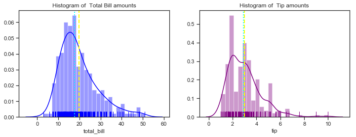
The histograms show that most total bill amounts fall in the range between 10 and 30 dollars with a peak around 16 dollars. It has only one peak when the default number of bins is used. As more bins are used you would expect to see more peaks in the distribution. The mean is the light yellow line and the median is the broken blue line. As the summary statistics above showed the median total total bill is about 2 dollars less than the mean indicating a non-symmetrical distribution. The mean and median tip amount are very close to each other. The distributions here do look slightly right skewed but you would expect not to see values near zero anyway for total bill amounts. The tips histograms shows that most tips fall in the range between 2 and 4 dollars with two distinct peaks at about 2.50 and 3.50.
The peaks of the kernel density estimates show which values have the highest priobability.
Boxplots of Total Bill amounts and Tip amounts
Boxplots can be used to show the central tendency, symmetry and skew of the data and any outliers. The rectangular box is bounded by the ‘hinges’ representing the lower (1st quartile) and upper (3rd quartile) while the line drawn through the box represents the median. The whiskers are the lines that extend out from the box in both directions and are drawn to the point that is 1.5 times the IQR. Outliers are any points that are outside of the whiskers. The whiskers represent the minimum and maximum values of the data excluding the outliers. The boxplots show if the data is symmetric or not - if the median is in the centre of the box and the whiskers are the same length. A skewed distribution has the median nearer to the shorter whisker. A positively skewed or right skewed distribution has a longer top whisker than bottom whisker whereas a negatively skewed or left skewed distribution has a longer lower whisker.
Boxplots use robust median and IQR statistics instead of the more sensitive mean and standard deviations.
f, axes = plt.subplots(1, 2, figsize=(12, 4))
sns.set(style="ticks", palette="pastel")
sns.boxplot(y=df['total_bill'], ax=axes[0], color="blue")
# add a title
axes[0].set_title("Boxplot of Total Bill amount")
sns.boxplot(y=df['tip'], ax=axes[1], color="purple")
axes[1].set_title("Boxplot of Tips amounts");
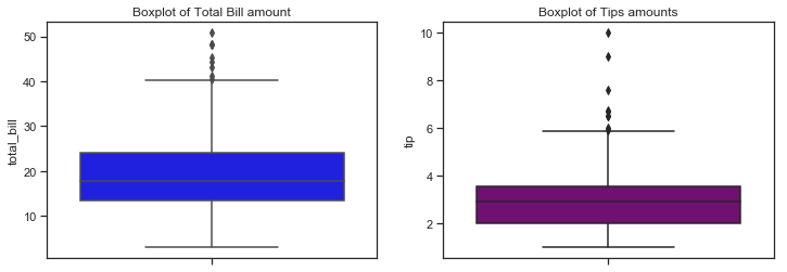
The boxplots above shows similar information on the distribution of total bill and tip amounts as the distribution plots above. The rectangular boxes show the middle half of the distribution. The median bill amount is about 18 and the median tip amount is over 3 dollars. Total bills over 40 represent outliers while tips over 6 dollars are considered outliers. Boxplots can be used to compare distributions, often for one variables at different levels of another variable. I will look at this more in section 3 but for now will just look at the number of bills by day and by sex.
sns.set(style="ticks", palette="pastel")

# set up 2 by 2 plots, overall figure size 12 by 4
f, axes = plt.subplots(1, 2, sharey=False, figsize=(12, 4))

# bill amount by day, grouped by sex
sns.set(style="ticks", palette="muted")
sns.boxplot(x="day",y="total_bill" ,data=df, order=day_order, ax=axes[0]) # controlling the day or
# bill amount by sex, grouped by smoking status
axes[0].set_title("Boxplot of total bill amount by day")
sns.boxplot(x="day",y="total_bill" ,hue="sex",data=df, palette=gender_pal,order=day_order, ax=axes[1])
# bill amount by dining time, grouped by sex
axes[1].set_title("Total bill amount by day by sex of bill payer")
sns.despine(offset=10, trim=True); # remove the spines
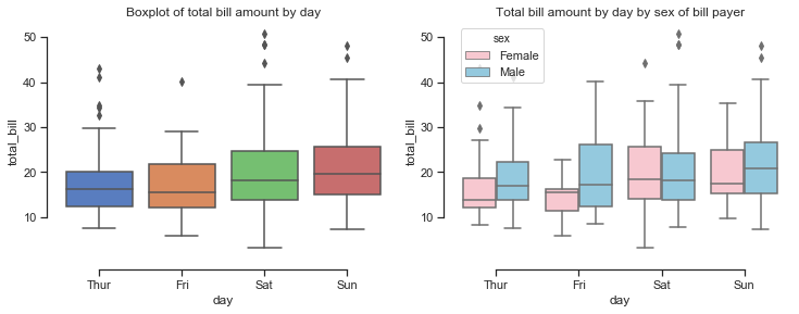
looking at the total bill amounts per day shows that the amount spent increases at the weekend and is lowest on a Friday. When broken down by the sex of the bill payer it seems that the median amount spent on the bill is higher for males than females and is also more variable for males. Saturday seems to be the only day when the median bills for males and females are similar although there is more of a right skew on the bill amounts by males.
Adding additional variables
df['Tip%']=df['tip']/df['total_bill']*100
df['BillPP']=df['total_bill']/df['size']
df['TipPP']=df['tip']/df['size']
df['total_spent']=df['total_bill']+df['tip']
df.head()
| total_bill | tip | sex | smoker | day | time | size | Tip% | BillPP | TipPP | total_spent | |
|---|---|---|---|---|---|---|---|---|---|---|---|
| 0 | 16.99 | 1.01 | Female | No | Sun | Dinner | 2 | 5.944673 | 8.495000 | 0.505000 | 18.00 |
| 1 | 10.34 | 1.66 | Male | No | Sun | Dinner | 3 | 16.054159 | 3.446667 | 0.553333 | 12.00 |
| 2 | 21.01 | 3.50 | Male | No | Sun | Dinner | 3 | 16.658734 | 7.003333 | 1.166667 | 24.51 |
| 3 | 23.68 | 3.31 | Male | No | Sun | Dinner | 2 | 13.978041 | 11.840000 | 1.655000 | 26.99 |
| 4 | 24.59 | 3.61 | Female | No | Sun | Dinner | 4 | 14.680765 | 6.147500 | 0.902500 | 28.20 |
print(f"While the standard deviation of the total_bill amount was quite high at ${df['total_bill'].std():.2f}, the standard deviation of the bill per person seems more reasonable at ${df['BillPP'].std():.2f}")

print(f"This makes sense when the average (mean) bill per person is ${df['BillPP'].mean():.2f}.")
print(f"The tip amount as a percentage of the total bill amount is {df['Tip%'].mean():.2f} percent.\n")
While the standard deviation of the total_bill amount was quite high at $8.90, the standard deviation of the bill per person seems more reasonable at $2.91
This makes sense when the average (mean) bill per person is $7.89.
The tip amount as a percentage of the total bill amount is 16.08 percent.
Now plotting the distribution of the bill per person and percentage tip rates.
%matplotlib inline
# set up the subplots and figure sizes
f, axes = plt.subplots(1, 2, figsize=(12, 4))

# plot the histograms of total bill amounts
sns.distplot(df['BillPP'], kde=True, rug=True, ax=axes[0], color="blue", bins=25)
# add a vertical line at the mean
axes[0].axvline(df['BillPP'].mean(), color='yellow', linewidth=2, linestyle="--")
# add a vertical line at the median
axes[0].axvline(df['BillPP'].quantile(q=0.5), color='cyan', linewidth=2, linestyle=":")
# add a title
axes[0].set_title("Distribution of BillPP")

#plot the histogram of tip rate
sns.distplot(df['Tip%'], kde=True, rug=True, ax=axes[1], color="purple", bins=25)
# add a vertical line to show the mean
axes[1].axvline(df['Tip%'].mean(), color='yellow', linewidth=2, linestyle="--")
# add a vertical line to show the median
axes[1].axvline(df['Tip%'].quantile(q=0.5), color='cyan', linewidth=2, linestyle=":")
# add title
axes[1].set_title("Distribution of  Tip percentages");
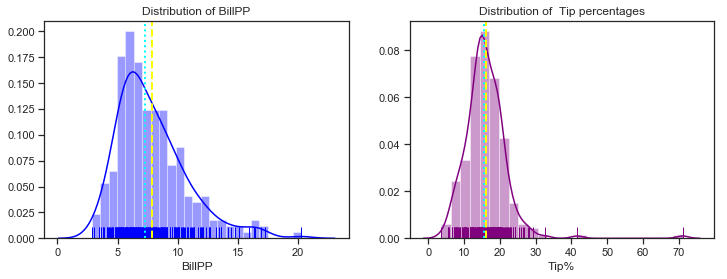
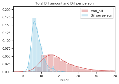
The distribution of bill per person still seems to be a litle bit right skewed like the total bill distibution but less so and also it is less spread out. The distribution of the percentage tip is now distinctly unimodal. The plots below show the distributions of total bill and amount per person on the same plot. The
%matplotlib inline
sns.set(style="ticks", palette="muted")
# plot the histograms of total bill amounts and bill per person
sns.distplot(df['total_bill'], color="r", label="total_bill")
sns.distplot(df['BillPP'], color="c", label="Bill per person")
# add a title, set the x and y axis limits then plot the legends
plt.title("Total Bill amount and Bill per person")
plt.xlim(-5,50)
plt.ylim(0,0.21)
plt.legend();
Aside on Unique Tip amounts
In a later section I was looking at the number of unique values of total bill and tip amounts in the dataset.
There are over 100 more unique bill amounts than unique tip amounts which suggests that maybe some rounding of tip amounts does occur such as to the nearest dollar. There seems to be no mode calculation in Numpy but there is one in the scipy.stats module. The mode is the most frequently occuring value.
Following this I was curious to see how many times were the tips rounded to the nearest 50 cent or dollar and it turns out there are 111 rows in the dataset where the tip was rounded to the 50 cent or dollar for tip amounts between 1 and 5 dollars. I think this is something that could be taken into account when trying to accurately predict tip amount from bill amount.
print(f"There are {len(df['total_bill'].unique())}  unique total bill amounts and {len(df['tip'].unique())}  unique tip amounts ")
# import stats module to use mode function
from scipy import stats
# Find the mode
mode= stats.mode(df['tip'])
print("The most common tip amount is ", *mode[0],"which occurs ", *mode[1],"times in the Tips dataset")
print(f"Tip of exactly 2 dollars occur {len(df[df.loc[:, 'tip'] ==2])} times")

# use pandas isin function to check if the tip amounts are rounded
# create a set of tip values
values =[1.00,1.50, 2.00,2.50,3.00,3.50,4.00,4.50,5.00]
# get the count using len of how many tips fall into these range
print(f"For tips between 1 and 5 dollars there were {len(df[df['tip'].isin(values)])} rows where the tip was rounded to nearest 50 cent or dollar. \n")
There are 229  unique total bill amounts and 123  unique tip amounts
The most common tip amount is  2.0 which occurs  33 times in the Tips dataset
Tip of exactly 2 dollars occur 33 times
For tips between 1 and 5 dollars there were 111 rows where the tip was rounded to nearest 50 cent or dollar.
Summary plots of the Tips dataset
I will finish up part 1 with some plots that summarise the dataset. These plots can help identify the relationship between total bill and tip that is examined more closely in Part 2 and also highlight some relationships between other variables in the dataset that could be explored in part 3.
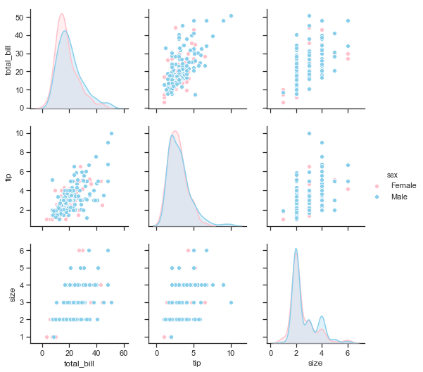
Seaborn’s pairplotcan be used to show all pairwise relationships of the (variables) in a dataset. The univariate distributions are shown across the diagonal and the relationship between pairs of variables are shown elsewhere.
The different levels of a categorical variables can be shown by colour using the hue semantic.
The pairplots below show the distributions of total_bill, tip and size variables on the diagonal. The bivariate relationships are shown as scatter plots. The different colours represent the sex of the bill payer in the first pairplot and the smoker status in the second pairplot below.
# To just select the original variables of the dataframe and not included the added variables
df.loc[:, ['total_bill','tip','sex','smoker','size']];
print("\n\n Pairplot showing relationships between total bill, tip and size by sex of bill payer \n")
# plot the pairplot using palette defined earlier for hue levels
sns.pairplot(df.loc[:, ['total_bill','tip','sex','smoker','size']], hue="sex",palette=gender_pal);
Pairplot showing relationships between total bill, tip and size by sex of bill payer
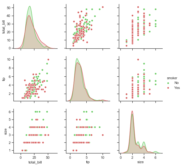
print("\n\n Pairplot showing relationships between total bill, tip and size by smoker in the party \n")
sns.pairplot(df.loc[:, ['total_bill','tip','sex','smoker','size']], hue="smoker",  palette= smoker_pal);
Pairplot showing relationships between total bill, tip and size by smoker in the party
Recap of part 1: Describe the Tips dataset
The objective for part 1 was to describe the variables in the Tips dataset using both statistics and plots.
I looked at some of the background to the Tips dataset, located and read the csv file into python and checked that all was in order. There was no data cleaning required for this dataset.
Pandas functions were used to get a good overview of the dataset. There are both categorical and quantitative variables in the dataset which determime the kind of statistics and visualisations that are appropriate to apply.
For categorical variables this meant count of values in each category, number of unique values, the most commonly occuring values in each category and their frequency. Countplots looked at the distribution of the values across the different levels of each category.
For the quantitative variables (total bill amount, tip and size) the statistics that measured central tendancy and spread were used including the mean, median, standard deviation, range of values and interquartile range. Graphical EDA was then performed using a variety of Seaborn plots such as boxplots and seaborn’s distplot function which incorporates histograms and kernel density estimates.
I also gave an overview of what the type of statistics used here actually tell about data in general to show how they would be useful for the Tips dataset.
My main reference point so far was the Seaborn tutorial and the book Experimental Design and Analysis by Howard J. Seltman[1] who taught data science and statistic courses at CMU, in particular a course called Experimental Design for Behavioral and Social Sciences. Seltman bundled his teaching materials into a free on-line textbook. Wikipedia also provided some information as referenced.
The next step would be to do some multivariate non-graphical exploratory data analysis and graphical analysis. The pairplot visualisation above summarises how the variables interact with each other in the dataset.
Part 2 looks more closely at the relationship between the total bill amount and the tip. Further multivariate analysis using additional variables will be the focus of part 3 which will look at relationship between the variables within the dataset.