Fundamentals of Data Analysis Project
Table of contents
- Project Overview
- About this notebook
- Part 1: Describe the tips dataset using descriptive Statistics and plots
- Part 2 Regression: Discuss and analyse whether there is a relationship between the total bill and tip amount.
- Part 3 Analyse: Analyse the relationships between the variables within the dataset
- Summary and Conclusions
- References
Project Overview
This project concerns the well-known tips dataset and the Python packages seaborn and jupyter. The project is broken into three parts, as follows.
-
Description: Descriptive Statistics and plots to describe the tips dataset. This sections provides a summary of the tips dataset using summary statistics and plots.
-
Regression: Is there a relationship between the total bill and tip amount? This sections discusses and analyses the relationship, if any between the total bill amount and tip together with an explantion of the analysis.
-
Analyse: Look at relationship between the variables within the dataset. Where section 2 looks at the relationship between total bill amount and the tip amount, this section investigate what relationships exist between all of the variables with interesting relationships highlighted and discussed.
This project as a whole involves doing some exploratory data analysis (EDA). In this phase of a data analysis you explore the dataset considering various questions and visualising the results. According to Experimental Design and Analysis by Howard J. Seltman[1] any method of looking at data without formal statistical models and inference could be considered as exploratory data analysis. EDA is used for detecting errors, checking assumptions, determining relationships among explanatory variables, assessing the direction and rough size of relationships between explanatory and outcome variables and the preliminary selection of appropriate models of the relationship between an outcome variable and one or more explanatory variables.
Exploratory data analysis is an approach to analyzing data sets to summarize their main characteristics, often with visual methods. A statistical model can be used or not, but primarily EDA is for seeing what the data can tell us beyond the formal modeling or hypothesis testing task. Exploratory data analysis was promoted by John Tukey[2] to encourage statisticians to explore the data, and possibly formulate hypotheses that could lead to new data collection and experiments.
About this notebook and python libraries used in it.
This project was developed using the seaborn, pandas and matplotlib.pyplot packages. These packages are imported using the conventionally used aliases of sns, pd andplt as well NumPy imported as np.
Seaborn is a Python data visualization library for making attractive and informative statistical graphics in Python. It has a dedicated website https://seaborn.pydata.org which I will be referring to throughout this project. Seaborn’s strength is in visualizing statistical relationships and showing how variables in a dataset relate to each other and also how these relationships may depend on other variables.
Visualization can be a core component of this process because, when data are visualized properly, the human visual system can see trends and patterns that indicate a relationship.
The project requirements specify using seaborn package but it is mainly a plotting library and does not produce statistics as such. According to the seaborn website seaborn is built on top of matplotlib and closely integrated with pandas data structures and offers a ‘dataset-oriented API for examining relationships between multiple variables, specialized support for using categorical variables to show observations or aggregate statistics … automatic estimation and plotting of linear regression models for different kinds dependent variables. Seaborn aims to make visualization a central part of exploring and understanding data’. Therefore these other libraries will be used in this project.
pandas provides data analysis tools and is designed for working with tabular data that contains an ordered collection of columns where each column can have a different value type. This makes it ideal for exploring the Tips dataset. The getting started section of the pandas documents has a comprehensive user guide which I will be referring to also throughout this project.
jupyter notebooks allow you to create and share documents containing live code, equations, visualistion and narrative text. It is suitable data cleaning and transformation, numerical simulation, statistical modeling, data visualization, machine learning, and much more. Once installed you launch it from the command line witht the simple command jupyter notebook or jupyter lab.
Part 1: Describe the tips dataset using descriptive Statistics and plots
The goal for part 1 is to begin the exploratory data analysis by providing a summary of the main characteristics of the Tips dataset using statistics and plots and to see what the data tells us. As mentioned above, exploratory data analysis was promoted by John Tukey who promoted the use of five number summary of numerical data including the maximum and minimum values, the median and the quartiles which I will look at in this section.
The Tips dataset
The Tips dataset is available in the seaborn-data repository belonging to Michael Waskom - the creator of the seaborn python data visualisation package.
It is one of the example datasets built into the seaborn package and is used in the documentation of the seaborn package and can be easily loaded using the seaborn load_dataset command. The tips csv file is also available at the Rdatasets website which is a large collection of datasets originally distributed alongside the statistical software environment R and some of its add-on packages for teaching and statistical software development purposes maintained by Vincent Arel-Bundock.
According to the introduction to seaborn many of it’s examples use the boring Tips dataset which is considered a “very boring but quite useful for demonstration”. The tips dataset illustrates the “tidy” approach to organizing a dataset. Tidy data is an alternate name for the common statistical form called a model matrix or data matrix which is a
A standard method of displaying a multivariate set of data is in the form of a data matrix in which rows correspond to sample individuals and columns to variables, so that the entry in the ith row and jth column gives the value of the jth variate as measured or observed on the ith individual.
Hadley Wickham of RStudio[3] defined ‘Tidy Data’ as a standard way of mapping the meaning of a dataset to its structure. A dataset is messy or tidy depending on how rows, columns and tables are matched up with observations, variables and types. In tidy data each variable forms a column, each observation forms a row and each type of observational unit forms a table. The Tips dataset does follow the tidy dataset format which I will show below.
According to the tips dataset documentation, the Tips dataset is a data frame with 244 rows and 7 variables which represents some tipping data where one waiter recorded information about each tip he received over a period of a few months working in one restaurant. In all the waiter recorded 244 tips. The data was reported in a collection of case studies for business statistics (Bryant & Smith 1995).[4] The waiter collected several variables: The tip in dollars, the bill in dollars, the sex of the bill payer, whether there were smokers in the party, the day of the week, the time of day and the size of the party.
There is no further information on the makeup of the party apart from the sex of the bill payer and whether there was a smoker in the party. For instance the mix of males and females in a party is not defined or whether there was more than one smoker in a party, if the bill includes alcoholic drinks or not or whether the bill and/or tip was paid in cash or by credit. While some relationships and trends between the variables might be shown throughout this project I think it is important to note that this is a very small dataset containing data for a single waiter in a single restaurant over a few months and therefore it can not be used to draw conclusions about tipping practices in general. Kaggle seems to have a little bit more information and notes that the following: In one restaurant, a food server recorded the following data on all customers they served during an interval of two and a half months in early 1990. The restaurant, located in a suburban shopping mall, was part of a national chain and served a varied menu. In observance of local law, the restaurant offered to seat in a non-smoking section to patrons who requested it. Each record includes a day and time, and taken together, they show the server’s work schedule.
Loading the Tips data file into Python
The tips dataset is available as described above in csv format (comma separated values) at the two urls :
- Vincent Arel-Bundock’s Rdatasets website at http://vincentarelbundock.github.io/Rdatasets/csv/reshape2/tips.csv
- The seaborn-data repository at https://github.com/mwaskom/seaborn-data/blob/master/tips.csv. Here the csv data is actually displayed nicely to the screen in tabular format - to get a link for the raw csv file click the
rawicon which dumps the raw csv file to the browser from where you can copy the url https://raw.githubusercontent.com/mwaskom/seaborn-data/master/tips.csv.
Data that is in csv format can be read into a pandas DataFrame object either from a csv file or from a URL using the read_csv function. A pandas DataFrame is a 2 dimensional data structure with rows and columns that resembles a spreadsheet. The pandas.read_csv() function performs type inferrence to infer the type of data types in each column. A DataFrame can have mixed data types such as numeric, integer, string, boolean etc but each column will have only one data type. There are many parsing options when reading in csv files using the pandas read_csv function.
The Tips dataset is a small dataset so the entire csv file can be read into python in one go without causing any problems.
For larger datasets you could specify how many lines to read in using the nrows argument. You can also preview the file before reading it in using some shell commands but this is not necessary here. This dataset is straighforward to read in to pandas. I am using the csv data from the seaborn-data repository mentioned earlier. (The csv file at the Rdatasets website has an extra column added to it which looks like an index starting from 1 and this could be treated as the row index by setting the index_col argument to be the first column of the csv file index_col =0 or alternatively this column could be dropped by setting the usecols to return a subset of the columns, for example: usecols=[1,2,3,4,5,6,7]).)
First importing Python Libraries
# import libraries using common alias names
import numpy as np
import pandas as pd
import seaborn as sns
import matplotlib.pyplot as plt

# check what version of packages are installed.
print("NumPy version",np.__version__, "pandas version ",pd.__version__, "seaborn version",sns.__version__  )  # '1.16.2'

# set print options with floating point precision if 4, summarise long arrays using threshold of 5, suppress small results
np.set_printoptions(precision=4, threshold=5, suppress=True)  # set floating point precision to 4
pd.options.display.max_rows=8 # set options to display max number of rows
NumPy version 1.16.2 pandas version 0.24.2 seaborn version 0.9.0
Read in the csv file
import pandas as pd  # import pandas library

csv_url = 'https://raw.githubusercontent.com/mwaskom/seaborn-data/master/tips.csv'

## creata a DataFrame named df from reading in the csv file from a URL
df =  pd.read_csv(csv_url)  ## creata a DataFrame named df from reading in the csv file from a URL
Check the DataFrame looks ok
Having successfully read in the csv file into a pandas DataFrame object, panda’s head and tail functions can be used to ensure the file has been read in and looks ok before exploring the DataFrame further below. As it is a very small file it can be quickly checked against the csv file source to check that everything looks ok. tail() is particularly useful for making sure a csv file has been read in properly as any problems usually manifest towards the end of the dataframe, throwing out the last number of rows but all looks well here.
print("The first few rows in the dataset: \n\n", df.head(3))  # look at the top 5 rows of the DataFrame df
print('\n The final few rows in the dataset \n',df.tail(3)) # Look at the bottom 5 rows of the DataFrame
The first few rows in the dataset:

    total_bill   tip     sex smoker  day    time  size
0       16.99  1.01  Female     No  Sun  Dinner     2
1       10.34  1.66    Male     No  Sun  Dinner     3
2       21.01  3.50    Male     No  Sun  Dinner     3

 The final few rows in the dataset
      total_bill   tip     sex smoker   day    time  size
241       22.67  2.00    Male    Yes   Sat  Dinner     2
242       17.82  1.75    Male     No   Sat  Dinner     2
243       18.78  3.00  Female     No  Thur  Dinner     2
Tidy data principles
The tips dataset illustrates the “tidy” approach to organising a dataset. The tips csv dataset has been imported into a pandas DataFrame object. Each column contains one variable and there are 244 rows in the dataFrame with one row for each of the 244 observations.
Again referring to Howard Seltman’s book, data from an experiment are generally collected into a rectangular array most commonly with one row per experimental subject and one column for each subject identifier, outcome variable and explanatory variable. The Tips dataset follows this principle. Each of the columns have either numeric values for a particular quantitative variable or the levels for a categorical variable.
What does the dataset look like?
Once loaded a dataset can be explored using the pandas and seaborn packages which work well together for analysing datasets such as this one. Pandas has many useful functions for slicing and dicing the data and can easily generate statistics such as the five number summary promoted by Tukey. Pandas can also be used to plot the data but this is where the seaborn package shines.
Column and row names:
When the ‘tips’ csv dataset was read in, the column names were assigned using the first line of data in the csv file which is the default treatment with pandas.read_csv() if you have not set a header row or provided column names. You can however provide different column names by setting header=None in the read_csv function and then providing the names to use using the names argument, for example names= 'col-name1', 'col-name2' etc.
print("The index of the tips DataFrame: ", df.index) # the index or row labels of the DataFrame
The index of the tips DataFrame: RangeIndex(start=0, stop=244, step=1)
There are 7 columns as expected and an index that begins at 0 for the first row. If the index of a DataFrame is not set to a particular column or some other value using index_col argument to read_csv , it will default to a sequence of integers beginning at 0 which is fine for the Tips dataset. The index goes from 0 (for the first row) up to 243 for the last row or observation in the dataset. The index is a range of integers from 0 up to but not including 244.
dtypes:
The dtypes (data types) have been inferred by read_csv but it is also possible to pass the data type when reading in the file.
print("The dtypes in the dataframe are:", end='\n\n')

print(df.dtypes) # the data types attributes for each column in df
# df.dtypes.value_counts() # how many variables of each type in the dataset
The dtypes in the dataframe are:

total_bill    float64
tip           float64
sex            object
smoker         object
day            object
time           object
size            int64
dtype: object
There are three numerical columns and 4 non-numerical object columns. The variables total_bill and tip are floats representing US dollar amounts while size is an integer representing the number of people in the party. The remaining columns have been read in as objects. Pandas uses the object dtype for storing strings, other arbitary objects or when there are mixed types in a column.
smoker is a binary categorical variable with two values yes or no. sex is also binary categorical variable with two values Male and Female. The ‘day’ and ‘time’ variables in this dataset could also be seen as categorical variables here as they have a limited number of distinct possible values. The time column here is not an actual time but instead just a binary categorical variable with two possible values dinner and lunch while day has four possible values: Thur, Fri, Sat and Sun for Thursday, Friday, Saturday and Sunday.
When a string variable consists of only a few values, converting such string variables to categorical data variable will actually save some memory. Specifying dtype='category' will result in an unordered Categorical whose categories are the unique values observed in the data. You can also use the astype on the dataframe to convert a dtype in a dataframe.
Converting variables to type category:
df['sex']=df['sex'].astype('category') # convert sex to be a categorical value
df['smoker']=df['smoker'].astype('category') # convery smoker to be a categorical value
df['day']=df['day'].astype('category')
df['time']=df['time'].astype('category')
print(*df.dtypes)
float64 float64 category category category category int64
Checking for missing or N/A values
Next checking to see if there are any missing values or NA’s in the dataset using isna()function and summing up the True or False boolean values to get a count of any missing values which in this case is zero as there are no missing or na values.
# checking if there are any missing values, using * to save printing space
print(*df.isna().any()) # isna returns boolean values 0 or 1, sum them to get count of NA's
False False False False False False False
Pandas has many useful functions for slicing and dicing the data. The data can be sorted and particular rows and columns can be selected in different ways.
Sorting by values:
While the head and tail functions show the top and bottom rows of a dataset as read in from the data source, the values may not be sorted. The sort_values function can be used to sort the dataframe in ascending or descending order by one or more variables to get an idea of the range of values in the dataset.
df.sort_values(by='tip').head() # sort by tip size and look at top 5 tip sizes
df.sort_values(by='total_bill', ascending = False).head(3) # sort by total bill amount and then look at top 3 amounts
.dataframe tbody tr th {
    vertical-align: top;
}

.dataframe thead th {
    text-align: right;
}
Describing the Tips Dataset using statistics.
Exploratory data analysis generally involves both non-graphical methods which include calculation of summary statistics and graphical methods which summarises the data in a picture or a plot. These methods can be univariate where one variable is looked at at a time or multivariate where two or more variables are looked at together to explore relationships. Seltman[1] recommends performing univariate EDA on each of the components before going on to do multivariate EDA. The actual EDA performed depends on the role and type of each variable. I will first look at the summary statistics of the categorical variables and then the numerical variables. For categorical variables the range of values and the frequency or relative frequency of values are of interest with the fraction of data that fall into each category.
Univariate non-graphical exploratory data analysis of Tips dataset.
Categorical variables in the Tips dataset:
Panda’s describe function can be used to look at categorical or object type data and present it in a table.
For object data it include the count(the number of non-null observations), unique, top (the most common value) and the frequency of the most common value.
# use pandas describe for the categorical variables in the dataframe
print("Table of characteristics of the categorical variables in the Tips dataset:\n")
df.describe(include=['category'])
Table of characteristics of the categorical variables in the Tips dataset:
.dataframe tbody tr th {
    vertical-align: top;
}

.dataframe thead th {
    text-align: right;
}
The total count of variables is 244 so there are no missing observations.
-
Sex: There are 157 male bill payers out of 244 observations leaving only 87 female bill-payers.
-
Smoker: There a more non-smokers in the dataset with 151 out of the total of 244 observations having only non-smokers in the party while 93 parties include smokers.
-
Time: The data includes 176 dinners out of 244 meals wuth the remaining 68 meals being lunches.
-
Day: Saturday is the most frequent day in this dataset.
Characteristics of Quantitative variables in the Tips dataset
Univariate EDA for a quantitative variable is a way to make preliminary assessents about the population distribution of the variable using the data of the observed sample.[1]
When looking at quantitative variables the characteristics of interest are the centre, spread, modality (the number of peaks in the pdf), the shape of the distribution and the outliers.
(Seltman notes that the observed data generally represents just one sample out of many possible samples. In the case of the Tips dataset in question, it could be considered as just one sample of measurements out of many possible samples where the values would be different if a different sample was taken by a different waiter maybe or in a different timeframe. The sample statistics below would then be estimates of the corresponding population parameters.)
Tukey’s five number summary include the minimum and maximum which refer to the extremes of the data, the median and the quartiles which unlike the mean and standard deviations are functions of the empirical distribution and are defined for all distributions. The quartiles and median are considered more robust to skewed distributions than the mean and standard deviation.
Pandas describe function generates statistics that summarize the central tendency, dispersion and shape of a dataset’s distribution. (excluding NaN values). It summarise and describe the numerical variables of the dataframe by including the count, mean, standard deviation, minimum and maximum values, median and the 25th and 75th percentiles. These statistics can also be obtained using the various statistics functions such as mean, sd, min, max etc. The only numerical variables in this dataset are the total_bill amount in dollars, the tip amount in dollars and size for the number of people in a party. (These are really just sample statistics).
Summary statistics of the quantitative variables in the Tips dataset
# get summary statistics of the numerical values,
df.describe() # get statistics summary of the tips dataframe df
.dataframe tbody tr th {
    vertical-align: top;
}

.dataframe thead th {
    text-align: right;
}
The table generated above shows the summary statistics for the total_bill, tip and size variables. They provide information on the central tendency and spread of the data.
Central Tendency statistics
The central tendency or location of the data distribution is determined by the typical or middle values. The arithmetic mean is the sum of all the data values divided by the number of values. While the mean value is the average value in the dataset it may not be typical of the values in the dataset if there are very small or very large values in the dataset. The median is another measure of central tendancy - it is the middle value after all the values are put in an ordered list. The mean and median are similar for symmetric distributions whereas for unimodal skewed distributions the mean will be more in the direction of the long tail of the distribution. The median can be considered a more typical value in the dataset or closer to some of the typical values and is also considered robust which means that the moving some of the data will not tend to change the value of the median. A few extreme values will not affect the median as they would affect the mean.
Central Tendency statistics of the Tips data:
print("The mean bill amount is $%.3f" %df['total_bill'].mean(),"while the median bill amount is $%.3f" %df['total_bill'].quantile(q=0.5))
The mean bill amount is $19.786 while the median bill amount is $17.795
print("The mean tip amount is $%.3f" %df['tip'].mean(),"while the median tip is $%.3f" %df['tip'].quantile(q=0.5))
The mean tip amount is $2.998 while the median tip is $2.900
The median bill amount is lower than the mean bill amount by approximately 2 dollars. The median tip amounts is lower than the mean tip by 10 cents. When the median value is smaller than the mean value it indicates thats the distribution is not symetrical.
Spread statistics
There are several statistics that are used to show the spread of the distribution of the data which concerns how far away from the centre the data points are located. The variance is a measure of spread which involves calculating the distance (deviation) from the mean for all the data point, squaring each number (to deal with negative deviations)and summing it up before being divided by the number of data points (or n-1 for a sample variance). The variance is the average of the squared deviations of each observation from the centre or mean of the data. Bigger deviations will make a bigger variance. The resulting variance figure will be in squared units of the original units. The standard deviation is the square root of the variance and is in the same units as the data and therefore can be more easily interpreted. The describe function shows the standard deviation rather than the variance but the variance can be found using the var function.
The range of values in the data is shown by the minimum and maximum values and is not considered a robust measure of spread but it is useful for showing possible errors or outliers. The other measure of spread is determined by the percentiles or quartiles of the values.
Panda describe included the 25%, 50% and 75% quartiles although you can specify which quartiles to include or not. These three values divide the data into quarters.
The 25% percentiles is the first quartile and one quarter of the values fall below this. The 50% percentile is the median value where half of the data falls below it and half above it. The 75% percentiles is the 3rd quartile where $\frac{3}{4}$ of the data points fall below it and one quarter above it. These figures are used to calculate the Interquartile range (IQR) which is calculated by taking the 75% percentile or 3rd quartile (Q3) minus the 25% percentile or first quartile (Q1). $$IQR = Q3 - Q1$$
Therefore half of the values are captured by the IQR which are the middle values of the data. Data that is more spread out will have a higher IQR. IQR is considered a more robust measure of spread than the variance and standard deviation. describe function does not show the IQR value itself but it can be calculated by taking the 25% from the 75% values returned. It will be more clearly shown in the boxplots further down.
The skewness of the data is another way of describing data and is a measure of assymetry. The plots will show if there is any skew in the distribution.
Spread statistics of the Tips data
Standard deviation and variance
print(f"The variance and standard deviations of Total Bill amounts are {df['total_bill'].var():.3f} and {df['total_bill'].std():.3f}")
print(f"The variance and standard deviations of tip amounts are {df['tip'].var():.3f} and {df['tip'].std():.3f}")
print(f"The variance and standard deviations of size are {df['size'].var():.3f} and {df['size'].std():.3f}")
The variance and standard deviations of Total Bill amounts are 79.253 and 8.902
The variance and standard deviations of tip amounts are 1.914 and 1.384
The variance and standard deviations of size are 0.905 and 0.951
The standard deviation for total bill is quite high at almost 9 dollars but when the size of the party is taken into account this may not seem as large. (I will add a variable that shows the total bill per person).
The range of the data
print("The minimum bill amount is $",df['total_bill'].min()," while the maximum bill amount is $", df['total_bill'].max(), " giving range of ",df['total_bill'].max() - df['total_bill'].min())
print("The minimum tip amount is $",df['tip'].min()," while the maximum tip amount is $", df['tip'].max(), "giving a range of ",df['tip'].max() - df['tip'].min())
print("The number of people in each dining party varies from",df['size'].min(),"to",df['size'].max(), "people" )
df.var();
The minimum bill amount is $ 3.07  while the maximum bill amount is $ 50.81  giving range of  47.74
The minimum tip amount is $ 1.0  while the maximum tip amount is $ 10.0 giving a range of  9.0
The number of people in each dining party varies from 1 to 6 people
The Interquartile range
print("The median bill amount is ",df['total_bill'].quantile(q=0.5), "dollars and the median tip amount is", df['tip'].quantile(q=0.5),"dollars")
print(f"The total bill IQR is the range from {df['total_bill'].quantile(q=0.25):.2f} to {df['total_bill'].quantile(q=0.75):.2f}")
print(f"The tip IQR ranges from {df['tip'].quantile(q=0.25):.2f} to dollars {df['tip'].quantile(q=0.75):.2f}")
The median bill amount is  17.795 dollars and the median tip amount is 2.9 dollars
The total bill IQR is the range from 13.35 to 24.13
The tip IQR ranges from 2.00 to dollars 3.56
The range of values for the bill amount is quite large varying between roughly 3 and 48 dollars while the tip amounts range from between 1 and 10 dollars. The interquartile range is closer to the mean values.
Describing the Tips dataset using plots.
This section will look at some graphical EDA of the univariate data in the Tips dataset.
While pandas functions were used above to look at a summary statistics of the dataset using statistics, the seaborn package will now be used to create some visualisations of the dataset that can be used to verify these summary statistics.
Plots can highlight any obvious relationships between the different variables in the dataset. They can also be used to identify any groups of observations that are clearly separate to other groups of observations. There are many different ways to visualise this dataset using the seaborn library and no universal best way and many examples at https://seaborn.pydata.org .
Visualising the categorical variables in the Tips dataset
There are four categorical variables in the Tips dataset as seen above. These are day, time, sex and smoker. Here I will show the distribution of the categorical variables using a countplot which is a bit like a histogram but across a categorical instead of quantitative variable. A countplot can be used to show the number of occurences in each category of a variable. I will first look at the number of bill payers by day. The count is not the overall number of people in the restaurant but the number of bill payers. In addition to showing the count of a category, a hue semantic can be used to show the breakdown by the levels of a second variable.
I will create a day_order to store the order in which to display the days on the plots.
Countplot of Tables served by Day.
df.describe(include=['category'])
.dataframe tbody tr th {
    vertical-align: top;
}

.dataframe thead th {
    text-align: right;
}
#I will create a `day_order` to store the order in which to display the days on the plots.
day_order=["Thur", "Fri", "Sat","Sun"] # the order to be shown on the plot
# countplot showing the count of total_bill
sns.set(style="ticks", palette="muted")

f, axes = plt.subplots(1, 2, figsize=(12, 4)) # set up 1 by 2 plot and figure size 12 by 4
# create a variable to store the order of days to show on the plots
day_order=["Thur", "Fri", "Sat","Sun"] # the order to be shown on the plot

# plot number of tables per day, added in time too
sns.countplot(x ="day",data =df, hue="time", palette=["teal","yellow"], order=day_order, ax=axes[0])
axes[0].set_title("Count of tables served by Day")

# plot number of  tables per day by size of party
sns.countplot(x =("day"), hue="size",data =df, ax=axes[1], order=day_order)
axes[1].set_title("Tables served by Day and by party size");
# hide the matplotlib axes text
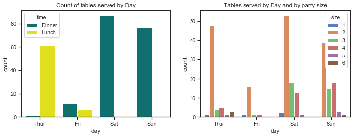
- Fridays are the quietest days for this waiter. Saturdays are the busiest days followed by Sundays so there are more customers at the weekend.
- The mosy common party size by far is 2. There are very few lone diners and very few parties of 5 and 6.
# create a colour palette for plotting times
pal = dict(Lunch="seagreen", Dinner="gray")
# countplots by gender of bill payer and by smoker in the group
sns.set(style="ticks")

f, axes = plt.subplots(1, 2, figsize=(12, 4)) # set up 1 by 2 plot and figure size 12 by 4
order=["Thur", "Fri", "Sat","Sun"] # the order to be shown on the plot

# create a dictionary mapping hue level to colors (as per the FacetGrid plot!)
gender_pal=dict(Female="pink",Male="skyblue")
smoker_pal=dict(Yes="r",No="g")
# plot number of tables per day, use the palette as per the dict pal. specify the order of days on the axes.
sns.countplot(x ="day", hue="sex", palette=gender_pal,data =df, order=order, ax=axes[0])
axes[0].set_title("Count of tables served per day by sex of bill payer")

# plot number of  tables per day by size of party
sns.countplot(x =("day"), hue="smoker",data =df, ax=axes[1], palette=smoker_pal, order=day_order)
axes[1].set_title("Count of tables served per day with smoker(s) present");
#plt.show() # hide the matplotlib axes text
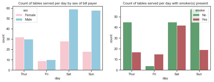
- There are almost equal numbers of male and female bill-payers on Thursdays and Fridays but the number of male bill-player far out-weighs female bill-payers at the weekend.
- There are more non-smokers than smokers on any day but especially on Thursdays and Sundays. While there are much less customers recorded for Fridays than any other days, these customers are mostly smokers.
- There are almost equal number of male and female bill-paying customers for lunch but far more males for dinner. There are more male paying customers overall.
Histogram and Kernel Density estimate plots of Total bill and Tip amount.
A histogram is a plot that shows the distribution of a single quantitative variable such as the total bill amount or the tip amount. A histogram represents the distribution of data by forming bins along the range of the data and then drawing bars to show the number of observations that fall in each bin.
It charts the data using adjacent rectangular bars and displays either the frequency or relative frequency of the measurements for a range of values in each interval. Each interval or range of values is a bin. The number of bins can be specified although seaborn and matplotlib will automatically choose this. The number of bins chosen usually depends on the amount of data and the shape of the distribution. distplot() uses a simple rule to make a good guess for what the right number is by default, but this can be changed which might reveal other features of the data.
The histogram visualises the centre and spread of the distribution as well as showing if there is any skew in the data. Below are the histograms of the Tip amount and the total bill amounts. The mean is shown as the red line and the median as the green dashed line. For symmetric distributions the mean is at the centre of the distribution and coincides with the median. Where the distribution is skewed the mean is further over than the median to the long tail which can be seen below for the total bill amount.
The mode is the most frequently occuring value in a distribution. There is no mode function in pandas or even numpy. It is not really used as such except for describing whether a distribution is unimodal, bimodal or multimodal which depends on how many peaks there is in the distribution. In multimodal distributions there is no unique highest mode.
Seaborn’s distplot() function draws a histogram and fit a kernel density estimate (KDE).
The kernel density estimate can be a useful tool for plotting the shape of a distribution. It also represents the density of observations on one axis with height along the other axis but involves further calculations where each observation is replaced with a normal gaussian curve centred at that value, these curves are then summed to compute the value of the density at each point in the support grid. The resulting curve is then normalized so that the area under it is equal to 1.
A kernel density plot can also be drawn using the kdeplot function and with this you can specify a bandwidth (bw) parameter which controls how tightly the estimation is fit to the data.
%matplotlib inline
# set up the subplots and figure sizes
f, axes = plt.subplots(1, 2, figsize=(12, 4))

# plot the histograms of total bill amounts
sns.distplot(df['total_bill'], kde=True, rug=True, ax=axes[0], color="blue", bins=25)
# add a vertical line at the mean
axes[0].axvline(df['total_bill'].mean(), color='yellow', linewidth=2, linestyle="--")
# add a vertical line at the median
axes[0].axvline(df['total_bill'].quantile(q=0.5), color='cyan', linewidth=2, linestyle=":")
# add a title
axes[0].set_title("Histogram of  Total Bill amounts")


#plot the histogram of tips
sns.distplot(df['tip'], kde=True, rug=True, ax=axes[1], color="purple", bins=25)
# add a vertical line to show the mean
axes[1].axvline(df['tip'].mean(), color='yellow', linewidth=2, linestyle="--")
# add a vertical line to show the median
axes[1].axvline(df['tip'].quantile(q=0.5), color='cyan', linewidth=2, linestyle=":")
# add title
axes[1].set_title("Histogram of  Tip amounts");
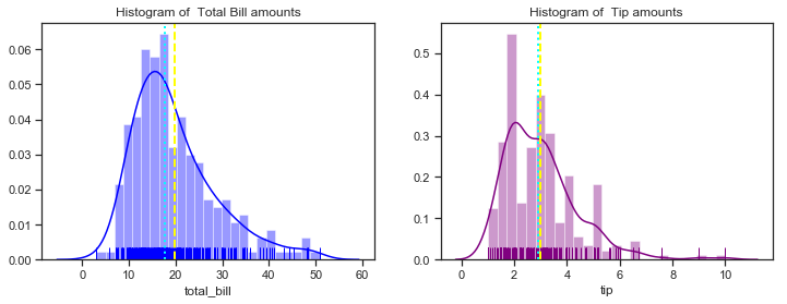
The histograms show that most total bill amounts fall in the range between 10 and 30 dollars with a peak around 16 dollars. It has only one peak when the default number of bins is used. As more bins are used you would expect to see more peaks in the distribution. The mean is the light yellow line and the median is the broken blue line. As the summary statistics above showed the median total total bill is about 2 dollars less than the mean indicating a non-symmetrical distribution. The mean and median tip amount are very close to each other. The distributions here do look slightly right skewed but you would expect not to see values near zero anyway for total bill amounts. The tips histograms shows that most tips fall in the range between 2 and 4 dollars with two distinct peaks at about 2.50 and 3.50.
The peaks of the kernel density estimates show which values have the highest priobability.
Boxplots of Total Bill amounts and Tip amounts
Boxplots can be used to show the central tendency, symmetry and skew of the data and any outliers. The rectangular box is bounded by the ‘hinges’ representing the lower (1st quartile) and upper (3rd quartile) while the line drawn through the box represents the median. The whiskers are the lines that extend out from the box in both directions and are drawn to the point that is 1.5 times the IQR. Outliers are any points that are outside of the whiskers. The whiskers represent the minimum and maximum values of the data excluding the outliers. The boxplots show if the data is symmetric or not - if the median is in the centre of the box and the whiskers are the same length. A skewed distribution has the median nearer to the shorter whisker. A positively skewed or right skewed distribution has a longer top whisker than bottom whisker whereas a negatively skewed or left skewed distribution has a longer lower whisker.
Boxplots use robust median and IQR statistics instead of the more sensitive mean and standard deviations.
f, axes = plt.subplots(1, 2, figsize=(12, 4))
sns.set(style="ticks", palette="pastel")
sns.boxplot(y=df['total_bill'], ax=axes[0], color="blue")
# add a title
axes[0].set_title("Boxplot of Total Bill amount")
sns.boxplot(y=df['tip'], ax=axes[1], color="purple")
axes[1].set_title("Boxplot of Tips amounts");
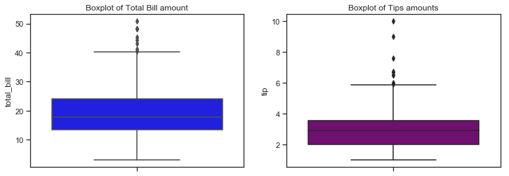
The boxplots above shows similar information on the distribution of total bill and tip amounts as the distribution plots above. The rectangular boxes show the middle half of the distribution. The median bill amount is about 18 and the median tip amount is over 3 dollars. Total bills over 40 represent outliers while tips over 6 dollars are considered outliers. Boxplots can be used to compare distributions, often for one variables at different levels of another variable. I will look at this more in section 3 but for now will just look at the number of bills by day and by sex.
sns.set(style="ticks", palette="pastel")

# set up 2 by 2 plots, overall figure size 12 by 4
f, axes = plt.subplots(1, 2, sharey=False, figsize=(12, 4))

# bill amount by day, grouped by sex
sns.set(style="ticks", palette="muted")
sns.boxplot(x="day",y="total_bill" ,data=df, order=day_order, ax=axes[0]) # controlling the day or
# bill amount by sex, grouped by smoking status
axes[0].set_title("Boxplot of total bill amount by day")
sns.boxplot(x="day",y="total_bill" ,hue="sex",data=df, palette=gender_pal,order=day_order, ax=axes[1])
# bill amount by dining time, grouped by sex
axes[1].set_title("Total bill amount by day by sex of bill payer")
sns.despine(offset=10, trim=True); # remove the spines
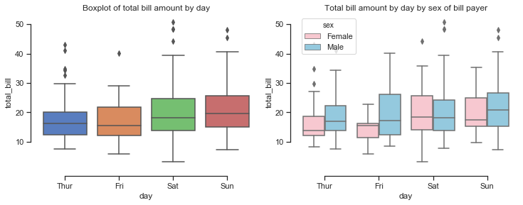
looking at the total bill amounts per day shows that the amount spent increases at the weekend and is lowest on a Friday. When broken down by the sex of the bill payer it seems that the median amount spent on the bill is higher for males than females and is also more variable for males. Saturday seems to be the only day when the median bills for males and females are similar although there is more of a right skew on the bill amounts by males.
Adding additional variables
df['Tip%']=df['tip']/df['total_bill']*100
df['BillPP']=df['total_bill']/df['size']
df['TipPP']=df['tip']/df['size']
df['total_spent']=df['total_bill']+df['tip']
df.head()
.dataframe tbody tr th {
    vertical-align: top;
}

.dataframe thead th {
    text-align: right;
}
print(f"While the standard deviation of the total_bill amount was quite high at ${df['total_bill'].std():.2f}, the standard deviation of the bill per person seems more reasonable at ${df['BillPP'].std():.2f}")

print(f"This makes sense when the average (mean) bill per person is ${df['BillPP'].mean():.2f}.")
print(f"The tip amount as a percentage of the total bill amount is {df['Tip%'].mean():.2f} percent.\n")
While the standard deviation of the total_bill amount was quite high at $8.90, the standard deviation of the bill per person seems more reasonable at $2.91
This makes sense when the average (mean) bill per person is $7.89.
The tip amount as a percentage of the total bill amount is 16.08 percent.
Now plotting the distribution of the bill per person and percentage tip rates.
%matplotlib inline
# set up the subplots and figure sizes
f, axes = plt.subplots(1, 2, figsize=(12, 4))

# plot the histograms of total bill amounts
sns.distplot(df['BillPP'], kde=True, rug=True, ax=axes[0], color="blue", bins=25)
# add a vertical line at the mean
axes[0].axvline(df['BillPP'].mean(), color='yellow', linewidth=2, linestyle="--")
# add a vertical line at the median
axes[0].axvline(df['BillPP'].quantile(q=0.5), color='cyan', linewidth=2, linestyle=":")
# add a title
axes[0].set_title("Distribution of BillPP")

#plot the histogram of tip rate
sns.distplot(df['Tip%'], kde=True, rug=True, ax=axes[1], color="purple", bins=25)
# add a vertical line to show the mean
axes[1].axvline(df['Tip%'].mean(), color='yellow', linewidth=2, linestyle="--")
# add a vertical line to show the median
axes[1].axvline(df['Tip%'].quantile(q=0.5), color='cyan', linewidth=2, linestyle=":")
# add title
axes[1].set_title("Distribution of  Tip percentages");
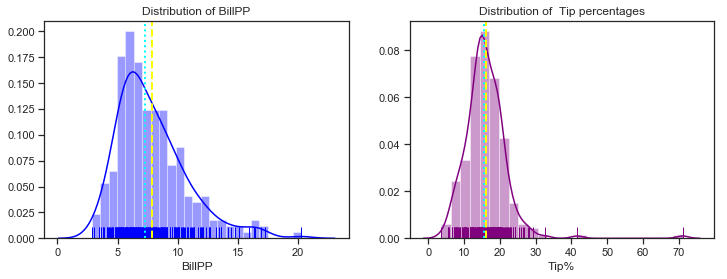
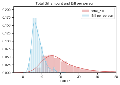
The distribution of bill per person still seems to be a litle bit right skewed like the total bill distibution but less so and also it is less spread out. The distribution of the percentage tip is now distinctly unimodal. The plots below show the distributions of total bill and amount per person on the same plot. The
%matplotlib inline
sns.set(style="ticks", palette="muted")
# plot the histograms of total bill amounts and bill per person
sns.distplot(df['total_bill'], color="r", label="total_bill")
sns.distplot(df['BillPP'], color="c", label="Bill per person")
# add a title, set the x and y axis limits then plot the legends
plt.title("Total Bill amount and Bill per person")
plt.xlim(-5,50)
plt.ylim(0,0.21)
plt.legend();
Aside on Unique Tip amounts
In a later section I was looking at the number of unique values of total bill and tip amounts in the dataset.
There are over 100 more unique bill amounts than unique tip amounts which suggests that maybe some rounding of tip amounts does occur such as to the nearest dollar. There seems to be no mode calculation in Numpy but there is one in the scipy.stats module. The mode is the most frequently occuring value.
Following this I was curious to see how many times were the tips rounded to the nearest 50 cent or dollar and it turns out there are 111 rows in the dataset where the tip was rounded to the 50 cent or dollar for tip amounts between 1 and 5 dollars. I think this is something that could be taken into account when trying to accurately predict tip amount from bill amount.
print(f"There are {len(df['total_bill'].unique())}  unique total bill amounts and {len(df['tip'].unique())}  unique tip amounts ")
# import stats module to use mode function
from scipy import stats
# Find the mode
mode= stats.mode(df['tip'])
print("The most common tip amount is ", *mode[0],"which occurs ", *mode[1],"times in the Tips dataset")
print(f"Tip of exactly 2 dollars occur {len(df[df.loc[:, 'tip'] ==2])} times")

# use pandas isin function to check if the tip amounts are rounded
# create a set of tip values
values =[1.00,1.50, 2.00,2.50,3.00,3.50,4.00,4.50,5.00]
# get the count using len of how many tips fall into these range
print(f"For tips between 1 and 5 dollars there were {len(df[df['tip'].isin(values)])} rows where the tip was rounded to nearest 50 cent or dollar. \n")
There are 229  unique total bill amounts and 123  unique tip amounts
The most common tip amount is  2.0 which occurs  33 times in the Tips dataset
Tip of exactly 2 dollars occur 33 times
For tips between 1 and 5 dollars there were 111 rows where the tip was rounded to nearest 50 cent or dollar.
Summary plots of the Tips dataset
I will finish up part 1 with some plots that summarise the dataset. These plots can help identify the relationship between total bill and tip that is examined more closely in Part 2 and also highlight some relationships between other variables in the dataset that could be explored in part 3.
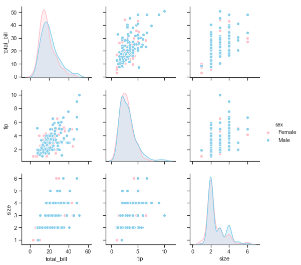
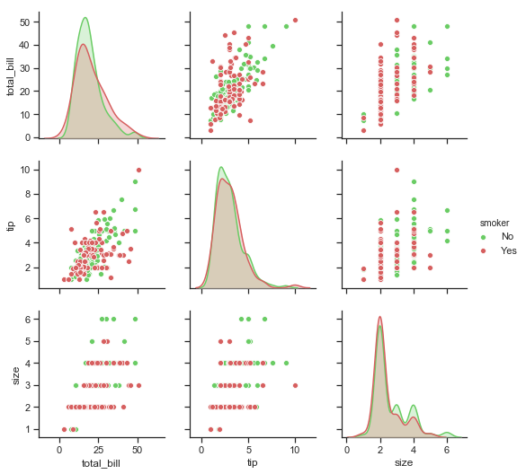
Seaborn’s pairplotcan be used to show all pairwise relationships of the (variables) in a dataset. The univariate distributions are shown across the diagonal and the relationship between pairs of variables are shown elsewhere.
The different levels of a categorical variables can be shown by colour using the hue semantic.
The pairplots below show the distributions of total_bill, tip and size variables on the diagonal. The bivariate relationships are shown as scatter plots. The different colours represent the sex of the bill payer in the first pairplot and the smoker status in the second pairplot below.
# To just select the original variables of the dataframe and not included the added variables
df.loc[:, ['total_bill','tip','sex','smoker','size']];
print("\n\n Pairplot showing relationships between total bill, tip and size by sex of bill payer \n")
# plot the pairplot using palette defined earlier for hue levels
sns.pairplot(df.loc[:, ['total_bill','tip','sex','smoker','size']], hue="sex",palette=gender_pal);
Pairplot showing relationships between total bill, tip and size by sex of bill payer
print("\n\n Pairplot showing relationships between total bill, tip and size by smoker in the party \n")
sns.pairplot(df.loc[:, ['total_bill','tip','sex','smoker','size']], hue="smoker",  palette= smoker_pal);
Pairplot showing relationships between total bill, tip and size by smoker in the party
Recap of part 1: Describe the Tips dataset
The objective for part 1 was to describe the variables in the Tips dataset using both statistics and plots.
I looked at some of the background to the Tips dataset, located and read the csv file into python and checked that all was in order. There was no data cleaning required for this dataset.
Pandas functions were used to get a good overview of the dataset. There are both categorical and quantitative variables in the dataset which determime the kind of statistics and visualisations that are appropriate to apply.
For categorical variables this meant count of values in each category, number of unique values, the most commonly occuring values in each category and their frequency. Countplots looked at the distribution of the values across the different levels of each category.
For the quantitative variables (total bill amount, tip and size) the statistics that measured central tendancy and spread were used including the mean, median, standard deviation, range of values and interquartile range. Graphical EDA was then performed using a variety of Seaborn plots such as boxplots and seaborn’s distplot function which incorporates histograms and kernel density estimates.
I also gave an overview of what the type of statistics used here actually tell about data in general to show how they would be useful for the Tips dataset.
My main reference point so far was the Seaborn tutorial and the book Experimental Design and Analysis by Howard J. Seltman[1] who taught data science and statistic courses at CMU, in particular a course called Experimental Design for Behavioral and Social Sciences. Seltman bundled his teaching materials into a free on-line textbook. Wikipedia also provided some information as referenced.
The next step would be to do some multivariate non-graphical exploratory data analysis and graphical analysis. The pairplot visualisation above summarises how the variables interact with each other in the dataset.
Part 2 looks more closely at the relationship between the total bill amount and the tip. Further multivariate analysis using additional variables will be the focus of part 3 which will look at relationship between the variables within the dataset.
Part 2 Regression: Discuss and analyse whether there is a relationship between the total bill and tip amount.
In this section I will look at the relationship between the total bill and the tip amount using regression. My primary references are the Fundamentals of Data Analytics lecture notes, chapter 9 of Experiment Design and Analysis by Howard J Seltman on Simple Linear Regression[5], Wikipedia[6] and a hacker earth blog post on regression analysis[7].
Regression analysis is a set of statistical processes for estimating the relationships between a dependent variable (often called the ‘outcome variable’) and one or more independent variables (often called ‘predictors’, ‘covariates’, or ‘features’). The most common form of regression analysis is linear regression, in which a researcher finds the line (or a more complex linear function) that most closely fits the data according to a specific mathematical criterion.[8] Regression will be used here to see if there is a relationship between the tip amount (the dependent variable) and the total bill amount (independent variables). Exploratory data analysis can show whether there is a case for trying a linear regression on the data.
Regression is the statistical method used to find the equation of the line that best fits the data. It describes the nature of the relationship between variables which can be positive or negative, linear or non-linear. Regression can be used to to see whether two or more variables are related and if so what is the strength of the relationship. Also what kind of relationship exists and whether predictions can be made from the relationship. The goal of regression here is to relate two numerical variables in the Tips dataset to each other, specifically the tip amount and the total bill amount. Is the tip amount related to the total bill amount, how and by how much. Can you predict the tip amount if you know the bill amount?
Scatter plots to identify relationship between total bill and tip:
Plots such as scatter plots can help to identify trends and patterns in a dataset which might indicate a relationship.
The scatter plot below visualise relationships between two numerical variables such total bill and tip amount. The correlation statistics below will then be used to put a numerical value on the strength and direction of the relationship.
A scatter plot is a plot of the ordered pairs of numbers consisting of the independent variable x and the dependent variable y. It shows the joint distribution of two variables where each point represents an observation in the dataset and can be used to spot relationships that may exist.
Here scatter plots are drawn using the seaborn scatterplot function where the total bill is shown along the vertical axis and the tip amounts along the vertical axis. Each point is an actual observation is the Tips dataset with a total bill amount and the corresponding tip amount paid with that bill.
# create the plot
sns.scatterplot(x=df['total_bill'],y=df['tip'], hue=df["size"], style=df["sex"])
# add title
plt.title("Scatter plot of Total bill amount and Tip");
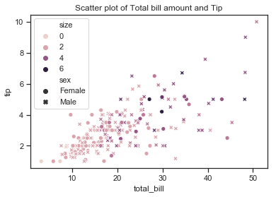
The scatter plot shows that there does appear to be a positive linear relationship of sorts between the two variables total bill and tip amount with the points forming a line across the diagonal from the intersection of the axis up to the top right hand corner. The tip amount does appear to rise with the bill amount as would be expected although there are some observations that this does not seem to hold for. The plot shows a few higher tips for smaller total bills but there are quite a number of observations where the tip seems quite small in comparison to the total bill size. These are the points on the bottom right hand side of the plot under the (imaginary) line and they do not seem to follow the same trend of higher bill amounts leading to corresponding high tip amounts.
Correlation and Covariance of Total Bill and Tip amounts
For two quantitative variables such as the total bill amount and the tip amount, the covariance and correlation are statistics of interest which are used to determine whether a linear relationship between variables exists and shows if one variable tends to occur with large or small values of another variable.
Covariance is a measure of the joint variability of two random variables and the (Pearson) correlation coefficient is the normalised version of the covariance which shows by its magnitude the strength of the linear relation.
The covariance shows how much two variables vary with each other and in what direction one variable will change when another one does. If a covariance is positive then when one measurement is above it’s mean then the other measurement will more than likely be above it’s mean and vice versa while with a negative covariance when one variable is above the mean the other measurement is likely to be below it’s mean. A zero covariance implies that the two variables vary independently of each other.
The correlation statistics are computed from pairs of arguments. The correlation of the measurements can be got using the pandas corr method on the dataframe. If there is a strong positive relationship between the variables, the value of the correlation coefficient will be close to 1, while a strong negative relationship will have a correlation coefficient close to -1. A value close to zero would indicate that there is no relationship between the variables.
The correlation is easier to interpret than the covariance. Correlation does not depend on units of measurement and does not depend on which variable is x or y. $r$ is the symbol used for sample correlation and $\rho$ is the symbol for the population correlation.
Correlation and Covariance statistics for Total bill and Tip amount.
The corr function applied to the tips dataset returns a correlation matrix for the numerical variables.
# calculating correlation on Tips dataset, subset to exclude new variables added

print("The covariances between the numerical variables in the Tips datasets are: \n" ,df.loc[:, ['total_bill','tip','sex','smoker','size']].cov())
print("\n The correlations between the numerical variables in the Tips datasets are: \n" ,df.loc[:, ['total_bill','tip','sex','smoker','size']].corr())
The covariances between the numerical variables in the Tips datasets are:
             total_bill       tip      size
total_bill   79.252939  8.323502  5.065983
tip           8.323502  1.914455  0.643906
size          5.065983  0.643906  0.904591

 The correlations between the numerical variables in the Tips datasets are:
             total_bill       tip      size
total_bill    1.000000  0.675734  0.598315
tip           0.675734  1.000000  0.489299
size          0.598315  0.489299  1.000000
print(f"The covariance between the total bill amount are tip amount is {df['total_bill'].cov(df['tip']):.4f}")
# correlation of total bill and tip amounts.
print(f"The correlation between the total bill and tip amount is {df['tip'].corr(df['total_bill']):.4f}")
The covariance between the total bill amount are tip amount is 8.3235
The correlation between the total bill and tip amount is 0.6757
The correlation between the total bill amount and the tip is positive and quite high at 0.67 which implies that tip amount is indeed related to the total bill amount. The relationship is quite strong but it does not seem to be the only factor. The size of the party can also be seen to have an influnce here with a positive value of 0.49.
Correlation however is not the same as causation! There can be many possible relationships between variables that are correlated such as cause and effect relationship and also reverse cause and effect. In other cases the observed correlation between variables may be due to the effects of one or more other variables so while it might seem that the total bill is correlated with the tip amount, it is possible that the other variables such as the size of the party or day of week have some influnce. Often a relationship between variables might even be just coincidental.
As the correlation coefficients and the scatter plots indicate that there is a linear relationship between total bill and tip amount the next step then is to look at regression.
In addition to scatter plots and joint distribution plots for two variables, seaborn has some regression plots that can be used to visualise relationships and patterns that exist in the data when exploring the data. Statistical models are used to estimate a simple relationship between sets of observations which can be quickly and easily visualised and can be more informative than looking at statistics and tables alone.
These regression plots are mainly used to visualise patterns in a dataset during the exploratory data analysis and are not meant to be used for statistical analysis as such. Other python packages such as statsmodels are recommended for looking at more quantitative measures concerning the fit of the regression models.
Seaborn has two main functions for visualising linear relationships through regression, regplot and lmplot which both produce similar output but have slightly different use. lmplot has slightly more features while regplot is an axes-level function and can draw onto specific axes giving you some control over the the location of the plot).
First a scatterplot of two variables x and y is drawn and then a regression model y ~ x is fitted and plotted over the scatter plot together with a 95% confidence interval for the regression.
I will draw some regression models of tip modelled on total_bill amount.
First a regression model tip ~ total_bill is fitted on top of a scatter plot of the two variables. A confidence interval for the regression is drawn using translucent bands around the regression line which estimated using a bootstrap. This feature can be turned off by setting ci to None.
If there are outliers in the dataset (and there seems to be some in the Tips dataset), a robust regression can be fitted which uses a different loss function which downweights relatively large residuals but takes a bit longer to run though.
plt.figure(figsize=(7, 4))
sns.regplot(x="total_bill", y="tip", data=df)
plt.title("Regression: tip ~ total_bill");

The regression plot below shows an upward trend in the tip amount as the total bill increases. A confidence interval represents the range in which the coefficients are likely to fall with a likelihood of 95%. The confidence interval is wider towards the top of the regression line.
Before going any further I will give a little overview of what I have learned about simple linear regression and how it can be used on the Tips dataset.
Simple Linear Regression.
Simple linear regression is a common method for looking at relationships between a single explanatory variable and a single quantitative outcome variable. It can be used here to explore a relationship between the total bill amount as the explanatory variable and the tip amount as the outcome variable. (Simple just means that there is only one explanatory variable.) In the Tips dataset there are 229 different observed values of the total bill amount but there are many amounts in between these exact bill amounts that could be assumed to also possible values of the explanatory variable. There are 123 unique tip amounts because it seems that some rounding up takes place as we saw earlier.
The scatter and regression plots above show that there are many set of observations or points that seem to fall around an imaginary line. Any straight line is characterised by it’s slope and intercept and can be expressed as $y = mx +c$ where the slope of the line $m$ shows how much $y$ increases when $x$ is increased by one unit. $c$ is the y-intercept of the line which is the value of $y$ when $x$ is zero. Linear regression looks for the equation of the line that the points lie on and finds the best possible values for the slope and intercept. The best line to fit the data is the one that minimises the cost of the least squares line. This is when the sum of the squared vertical distances from each point to the regression line is at a minimum.
Regression looks at the relationship between the population mean of an outcome variable $Y$ and an explanatory variable $x$. A regression model can be used to find the expected value of the Tip amount as the outcome variable for a given value of the total bill amount as an explanatory variable. In other words to predict the tip amount expected if we know the total bill amount.
In regression there is usually a null hypothesis and an alternative hypothesis. The hypothesis here is whether there is a linear relationship between the total bill and the tip amount. The null hypothesis is that there is no relationship and $H_0: B_1=0$; the alternative hypothesis is that there is a relationship and $H_1: B1 \neq 0$.
The equation $E(Y|x) = B_0 + B_1x + \epsilon$ linearly relates the tip amount and total bill amount where the expected value of the tip amount (Y) for any particular total bill (x) amount would be equal to the intercept parameter and the slope parameter times the value of the total bill amount as x plus a random error term epsilon $\epsilon$. Regression finds the estimates of the unknown slope $B_0$ and intercept $B_1$ parameters.
If the null hypothesis turns out to be true then the slope parameter is zero and the expected value or population mean of $Y$ will just be equal to the value of the intercept $B_0$. This would mean that the $x$ value (the total bill amount) has no effect on the $y$ value (tip amount) and therefore the tip amount would stay the same for all total bill amounts which is very unlikely.
The alternate hypothesis is that changes in $x$ are associated with changes in $Y$. That is that changes in the total bill amounts are related to changes in the tip amounts.
A regression model would say that for each value of the total bill amount, the population mean of Tip amount over all the observations that have that particular total bill amount can be calculated using the simple linear expression $B_0 + B_1x$. The equation $E(Y|x) = B_0 + B_1x$ makes a prediction of the true mean of the Tip amount for any fixed value of the total bill amount. The exact values of the slope and intercept parameters are not known so estimates of the parameters are made and substituted into this equation. These parameters estimates are called coefficients.
This difference then between what the model says the y values should be (the fitted values $\hat{y}$ ) and what the observed y values actually are squared and summed up. The vertical distances between the actual observed points and the best fit regression line are known as the residuals. The least squares line is the line with the smallest sum of squared residuals. Calculus can be used to find the values of $b_0$ and $b_1$ that give this minimum value and find the best fit line using the following equations:
$$b_1 = \frac{\sum_i (x_i - \bar{x}) (y_i - \bar{y})}{\sum_i (x_i - \bar{x})^2} \qquad \textrm{and} \qquad b_0 = \bar{y} - b_1 \bar{x} $$
$\hat{B_0}$ and $\hat{B_1}$ are often used instead of $b_0$ and $b_1$ to show these are statistics rather than parameters.
There are several assumptions that an ordinary least squares (OLS) regression model should satisfy. The first is that the regression model assumes linearity within the range of the observed values. Then there are important assumptions regarding the error term which the blogpost 7 classical assumptions of OLS[11] by Jim Frost outlines which include the following:
- The error term accounts for the variation in the dependent variable (Tip amount) that the independent variables (total bill) do not explain and should only be determined by random chance for the model to be unbiased. If this is the case the expected value of the error term is zero, otherwise part of the error term should be added to the regression model itself. The expected value of the error term should equal zero.
- All independent variables should be uncorrelated with the error term.
- All observations of the error term should be uncorrelated with each other.
- The variance of the error term should be consistent for all observations.
An error is the deviation of the true outcome value from the population mean of the outcome for a given $x$ value. The error term is a population value that we don’t know so the residuals are used instead. The residuals are the sample estimate of the error for each observation - the difference between the observed value and the fitted value.
A linear model should produce residuals that have a mean of zero, have a constant variance, and are not correlated with themselves or other variables.
Finding the regression coefficients:
While seaborn’s regression plots can help us spot trends and possible relationships in the data, they do not actually give us the regression coefficients or the regression equation. According to the seaborn tutorial on visualising linear relationships in the spirit of Tukey, the regression plots in seaborn are primarily intended to add a visual guide that helps to emphasize patterns in a dataset during exploratory data analyses. That is to say that seaborn is not itself a package for statistical analysis. To obtain quantitative measures related to the fit of regression models, you should use statsmodels.
The Fundamental of Data Analysis lectures on Linear Regression demonstrated how to find the slope and intercept parameters to give the equation of the line that that best describes the data points. First the actual observations are plotted using a scatter plot. The best line to fit the data is the one that minimises the cost of the least squares line. This is when the sum of the squared vertical distances from each individual data point to the regression line is at a minimum.
The best line is considered the one that minimises the cost $Cost(m,c)$ of the Least Squares Lines $ \sum_i (y_i - mx_i - c)^2 $.
- Each $y_i$ is the corresponding value of Tip amount to each total bill amount $x_i$ in the dataset. These are actual measured values so $(x_i,y_i)$ is the ith point in the dataset.
- The value $mx_i + c$ is what the model says that $y_i$ should have been.
- $y_i - mx_i - c$ is the difference between the observed $y_i$ values and the the value the model gives $(mx_i + c)$. - These values are then squared.
- Particular values of $m$ and $c$ will give the lowest values for this cost function which can be plotted on the scatter plot of actual observations.
The lecture demonstrated how several lines can be drawn as estimates for the model that best fits the data with a given slopes and intercepts. A cost is then calculated for each line and the line with the lowest cost is considered the best fit for the data. A cost function is used to determine the best line to fit the data. However the data does not alway fit perfectly and therefore the cost is usually greater than zero.
If I was to do this for the Tips dataset I would start with a guess of 15% for the slope using the typical tip rate of 15% and 1 as the intercept given the minimum tip in the dataset is 1 dollar. Fortunately numpy’s polyfit function can do all this. There are also functions in packages such as statsmodels and scikit-learn.
Using the numpy polyfit function to find the best fit line
numpy’s polyfit is a function that can fit a polynomial to a set of x and y points. A linear equation is a polynomial of degree 1. polyfit returns a vector of coefficients that minimise the squared error - the estimates for the slope and intercept parameters. It can be used to fit lines in many dimensions and does the calculations involved in minimising the cost function.
# set x and y to be total bill and tip amount from the dataset
x, y = df['total_bill'], df['tip']
# use polyfit function on total bill and tip amount. polynomial degree is 1 for a linear equation
np.polyfit(x,y,1)
array([0.105 , 0.9203])
# explanatory variable x is total bill, outcome variable tip is y
x, y = df.total_bill, df.tip
# First calculate the mean total bill amount (mean of x) and the mean tip amount (mean of y)
x_avg, y_avg = np.mean(df.total_bill), np.mean(df.tip)
print("The mean bill amount is $%.3f " %x_avg, "and mean tip amount is $%.3f \n" %y_avg)
#  subtract means from each of the individual total_bill and tip values
x_zero= df['total_bill'] - np.mean(df['total_bill'])
y_zero= df['tip'] - np.mean(df['tip'])

# The best slope m is found by the following calculations:
m = np.sum(x_zero * y_zero) / np.sum(x_zero * x_zero)

# The best slope m from above is used to calculate the best intercept c
c = y_avg - m* x_avg

print("The slope m is calculated above to be %.4f and the intercept c  to be %.4f." %(m,c))
The mean bill amount is $19.786  and mean tip amount is $2.998

The slope m is calculated above to be 0.1050 and the intercept c  to be 0.9203.
# Calculating the cost for various slope and intercept values

cost = lambda m,c: np.sum([(y[i] - m * x[i] - c)**2 for i in range(x.size)])
print("The cost using the above calculated slope  (m = %.3f) and intercept (c = %5.3f): %8.2f" % (m, c, cost(m, c)))
## first for a guess using tip rate of 15% and minimum tip as intercept of 1
print("Cost with m = %.3f and c = %5.3f: %8.2f" % (0.15, 1.1, cost(0.15, 1.1)))
# using the estimates from the polyfit function
print("Cost with m = %.3f and c = %5.3f: %8.2f" % (0.105, 0.9203, cost(0.105, 0.9203)))
The cost using the above calculated slope  (m = 0.105) and intercept (c = 0.920):   252.79
Cost with m = 0.150 and c = 1.100:   570.90
Cost with m = 0.105 and c = 0.920:   252.79
As the cost is not zero this indicates that the tip is not completely explained by the total bill amount.
The estimate for the slope $m$ and intercept parameter $c$ can be put into the regression equation to find the expected value of the tip amount for any total bill amount (within the range that the slope and intercept were calculated on). For example $E(Y|x) = B_0 + B_1x$ using the intercept estimate of 0.9203 as $B_0$ and the slope estimate 0.105 for $B_1$ would give the values below. We could then check how the model would predict the tip amount for a total_bill amount. In his book, Seltman notes that while it is reasonable to interpolate and make predictions for unobserved $x$ values between the observed $x$ values it would be unwise to extrapolate and make predictions outside of the range of $x$ values studied.
There are only 229 unique total bill amounts in the tips dataset but the linear regression model could be used to make tip predictions for any total bill amounts between the minimum 3.07 and maximum 50.81 dollars but not outside this range.
## apply the model to some total_bill amounts to get predictions of tips
B0, B1 =  0.9203, 0.105,
# just selecting a range of total bills between 30 and 40 in steps of 3
for x in range(30,40,3):
    tips_y = B0 + B1*x
    print(f"For a meal with a total bill of {x:.2f} the expected value of the tip amount is {tips_y:.2f}")

#print(f"The tip IQR ranges from {df['tip'].quantile(q=0.25):.2f} to {df['tip'].quantile(q=0.75):.2f} dollars")
For a meal with a total bill of 30.00 the expected value of the tip amount is 4.07
For a meal with a total bill of 33.00 the expected value of the tip amount is 4.39
For a meal with a total bill of 36.00 the expected value of the tip amount is 4.70
For a meal with a total bill of 39.00 the expected value of the tip amount is 5.02
Having made some predictions the next step would be to check how the predictions did on actual observations where we know the total_bill amount and the tip amount.
# selecting some data that fall in the same range predicted for above.
df[(df.loc[:, 'total_bill'] >=30) & (df.loc[:,'total_bill'] <40)].sort_values(by='total_bill')
.dataframe tbody tr th {
    vertical-align: top;
}

.dataframe thead th {
    text-align: right;
}
There are packages with functions that do all this such as the scikit-learn package.
Using $R^2$ to show how much of the changes in Tip amounts is due to Total Bill amounts:
Coefficient of Determination: $R^2$
The correlation coefficient shows the stength and direction of the relationship between the tip and total bill amount variables. How much of the variance in tip amount ($y$) is actually determined by total bill amount ($x$) can be measured using the Coefficient of Determination also known as R Squared. The $R^2$ value is an estimate of how much the changes in the $y$ values (tip amount) is due to changes in the $x$ values (the total bill amounts) compared to all the other factors that affect the $y$ value.
$$ R^2 = 1 - \frac{\sum_i (y_i - m x_i - c)^2}{\sum_i (y_i - \bar{y})^2} $$
The Pearson correlation coefficient can be squared to get the R-squared value. Numpy has a function corrcoef() that calculates this value. It returns a matrix of correlation coefficient between each pair of variables which can be squared to get the coefficient of Determination - R squared.
# Calculate the R-squared value for the Tips dataset using numpy corrcoef,
np.corrcoef(df['total_bill'],df['tip'])
# just get a single value for correlation between total bill and tip from the correlation matrix
print(f" R-squared is:{np.corrcoef(df['total_bill'],df['tip'])[0][1]**2:.4f} ")
R-squared is:0.4566
There are clearly other factors that affect the tip amount other than the size of the total bill. According to the R-squared statistic only 46% of the variation in the tip amount is related to the total bill amount.
statmodels
just a quick look at how to use the statsmodel package for linear regression
# import ols for ordinary least squares regression
from statsmodels.formula.api import ols
# fit the model
model = ols('tip ~ total_bill', data=df).fit()
# the detailed statistics derived from the fit
model.summary()
# just the paramters for the intercept and coefficient
print(model.summary())
print(model.params)
                            OLS Regression Results
==============================================================================
Dep. Variable:                    tip   R-squared:                       0.457
Model:                            OLS   Adj. R-squared:                  0.454
Method:                 Least Squares   F-statistic:                     203.4
Date:                Fri, 29 Nov 2019   Prob (F-statistic):           6.69e-34
Time:                        20:39:57   Log-Likelihood:                -350.54
No. Observations:                 244   AIC:                             705.1
Df Residuals:                     242   BIC:                             712.1
Df Model:                           1
Covariance Type:            nonrobust
==============================================================================
                 coef    std err          t      P>|t|      [0.025      0.975]
------------------------------------------------------------------------------
Intercept      0.9203      0.160      5.761      0.000       0.606       1.235
total_bill     0.1050      0.007     14.260      0.000       0.091       0.120
==============================================================================
Omnibus:                       20.185   Durbin-Watson:                   2.151
Prob(Omnibus):                  0.000   Jarque-Bera (JB):               37.750
Skew:                           0.443   Prob(JB):                     6.35e-09
Kurtosis:                       4.711   Cond. No.                         53.0
==============================================================================

Warnings:
[1] Standard Errors assume that the covariance matrix of the errors is correctly specified.
Intercept     0.920270
total_bill    0.105025
dtype: float64
- Adjusted R-squared reflects the fit of the model. A higher value indicates a better fit assuming certain conditions are met
- Intercept coefficient is the Y intercept (doesnt always make sense as in this case as it means the expected output (Tip) is equal to this amount when total bill is zero
total_billcoefficient represents the change in the output of Y (tip) due to a change of one unit in the total bill amount.- std err represents the level of accuracy of the coefficients. The lower the better.
- P>|t| is the p-value. A p-value less than 0.05 is considered statistically significant
- Confidence interval represents the range in which the coefficients are likely to fall with a likelihood of 95%.
Summary of regression of total bill and tip amount so far.
# correlation of total bill and tip amounts.
print("The correlation coefficient between total bill and tip amount is %.3f" %df['total_bill'].corr(df['tip']))
print(f"The coefficient of determination R squared is {np.corrcoef(df['total_bill'],df['tip'])[0][1]**2:.4f}")
print(f"The estimates for the slope and intercept parameters are {np.polyfit(df['total_bill'],df['tip'],1)[1]:.4f} and {np.polyfit(df['total_bill'],df['tip'],1)[0]:.4f} ")
The correlation coefficient between total bill and tip amount is 0.676
The coefficient of determination R squared is 0.4566
The estimates for the slope and intercept parameters are 0.9203 and 0.1050
-
A scatterplot is used to show the shape of the relationship between the variables.
-
There is quite a strong positive relationship between total bill and tip amount but it is not perfectly linear.
-
There can be two or more independent variable and one independent variable. While there is a relationship between the total bill amount and the tip amount, we could also see that there is a positive relationship between the size of party and the tip amount.
-
The coefficient of determination (also known as R squared) is a better indicator of the strength of a linear relationship between total bill and tip amoount than the correlation coefficient because it shows the percentage of the variation of the dependent variable (tip) that is directly attributed to the independent variables (total bill). The $R^2$ value is an estimate of how much the changes in the $y$ values (tip amount) is due to changes in the $x$ values (the total bill amounts) compared to all the other factors that affect the $y$ value.
-
Numpy
corrcoef()function calculates the Pearson correlation coefficient which can be squared to get the R-squared value. -
While the correlation coefficient is 0.676, the $R^2$ values is lower at 0.456.
-
The coefficient of determination is got by squaring the correlation coefficient then converting the result to a percentage.
-
The standard error of the estimate is an estimate of the standard deviation of the y values about the predicted $\hat{y_i}$ values
-
The standard error of estimates can be used to construct a prediction interval
Seaborn regression plots to show the relationship between tip and total bill.
I will now look more at the regression plots in the seaborn package and see how to interpret them given the information on regression above. The lmplot or regplot functions visualise the relationship between the total bill and tip amount. The first plot here is the simple linear regression between tip as the outcome and total bill as the explanatory variable.
plt.figure(figsize=(7, 4))
sns.regplot(x="total_bill", y="tip", data=df)
plt.title("Simple Linear Regression: tip ~ total_bill");
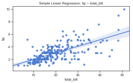
The plot shows a positive relationship between total bill and tip amount as the tip generally increases as the total bill increases. The confidence interval gets wider towards the top of the regression line. The correlation and R squared statistics suggest that while there is a positive relationship between total bill and the tip amount, there is something else going on. I will next look at using the regression plots to condition on another variable to see how the relationship between total bill and tip changes as a function of a third variable.
Effect of another variable on the relationship between total bill and tip amount.
Conditioning on other variables.
How does the relationship between tip and total_bill amount change as a function of a third variable?
The lmplot combines the regplot function with a FacetGrid and can be used to see if there are any interactions with up to three additional variables. The best way to separate out a relationship is to plot both levels on the same axes and to use color to distinguish them which I will do here.
I am going to use the lmplot function to see if there are any interactions on the relationship between total bill and tip amount by using colour through the hue semantic. Further variables could be added by drawing multiple “facets” for each level of the variable to appear in a different row or col on a grid. However I do think that this can get very complicated to read.
Effect of party size on the relationship between total bill and tip amount
Here I use the lmplot to look at the relationship between total bill and tip amount taking into account the size of the party. Firstly conditioning on party size shows that steeper lines for parties of 1 then 4, 3 and 2. For the larger parties the regression line is almost flat. However parties of 5 and 6 are not very common in the dataset as can be seen by the sparsity of points. There is overlap in the confidence intervals.
sns.lmplot(x="total_bill", y="tip", hue="size",data=df)
plt.title("Effect of party size on relationship between total bill and tip");
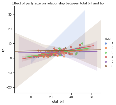
Effect of Sex of bill payer on the relationship between total bill and tip amount.
Here I have conditioned on sex of the bill payer using the hue semantic and on the smoker status using columns. There are more male bill payers in the dataset than female bill payers, however the difference on the regression line is very small with male bill payers paying slightly less tips on average for smaller bills than females but at the other end of the scale males are paying slightly higher tips than females for higher bills. There are fewer females paying higher bill amounts. The confidence intervals for males and females overlap.
sns.lmplot(x="total_bill", y="tip", hue="sex",data=df, palette=["pink","skyblue"])
plt.title("Effect of sex of bill payer on the relationship between total bill and tip amount");
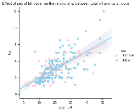
Effect of Smoker on the relationship between total bill and tip amount.
Here I have conditioned on a smoker in the party using the hue semantic. It seems than non-smokers tend to be less generous for smaller bills but more generous at the higher end while non-smokers pay higher tips on lower bills but seem to get less generous relative to the bill as the bill increases. The confidence interval for smokers is much wider at the higher end than for non-smokers. From the plots it does look like smoker status does influence the tip amount.
sns.lmplot(x="total_bill", y="tip", hue="smoker",data=df, palette=["g","r"])
plt.title("Effect of smoker in the party on the relationship between total bill and tip amount");
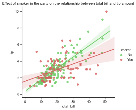
Effect of Smoker and sex on the relationship between total bill and tip amount.
It seems to me that smoker status does have some influence on the relationship between the total bill and the tip amount while the sex of the bill payer does not make much difference. The regression plots below show that higher bills tend to lead to higher tips by parties with non-smokers than with smokers. The confidence intervals for males and females overlap but the confidence intervals for smokers and non-smokers do not. In part 3 I will look more closely at the difference between male and female smokers.
sns.lmplot(x="total_bill", y="tip", hue="sex",col="smoker",data=df, palette=["pink","skyblue"]);
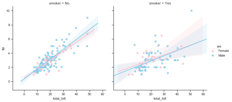
Effect of size, smoker and sex on the relationship between total bill and tip amount.
You can also fit a linear regression when one of the variables takes discrete values for example if using the size variable which only takes 6 possible values in the Tips dataset. In this case you can add some random noise known as jitter to the discrete values to make the distribution of those values more clear although this jitter does not influence the regression line fit itself.
sns.lmplot(x="size", y="tip", data=tips, x_jitter=.05).
Alternatively you can collapse over the observations in each discrete bin to plot an estimate of central tendency along with a confidence interval.
sns.lmplot(x="size", y="tip", data=tips, x_estimator=np.mean).
The regression plot of tip against size shows that the tip amount increases by the size of the party up to a party size of 4 then the tip amount seems to fall a bit relative to the size for parties of 5 and 6 people.
There are very few parties of more than 4 in this dataset.
sns.lmplot(x="size", y="tip", hue="smoker",x_estimator=np.mean, data=df, col="sex",palette=smoker_pal);
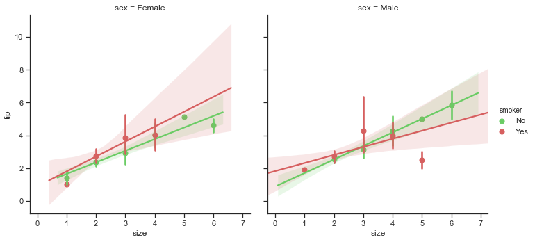
Combining size, smoker and sex shows that there is an upward trend overall in tip amount as party size gets bigger. The tip amount increases by a higher amount for larger parties with smokers and a female bill payer. Tip amount tends to increase by party size for male non-smokers more than smokers in the same group.
Effect of Day of week and time on the relationship between total bill and tip amount.
The regression plots below show how the relationship between total bill and tip amount varies by day of the week and whether it is lunch or dinner time. There are very few lunches in the dataset on days other than Thursdays - in fact only 7 on Fridays and none at all on Saturdays on Sundays. Looking at dinners by day, the steepest lines is for dinner on a Thursday but this was a single observation so we can’t infer much from this. Saturdays shows the steepest slope so tips become more generous relative to the bill as the bill amount grows. On the other hand people are more generous with tips for smaller bills. The confidence intervals for each day overlap.
# faceting by time and also by day of week
sns.lmplot(x='total_bill', y='tip', hue="day",col="time",data=df);
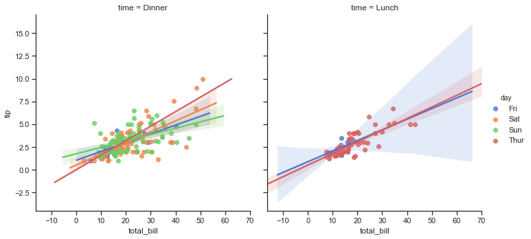
Fitting different regression models to look at the relationship between total bill and tip amount.
The seaborn tutorial shows ways of fitting different regression models to a dataset where simple linear regression might not be the most suitable.
Both lmplot and regplot can be used to fit a polynomial regression model for higher order polynomials. To do so you use the order argument to the regression plot.
Regression of total bill and tip amount using higher order polynomials
The plots below show the difference between linear regression and higher order polynomials. In my opinion the polynomial with order 3 looks like a slightly better fit to the line than the first order linear regression line.
f, axes = plt.subplots(2, 2, figsize=(12, 6))
sns.regplot(x="total_bill", y="tip", data=df, ax=axes[0,0], label="order = 1", ci=False); axes[0,0].legend()
sns.regplot(x="total_bill", y="tip", data=df, order=2, ax=axes[0,1], label="order =2", ci=False); axes[0,1].legend()
sns.regplot(x="total_bill", y="tip", data=df, order=3, ax=axes[1,0], label="order =3", ci=False); axes[1,0].legend()
sns.regplot(x="total_bill", y="tip", data=df, order=4, ax=axes[1,1], label = "order=4"); axes[1,1].legend()
plt.legend()
plt.suptitle("Trying higher order polynomial regression functions to Total Bill and Tips")
plt.show()
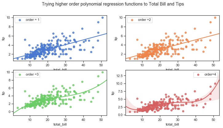
Robust regression of total bill and tip amount
A robust regression can be fitted to total bill and tip amount using different loss functions to deal with outliers by downweighting relatively large residuals.
sns.regplot(x="total_bill", y="tip", data=df, robust=True);
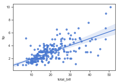
Logistic regression of total bill and tip
A logistic regression model can be used where the outcome y is a binary variable. This would shows the estimated probability of y being 1 for a given value of x or alternatively y being 0. A tip falls into either the big tip category (1) or not (0). The seaborn tutorial shows a logistic regression fitted to the Tips data where a binary variable is first created called ‘big_tip’ for tips that are greater than 15% of the total bill amount. This plot shows that the number of “big_tips” actually falls as the size of the total bill gets biggers.
# big tip variable for tips greater than 16%

df["big_tip"] = (df.tip / df.total_bill) >.16
sns.lmplot(x="total_bill", y="big_tip",data=df,logistic=True,ci=None, y_jitter=.03)
plt.title("logistic regression of big_tip on total bill");
# Drop this variable again from df
df=df.drop("big_tip", axis=1)
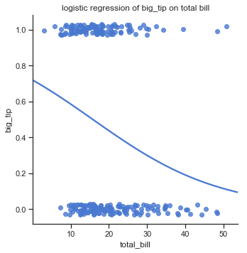
Using a lowess smoother to fit a regression of total bill and tip
The seaborn tutorial shows another way of fitting a nonparametric regression using a lowess smooth. lowess smoothing is used to fit a line to a scatter plot where noisy data values, sparse data points or weak interrelationships interfere with your ability to see a line of best fit. It also used for linear regression where least squares fitting doesn’t create a line of good fit or is too labor-intensive to use. Lowess are non-parametric strategies for fitting a smooth curve to data points. A parametric fitting assumes the data fits some distribution which can misrepresent the data whereas non-parametric smoothers try to fund a curve of best fit without assuming the data must fit some distribution shape.
sns.lmplot(x="total_bill", y="tip", data=df, lowess=True)
plt.title("using a lowess smoother")
plt.show()
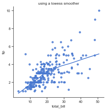
Using Residual plots to check whether the simple regression model of tip ~ total bill is appropriate.
Seaborns residplot() function is used for checking whether the simple regression model is appropriate for a dataset.
A residplot fits and removes a simple linear regression and then plots the residual values for each observation. Ideally, these values should be randomly scattered around y = 0 as explained earlier.
If there is structure in the residuals, this suggests that simple linear regression is not appropriate.
If the residual plot does have a shape this suggest non-linearity in the data set. A funnel shape pattern suggests that the data is suffering from heteroskedasticity, i.e. the error terms have non-constant variance. Hackerearth[7]
Applying the residplot to the data does seem to show this funnel shape suggesting that the tips dataset does suffer from heteroskedasticity. It doesn’t look like the variance of the error terms are consistent as the reiduals become more spread out from zero as the total bill amount increases.
sns.residplot(x="total_bill", y="tip", data=df, scatter_kws={"s": 80})
plt.title("Residual plot"); plt.show()
According to this blogpost on statisticsbyjim linear regression assumptions if you want to see if the residuals follow a normal distribution then you should look at a normal probability plot. They should follow a straight line. seaborn qqplot. The qqplot shows that this line is fairly straight for total bills but only up to a certain total bill amount .
# qqi plot for checking normality
import seaborn_qqplot as sqp

sqp.qqplot(df, x="total_bill", y="tip");
Regression using the percentage tip rate as the outcome variable
A case study of restaurant tipping[9] applied a general linear regression model to find the variables which best predicted the percentage tip given to a waiter and found that the size of the party was the most important predictor of tip rate where the tip expressed as a percentage of total bill actually decreases as the party size increases.
The aim of this project however was to look at the relationship between the total bill and tip amount so the analysis above was done using the tip amount as the outcome but just for completion the pairplots below show how tips change as other variables changes using actual tip amount in the top row and then using tip rate (tip amount/total bill amount) in the bottom row. The pairplots summarise the main relationships in the dataset between tip and the other variables individually using scatter plots show the joint distribution of two variables. The points are coloured according to the day of week. This gives some insight into the factors that may influence the tip along with the total bill amount which will be looked at further in part 3.
# pairplot with tip in first row, tip% in second row as Y variables against other variables as X, conditioned on day
g = sns.pairplot(df, x_vars=["total_bill", "size","sex","smoker"],y_vars=["tip","Tip%"], hue="day")
plt.suptitle("Relationships in the Tips dataset");
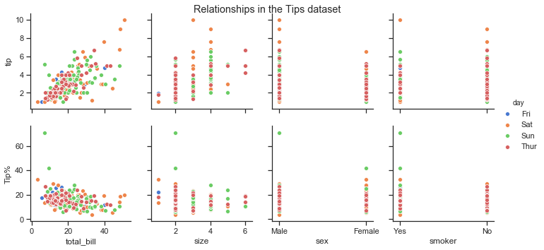
Review of Part 2 on Regression: Is there a relationship between total bill and tip amount?
-
In this section I looked first at the scatter plots of total bill and tip amounts. Using scatter plots is a graphical method of depicting the relationship between one variable and another. A positive relationship between total bill and tip was visible where the tip amount tends to rise with the total bill amount.
-
The covariance and correlation statistics also indicated that there was a positive and fairly strong linear (0.68) relationship between the total bill amount and the tip given.
-
I looked at what linear regression actually is and how it is used to find the equation of the line that best fits the data. I outlined some of the steps involved and how the method could be applied to the total bill and tip variables in the Tips dataset to find a relationship and also to be able to predict an expected tip amount given a total bill amount.
-
Seaborn does not actually give you any statistical values such as the regression coefficients or the regression equation. There ar many other packages to do this. I used the numpy polyfit function to fit a linear eqaution to the data that minimises the cost function.
-
The coefficient of determination, also known as R-squared was also calculated using numpy. While the correlation coefficients provide a measure of the strength and direction of the relationship between variables, the coefficient of determination is an estimate of how much of the changes in one variable such as tip are due to changes in the total bill amount.
-
The R-Squared value of 0.4566 indicates that only 46% of the variation in the tip amount is due to the variation in the total bill amount which means that there are other factors that account for some of the variation in tip amount.
-
The effect of the other variables in the dataset on the relationship between the total bill and tip amount were next explored. Seaborn
lmplotswere used here with hue semantics and facets to show the effects of other variables by conditioning the relationship between total bill and tip on one or more other variables. Smoker status in particular stood out as a variable of interest. -
I then looked at using the tip as a percentage of total bill as the outcome variable with the total bill amount as the explanatory variable.
-
Using seaborn plots I also considered looked at the various other regression models such as logistic regression which could be applied to the dataset if the tip variable was converted to a binary variable with 0 representing values under a particular percentage tip and 1 representing values over.
-
Higher order polynomial regression functions were applied to the data to compare with the linear regression model.
-
Regression using a lowess smoother was also briefly explored. This could be suitable for the tips dataset as the least squares line doesn’t create a line of good fit for the higher total bill amounts.
-
I used the residual plot function to look at the error terms and this did seem to indicate that the data may be suffering from heteroskedascity and suggests that the simple linear regression of
tip ~ total_billmay not be appropriate model to use. -
Using the tip as a percentage of total bill showed that the customers in the dataset did tend to tip using percentages of the bill as guidelines, but the rate given did fall somewhat as the group size got larger. anatory variable.
-
The plots showed that tip amount is certainly related to the total bill amount but as the total bill creeps up the tip rate seems to fall. Tip rate starts to fall off as the size of the party increases but more so for smokers than non-smokers.
Tip amount in general does rise with the amount of the total bill. Tip amount does increase as the size of the group increases as the total bill increases with size. The percentage of tip looks fairly constant but tends to fall as group size increases.
I will be looking further at relationships between the variable in part 3.
Part 3 Analysis: Analyse the relationship between the variables within the dataset.
Analyse: analyse the relationship between the variables within the dataset. You are free to interpret this as you wish — for example, you may analyse all pairs of variables, or select a subset and analyse those.
Part 1 above described the variables in the Tips dataset using statistics and some plots. It used both non-graphical and graphical univariate exploratory data analysis and looked at the distribution of each of the variables. Part 2 looked at the relationship between the total bill amount and the tip using regression. This included looking at how other variables interacted with the total bill in determining bill amount. Part 2 include some regression plots showing the individual effects of sex of bill payer and smoker status on the relationship between the total bill amount and the tip. The effect of the size of the party was also shown to influence the outcome tip amount and rate.
Part 3 now looks at some of the relationships between the different variables in the dataset. The focus will be on multivariate analysis of the dataset using both non-graphical and graphical means but particularly the latter. There is some overlap with part 1 and part 2 so I will try not to duplicate here. I will focus more on the relationships between the sex of bill payer, smoker and size variables.
The time variable represents whether the meal was at lunch or dinner time but there are few if any lunches in the dataset outside of Thursdays with only a small number on Fridays. All meals in the dataset for the weekend represent dinners only. Therefore I don’t think there is much value in looking at the time variable in too much detail for this particular dataset.
Gender and Smoker: How does the characteristics of the customers matter in this dataset?
This section focuses on the two binary categorical variables sex and smoker where the sex variable refers to the gender of the bill payer which has two levels Male and Female. smoker is a binary variable that has two levels Yes and No.
These variables both represent characteristics of the customers.
I would not have thought that smoker status would have an effect on the tip given in relation to the total bill amount but in part 2 when I looked at the relationship between total bill and tip amount, it did seem to have some effect. Sex of the bill payer on the other hand did not seem to matter much unless considered together with smoker status.
First to recap, the relationship between the total bill amount and tip amount are shown in the following plot broken down by smoker and sex of bill payer.
The plots on the bottom row show that there is a lot more variability in the tips given when smokers are present compared to non-smokers in the top row. Comparing males to females it seems that female non-smokers have the least variability of tip amounts of the 4 groups. The number of points indicate that there are a lot more male bill payers present in this dataset. The higher bill amounts are generally paid for by males, and mostly with no smokers. Apart from one exception male smokers bills tend to be about the mid-range. Their tips are not at all consistent though.
# regression plot of total bill vs tips by sex and smoker status
sns.lmplot(x="total_bill", y="tip", col="sex", row="smoker",ci=False,data=df, height=3.5, aspect =1);
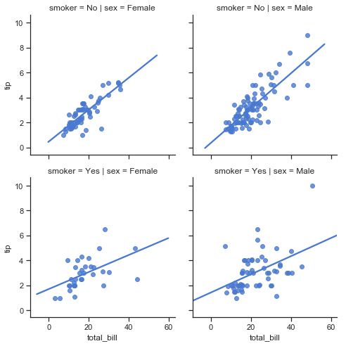
The characteristics of customers in the dataset
The statistics in part 1 showed that there were almost equal numbers of male and female bill payers on weekdays but far more male bill payers than females on the weekends. The boxplots of total bill by day showed that the amounts spent by males were more variable and the median bill was generally higher for male bill payers except on Saturdays when the medians of male and bill payers were similar. Note that there is no information about the makeup of the party other than the sex of the bill payer. Similarly we only know that there was smokers present in the party but not how many and whether the bill payer was a smoker or non smoker. Part 2 showed that size of the party does seem to be a factor in determining the tip amount. There is no way of knowing from the data how many of the customers were males or females as we only know the sex of the bill payer. Similarly with smoking status we know there was a smoker present or not in the group but not how many of the group were actually smokers.
This plot below shows that while the weekends were busiest overall, Saturdays were the busiest of the 4 days for smokers, both male and female. The proportion of smokers on Fridays was highest but the overall number of tables served on Fridays was quite small. There are more male than female bill payers in the dataset, more female non-smokers on Thursdays than male non-smokers.
sns.catplot(x="day", kind="count", data=df, hue="sex", col="smoker", palette=gender_pal, height=3.5, aspect =1, order=day_order)
plt.show()
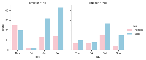
Total bill amounts per day by sex and smoker
The swarm plot below is a categorical scatter plot where the points are adjusted so that they don’t overlap. The total_bill amount is shown on the vertical axis. The days are shown on the horizontal axis ordered by day as used earlier. We can see that there was only 1 dinner on a Thursday paid for by a female with no smokers in the party. The remaining meals were lunches, mostly with non-smokers only and there seems to have been just slightly more female bill payers than male. One of the most obvious things from these plots above is that Friday is a very quiet day for non-smokers compared to smokers but there were very few customers served by this waiter overall on Friday. On fridays most meals served were dinners, there were more smoking than non-smoking parties and an almost even split between male and female bill payers. Saturday then was busier than the weekdays but only dinners were served. There was quite a few more male bill payers than female bill payers and there was nearly the same number of parties with smokers present as non-smokers. Sundays was again very busy but had less smokers present, the bills were still mostly settled by males.
The swarm plots also shows how the total bill amounts were distributed. The lowest 2 bills were paid for by females with smokers in the party. The largest bill was paid for by male with smoker present. There were a few large bills on weekends paid for by males across both smoking levels. The size of the party is not shown here.
There are no high total bill amounts at all for female non-smokers and just one observation for a female smoker on a Saturday. Where there are male bill payers with smokers in the party, the total bill is more variable whereas male non-smokers total bills are clustered in the low-mid price bill range.
# building up a plot to show
sns.set(style="ticks")
g= sns.catplot(x="day", y="total_bill", hue="sex",row="smoker", col="time", data=df, palette=gender_pal, height=4,
               aspect =1, kind="swarm", linewidth=1, order=day_order);
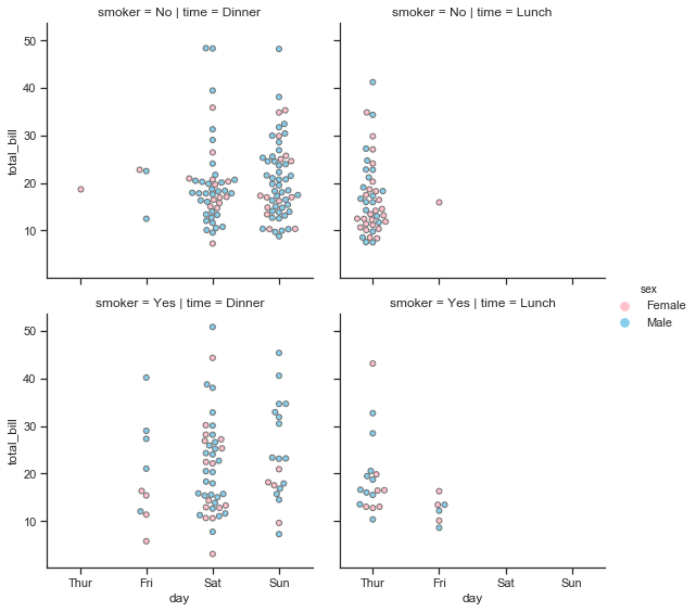
The boxplots show that there is greater variability in the total bill amounts by males. The median bill amount is generally lower for female bill payers except on Saturdays when it is just slightly more than that on male bill payers. Females tend to be less variable than males but there is no substantial difference between the total bills paid by females smokers and non-smokers. There are some smaller bills by female smokers and a few outliers but not such a difference as can be seen between the male smokers and non-smokers. Male smokers have a wider distribution of total bills and is skewed towards higher bills.
# total bill per day by sex, showing days in order of day
sns.boxplot(x="day",y="total_bill" ,hue="sex",data=df, palette=gender_pal, order=day_order);
plt.title("Distribution of Total bill amounts per day by sex of bill payer");
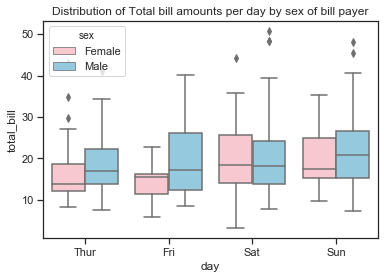
sns.set(style="whitegrid")

# set up number of subplots and figure size
f, axes = plt.subplots(1, 2, sharey=False, figsize=(10, 4))

# bill amount by sex, grouped by smoking status
sns.boxplot(x="sex",y="total_bill" ,hue="smoker",data=df, palette=smoker_pal, ax=axes[0])
# bill amount by dining time, grouped by sex
sns.boxplot(x="sex",y="tip" ,hue="smoker",data=df, palette=smoker_pal, ax=axes[1])
# bill amount by dining time, grouped by sex

sns.despine(offset=10, trim=True) # remove the spines
plt.suptitle("Total Bill and Tip by sex and by smoker");
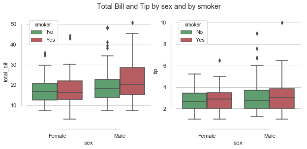
The boxplots above show that while male smokers tend more towards higher bills than male non-smokers or females (smokers and non-smokers), the median tip amount does not seem to rise as much as you would expect relative to the bill.
Average tips paid by sex and smoker:
The barplots below show the mean tip amount broken down by male and female bill payers.The vertical lines on top are the confidence intervals showing the uncertainty around the mean. The difference in the average tip paid by male and females was more pronounced on Thursdays and Saturdays with the mean tip paid by male bill being higher than that of females on Thursdays and Saturdays but slightly lower on Fridays and Sundays. There was more variability in the tip by males on Fridays than females. There is a bigger difference in the mean tip between male and female non-smokers than between smokers of both sexes. The highest average tips were paid by male non-smokers.
When looking at the mean tip paid by smoker versus non-smoker, smokers paid on average a higher tip on Thursdays and Sundays. Non-smokers on Fridays were the most variable. Sunday smokers paid the highest average tip.
# a barplot showing the count of total_bill
sns.set(style="whitegrid")
# set up number of subplots and figure size
f, axes = plt.subplots(1, 3, figsize=(12, 3))
order=["Thur", "Fri", "Sat","Sun"] # the order to be shown on the plot

# plot mean tip by day by sex
sns.barplot(x ="day", y="tip", hue="sex", palette=gender_pal,data =df, order=day_order, ax=axes[0]) #

# plot mean tip by smoker by sex
sns.barplot(x ="smoker", y="tip", hue="sex", palette=gender_pal,data =df, ax=axes[1])

# plot number of tips (or total_bill) by smoker using length as the estimator instead of mean
sns.barplot(x ="day", y="tip", hue="smoker", palette=["g","r"],data =df, order=order, ax=axes[2])
plt.suptitle("Average tip");
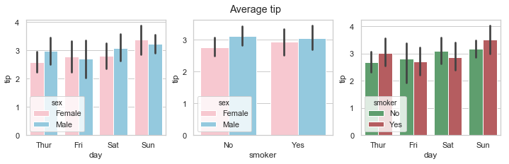
- There are almost equal numbers of male and female bill-payers on Thursdays and Fridays but the number of male bill-player far out-weighs female bill-payers at the weekend. This could be for any number of reasons and we don’t know the gender of their dining companions.
- There are more non-smokers than smokers on any day but especially on Thursdays and Sundays. While there are much less customers recorded overall for Fridays than any other days, these customers are mostly smokers.
- There are almost equal number of male and female bill-paying customers for lunch but far more males for dinner. There are more male paying customers overall.
This dataset contains only the tables served by one waiter who may just work less hours on a Friday. There is no data at all for Monday, Tuesday or Wednesday.
The relationship between total bill and tip amount is stronger for non-smokers than smokers.
The scatter plot of total bill and tip amount with the a regression line plotted. The effect of a smoker being present does seem to impact the slope of the regression line with a steeper line for non smokers suggesting a stronger linear relationship between total bill and tips for non-smokers. The non-smokers are more generous here than smokers and the tip amount increases in line with the total bill.
While there are more male bill payers in the data, the sex of the bill payer does not seem to affect the relationship between total bill and tip amount, unless there is a smoker present.
sns.set(style="ticks")
sns.lmplot(x="total_bill", y="tip", hue="sex",col="smoker",ci=False,data=df, palette=gender_pal, height=3.5, aspect =1); plt.show()
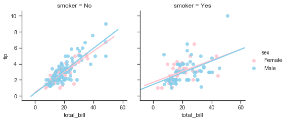
Now some statistics by gender and smoker
Pandas groupby function allows you to aggregate by more than one statistic so in this way I can specify the actual statistics I want to see. Here I select some of the columns of the dataframe, including the new percentage tip column and save to df2
df2= df.loc[:, ['total_bill','tip','Tip%','sex','smoker','size']]
Males versus females:
Higher average amounts spent on bills and tips by males. Less variability in spending of females.
df2.groupby(['sex']).agg([np.mean, np.std]).round(2)
.dataframe tbody tr th {
    vertical-align: top;
}

.dataframe thead tr th {
    text-align: left;
}

.dataframe thead tr:last-of-type th {
    text-align: right;
}
Smokers vs non-smokers:
Higher average spend by smokers with more variability in tipping rates.
df2.groupby(['smoker']).agg([np.mean, np.std]).round(2)
.dataframe tbody tr th {
    vertical-align: top;
}

.dataframe thead tr th {
    text-align: left;
}

.dataframe thead tr:last-of-type th {
    text-align: right;
}
Female non-smokers vs Female smokers vs Male non-smokers vs Male smokers
Highest average bills for smoking males but highest average tip for non-smoking males. Female smokers are the most generous in terms of percentage tips. Male smokers the most variable overall and female non-smokers the most consistent.
df2.groupby(["sex","smoker"]).agg([np.mean, np.std]).round(2)
.dataframe tbody tr th {
    vertical-align: top;
}

.dataframe thead tr th {
    text-align: left;
}

.dataframe thead tr:last-of-type th {
    text-align: right;
}
Does the sex of the bill payer influnce the tip amount?
The number of male bill payers is almost twice the number of female bill payers. When females are paying the bills there is less variability in both the bill amount and the tip amount with smaller ranges of values and smaller standard deviations. The largest bill and tip was paid for by a male and the smallest bill size was paid for by a female. It is important to remember here that while we know the sex of the bill payer we do not know the sex of the individuals in any party. On average, female bill payers give slightly higher tip as a percentage of the total bill amount, in particular female smokers.
Does having a smoker in the party influence the tip amount?
-
Parties with male bill-payer and no smokers represent the largest group of bill payers in the dataset at a count of 97 while parties with female bill-payers and smokers represents the smallest group of bill payers at just 33.
-
When there is a smoker in the party the mean bills and tips increase and the variability of bills and tip increase.
-
The combination of female bill payer and smoker present has the highest average tip percentage rate
-
The combination of male bill payer and smoker has the lowest percentage tip rate.
-
Parties with a male bill-payer and smokers have the highest average bill amount and are the most variable
-
parties with female bill payer and no smokers present have the least variation in bill amount and tips.
It is important to note that we only know whether there is a smoker in the party or not. There is no more information in the dataset regarding how many of the party are actually smokers or whether the bill payer was a smoker or not so of all the variables I think this would be the last variable to use to reach conclusions about tipping behavious on!
How does the size of the parties matter in this dataset?
The pairplots at the end of part 1 showed the pairwise relationships in the dataset. The pairplots show how the majority of party sizes are of 2, followed by 3 then 4. There are very few solo diners and very few parties over 4. The two plot below again show that the majority of parties were of size 2. The percentage tip given varies across all party sizes but the distribution of percentage tips is wider for paries of 2 and gets smaller as the party size increases. However there are much less observations in larger party sizes.
As seen in part 2 when looking at the correlation matrix for the quatitative variables in the dataset, the size of the party is positively correlated with both the size of the total bill and with the tip amount, but the correlation with the tip amount is lower. The tip as a percentage is negatively correlated with the size of the party. The case study of restaurant tipping[14] found that the size of the party was the most important predictor of tip rate where the tip expressed as a percentage of total bill actually decreases as the party size increases.
# looking again at the correlation between the numerical variables in the tips dataset.
print(f" The correlation between size of the party and the total bill amount is {df['size'].corr(df['total_bill']):.2f}")
print(f" The correlation between size of the party and tip amount in dollars is {df['size'].corr(df['tip']):.2f}")
print(f" The correlation between size of the party and the bill per person is {df['size'].corr(df['BillPP']):.2f}")
print(f" The correlation between size of the party and the percentage Tip rate is {df['size'].corr(df['Tip%']):.2f}")
 The correlation between size of the party and the total bill amount is 0.60
 The correlation between size of the party and tip amount in dollars is 0.49
 The correlation between size of the party and the bill per person is -0.18
 The correlation between size of the party and the percentage Tip rate is -0.14
The correlation statistics show that party size is positively correlated with total bill amount which makes sense as you expect the amount spent to rise with the number of diners in the party. The party size is also positively correlated with the tip amount but to a lesser extent. These correlation are both positive but not very strong as the range is up to 1.0 and suggest that diners in largers parties are not purchasing the same type of menu items as diners in smaller party sizes. There is no information on the profile of the customers. It could be possible that there could be children in the larger parties who are consuming from a children’s menu. The larger parties show a smaller range of bills per person while pairs or couples dining together have bills per person that span the a wider range of dollar amounts.
# set the figure and subplots

# plot boxplots for bills
# set the figure and subplots
f, axes = plt.subplots(1, 2, sharey=False, figsize=(13, 4))
# boxplots of tips by party size
sns.boxplot(x="size", y="total_bill", data=df, ax=axes[0])
sns.boxplot(x="size", y="BillPP", data=df, ax=axes[1])
# set the ylimits to exclude the extreme outlier squashing the plot down

axes[0].set_title("Boxplot of total bill amount by party size")
axes[1].set_title("Boxplot of bill per person by party size");


f, axes = plt.subplots(1, 2, sharey=False, figsize=(13, 4))
# boxplots of tips by party size
sns.boxplot(x="size", y="tip", data=df, ax=axes[0])
sns.boxplot(x="size", y="Tip%", data=df, ax=axes[1])
# set the ylimits to exclude the extreme outlier squashing the plot down
axes[1].set_ylim(0,50)
axes[0].set_title("Boxplot of tip amount by party size")
axes[1].set_title("Boxplot of percentage tip by party size");
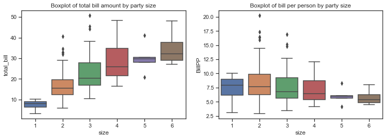
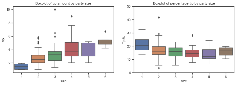
The boxplot below is combined with a swarmplot to show each observation along with a summary of the distribution. There are very few parties of five and six and only a few solo diners. Would this not influence the correlation coefficient and any regression model?
The boxplots above show that total bill amounts and tip amounts rise by party size while the bill per person falls. The percentage tip by larger parties seems to fall in a similar range to those of smaller parties, with the exception of of the few single diners. The median percentage tip does fall a bit for parties of 5 but there are very few observations in this category.
The bulk of the diners are concentrated in small parties.
# plot a catplot of size versus Tip%, use violin plot and show the obsevations within it using swarmplot
g = sns.catplot(x="size", y="Tip%", kind="violin", inner=None, data=df)
sns.swarmplot(x="size", y="Tip%", color="k", size=3, data=df, ax=g.ax);
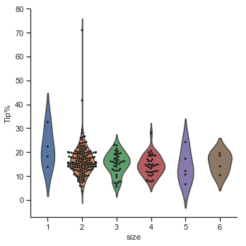
g = sns.catplot(x="size", y="BillPP", kind="violin", inner=None, data=df)
sns.swarmplot(x="size", y="BillPP", color="k", size=3, data=df, ax=g.ax);
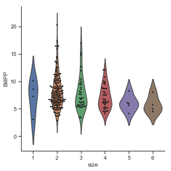
Party size and smokers.
The pairplots here show the relationship between Tip amount against party size and bill per person. The second row shows the the tip as a percentage of the bill amount. The tip amount does increase as the party size increases. The smokers seem to be concentrated in the smaller parties. The percentage tips seem to be fairly constant across party sizes for non-smokers but does fall as party size increases for smokers. However the number of larger parties are very few so this must be considered. The bill per person variable (BillPP) represents the total bill amount averaged over each party. The percentage tip actually falls as the bill per person increases for smokers. It also falls somewhat for non-smokers but not to the same degree.
sns.pairplot(df, x_vars=[ "size", "BillPP"], y_vars=["tip","Tip%"],height=5, aspect=.8, kind="reg", hue="smoker",palette=smoker_pal);
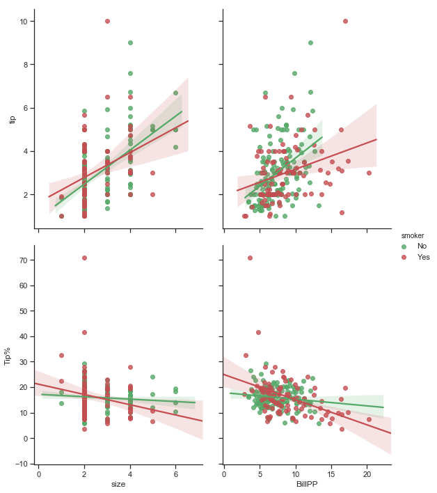
Percentage Tips per party size over the different categories of diners:
The table below shows the percentage tips for males and females including smoker and non smoker status. There are no large parties at all of 5 or 6 people with smokers and only 1 group of 5 people.
# pivot table of Tips% over sex and smoker, for each party size, calculate mean of each group
df.pivot_table(values=['Tip%'], index=['sex','smoker'], columns=['size'], aggfunc=np.mean).round(2)
.dataframe tbody tr th {
    vertical-align: top;
}

.dataframe thead tr th {
    text-align: left;
}

.dataframe thead tr:last-of-type th {
    text-align: right;
}
# df2 excludes a few of the new columns. get mean and standard deviation over each group size
df2.groupby(["size"]).agg([np.mean, np.std]).round(2)
.dataframe tbody tr th {
    vertical-align: top;
}

.dataframe thead tr th {
    text-align: left;
}

.dataframe thead tr:last-of-type th {
    text-align: right;
}
sns.scatterplot(x=df['total_bill'],y=df['tip'], hue=df["size"], style=df["sex"])
# add title
plt.title("Scatter plot of Total bill amount and Tip");
sns.lmplot(x='total_bill',y='tip', data=df)
<seaborn.axisgrid.FacetGrid at 0x1a24329518>

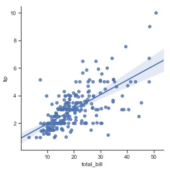
Summary and Conclusions
In part 1 the tips dataset was described using statistics and plots using the pandas and seaborn libraries. The type of variable determined the type of statistic and visualisation to use.
In part 2 I did some investigation into simple linear regression and looked at the relationship between total bill and tip amount and calculated some regression and correlation statistics using the numpy library. The main focus though was on using seaborn plotting library. To look at performing an actual regression analysis another package such as statsmodels or the scikit-learn package sklearn would be required but this is outside the scope of this particular project.
Part 2 looked at some background on regression and applied this to the total bill and tip amounts. There is a correlation between total bill amount and the tip amount but the plots and statitics show that there are other factors at play. Party size of the party was also positively correlated with the tip size but negatively correlated with percentage tip. There were very few parties of small and large sizes in this dataset though. There is definitely a relationship between the total bill amount and the tip. The plots suggested a linear relationship between total bill and tip amounts for lower and medium sized total bills but the relationship looked less linear as the total bill size increases.The bill amount appears to influence the tip amount in general but in particular for lower bill amounts than for larger total bill amounts. The relationship seems to weaken as the bill amount grows. There are many bills for which you would expect higher tips in the lower right side of the plot and for which a waiter might be disappointe
Part 3 looked more closely at the sex, smoker and size variables in the dataset. The statements about any of these variables only apply to this dataset and cannot be used to draw conclusions outside of this dataset!
This dataset was a good dataset to explore and learn how to use the Seaborn library but not for drawing any conclusions about tipping patterns of diners in general.
References
-
Experimental Design and Analysis by Howard J. Seltman[1]
-
John Tukey[2]
-
Bryant, P. G. and Smith, M (1995) Practical Data Analysis: Case Studies in Business Statistics. Homewood, IL: Richard D. Irwin Publishing[4]
-
chapter 9 of Experiment Design and Analysis by Howard J Seltman: Simple Linear Regression[5]
-
https://www.statisticshowto.datasciencecentral.com/lowess-smoothing/
-
Python for Data Analysis - Chapter 4 NumPy Basics: Arrays and Vectorised Computation by Wes McKinney
-
Jupyter logo. Cameron Oelsen [BSD (http://opensource.org/licenses/bsd-license.php)]