Technology used:
The main Python libraries used for this project were pandas, seaborn, numpy and scikit-learn.
- Seaborn [3] is a Python data visualization library for making attractive and informative statistical graphics in Python.
- Pandas [4] provides data analysis tools and is designed for working with tabular data that contains an ordered collection of columns where each column can have a different value type.
- Numpy.random [5] is a subpackage of the
NumPypackage for working with random numbers. NumPy is one of the most important packages for numerical and scientific computing in Python.
The World Happiness Score
The first section of the notebook looked at the real-world phenomenon that I chose to simulate for the project. The only requirement being that at least one-hundred data points could be collected and measured across at least four different variables.
Datasets used for this project
The World Happines Report is produced by the United Nations Sustainable Development Solutions Network in partnership with the Ernesto Illy Foundation. The first World Happiness Report was published in 2012, the latest in 2019. The World Happiness Report is a landmark survey of the state of global happiness that ranks 156 countries by how happy their citizens perceive themselves to be. Each year the report has focused in on a different aspect of the report such as how the new science of happiness explains personal and national variations in happiness and how well-being is a critical component of how the world measures its economic and social development. Over the years it looked at changes in happiness levels in the countries studies and the underlying reasons, the measurement and consequences of inequality in the distribution of well-being among countries and regions. The 2017 report emphasized the importance of the social foundations of happiness while the 2018 report focused on migration. The latest World Happiness Report (2019) focused on happiness and the community and happiness has evolved over the past dozen years. It focused on the technologies, social norms, conflicts and government policies that have driven those changes.
Increasingly, happiness is considered to be the proper measure of social progress and the goal of public policy. Happiness indicators are being used by governments, organisations and civil society to help with decision making. Experts believe that measurements of well-being can be used to assess the progress of nations. The World Happiness reports review the state of happiness in the world and show how the new science of happiness explains personal and national variations in happiness.
The underlying source of the happiness scores in the World Happiness Report is the Gallup World Poll - a set of nationally representative undertaken in many countries across the world. The main life evaluation question asked in the poll is based on the Cantril ladder. Respondents are asked to think of a ladder, with the best possible life for them being a 10, and the worst possible life being a 0. They are then asked to rate their own current lives on that 0 to 10 scale. The rankings are from nationally representative samples, for the years 2016-2018. The overall happiness scores and ranks were calculated after a study of the underlying variables.
Happiness and life satisfaction are considered as central research areas in social sciences.
The variables on which the national and international happiness scores are calculated are very real and quantifiable. These include socio-economic indicators such as gdp, life expectancy as well as other life evaluation questions regarding freedom, perception of corruption, family or social support. Differences in social support, incomes and healthy life expectancy are the three most important factors in determining the overall happiness score according to the World Happiness Reports.
The variables used reflect what has been broadly found in the research literature to be important in explaining national-level differences in life evaluations. Some important variables, such as unemployment or inequality, do not appear because comparable international data are not yet available for the full sample of countries. The variables are intended to illustrate important lines of correlation rather than to reflect clean causal estimates, since some of the data are drawn from the same survey sources, some are correlated with each other (or with other important factors for which we do not have measures), and in several instances there are likely to be two-way relations between life evaluations and the chosen variables (for example, healthy people are overall happier, but as Chapter 4 in the World Happiness Report 2013 demonstrated, happier people are overall healthier).
The World Happiness Reports and data are available from the Worldhappiness website. The latest report is The World Happiness Report 2019[7]. The World Happiness Report is available for each year from 2012 to 2019 containing data for the prior year. For each year there is an excel file with several sheets including one sheet with annual data for different variables over a number of years and other sheets containing the data for the calculation of the World Happiness score for that year. Some of the data such as Log GDP per capita are forecast from the previous years where the data was not yet available at the time of the report. Kaggle also hosts part of the World Happiness datasets for the reports from 2015 to 2019.
The full datasets are available online in excel format by following a link under the Downloads section on the World Happiness Report[8] website to https://s3.amazonaws.com/happiness-report/2019/Chapter2OnlineData.xls.
For this project I downloaded both the latest csv and excel files.
The happiness scores and the world happiness ranks are recorded in Figure 2.6 of the 2019 report with a breakdown of how much each individual factor impacts or explains the happiness of each country studied rather than actual measurements of the variables. The actual variables themselves are in Table 2.1 of the World Happiness Report. There are some other variables included in the report which have a smaller effect on the happiness scores.
In this project I will focus on the main determinants of the Happiness scores as reported in the World Happiness reports. These are income, life expectancy, social support, freedom, generosity and corruption. The happiness scores and the world happiness ranks are recorded in Figure 2.6 of the 2019 report with a breakdown of how much each individual factor impacts or explains the happiness of each country studied rather than actual measurements of the variables.
The actual values of these variables are in Table 2.1 data of the World Happiness Report. There are some other variables included in the report which have a smaller effect on the happiness scores.
-
Life Ladder
-
Log GDP per capita / Income
-
Social Support / Family
-
Healthy Life Expectancy at birth
-
Freedom to make life choices
-
Generosity
-
Perceptions of Corruption
-
Life Ladder The variable named Life Ladder is a Happiness score or subjective well-being from the Gallup World Poll It is the national average response to the question of life evaluations. The English wording of the question is “Please imagine a ladder, with steps numbered from 0 at the bottom to 10 at the top. The top of the ladder represents the best possible life for you and the bottom of the ladder represents the worst possible life for you. On which step of the ladder would you say you personally feel you stand at this time?” This measure is also referred to as Cantril life ladder. [10](Statistical Appendix 1 for Chapter 2 of World Happiness Report 2019, by John F. Helliwell, Haifang Huang and Shun Wang) The values in the dataset are real numbers representing national averages. They could vary between 0 and 10 but in reality the range is much smaller in between these numbers.
-
Log GDP per capita:
GDP per capita is a measure of a country’s economic output that accounts for its number of people. It divides the country’s gross domestic product by its total population. That makes it a good measurement of a country’s standard of living. It tells you how prosperous a country feels to each of its citizens.11
Gross Domestic Product per capita is an approximation of the value of goods produced per person in the country, equal to the country’s GDP divided by the total number of people in the country. It is usually expressed in local currency or a standard unit of currency in international markets such as the US dollar. GDP per capita is an important indicator of economic performance and can be used for cross-country comparisons of average living standards. To compare GDP per capita between countries, purchasing power parity (PPP) is used to create parity between different economies by comparing the cost of a basket of similar goods.
GDP per capita can be used to compare the prosperity of countries with different population sizes.
There are very large differences in income per capita across the world. As average income increases over time the distribution of gdp per capita gets wider. Therefore the log of income per capita is taken when the growth is approximately proportional. When $x (t)$ grows at a proportional rate, $log x (t)$ grows linearly. [12]Introduction to Economic Growth Lecture MIT.
Per capita GDP is a unimodal but skewed distribution. The log of GDP per capita = log (Total GDP per capita/ population) is a more symmetrical distribution. [13]Sustainable Development Econometrics Lecture
The natural log is often used in economics as it can make it easier to see the trends in the data and the log of the values can fit a normal distribution.
- Healthy Life Expectancy at Birth.
Healthy life expectancies at birth are based on the data extracted from the World Health Organization’s (WHO) Global Health Observatory data repository.
Healthy life expectancy (HALE) is a form of health expectancy that applies disability weights to health states to compute the equivalent number of years of good health that a newborn can expect. The indicator Healthy Life Years (HLY) at birth measures the number of years that a person at birth is still expected to live in a healthy condition. HLY is a health expectancy indicator which combines information on mortality and morbidity. [14]Eurostat.
Overall, global HALE at birth in 2015 for males and females combined was 63.1 years, 8.3 years lower than total life expectancy at birth. In other words, poor health resulted in a loss of nearly 8 years of healthy life, on average globally. Global HALE at birth for females was only 3 years greater than that for males. In comparison, female life expectancy at birth was almost 5 years higher than that for males. HALE at birth ranged from a low of 51.1 years for African males to 70.5 years for females in the WHO European Region. The equivalent “lost” healthy years (LHE = total life expectancy minus HALE) ranged from 13% of total life expectancy at birth in the WHO African Region to 10% the WHO Western Pacific Region. [15]www.who.int.
- Social Support is the national average of the binary responses (either 0 or 1) to the GWP question “If you were in trouble, do you have relatives or friends you can count on to help you whenever you need them, or not?”. [10](Statistical Appendix 1 for Chapter 2 of World Happiness Report 2019, by John F. Helliwell, Haifang Huang and Shun Wang)
The World Happiness Report report noted that for the world as a whole, the distribution of happiness is normally distributed but when the global population is split into ten geographic regions, the resulting distributions vary greatly in both shape and average values.
Therefore I think it is important to look at the geographic regions when studying the properties of this dataset. The ‘region’ data was not available in the data available from the World Happiness Report but it was included in the csv files for 2015 and 2016 on Kaggle in addition to the country. I merged the datasets to add a ‘Region’ variable to the data to be able to look at the distributions across regions. I had to manually add a few regional values where the country was not included in the earlier datasets.
Note that Table 2.1 data includes some rows where there were some missing values as there were some countries added to the World Happiness Report in recent years for which the data was not available.
Also some of the data in Table 2.1 was not available for 2018 at the time of the 2019 report being published. Some imputation was used or some interpolation from previous years values.
Statistical Appendix 1 for Chapter 2[10] of the World Happiness Report for 2019 outlines how imputation is used for missing values when trying to decompose a country’s average ladder score into components explained by the 6 hypothesized underlying determinants (GDP per person, healthy life expectancy, social support, perceived freedom to make life choice, generosity and perception of corruption).
The first section of code in the notebook reads in the real world dataset and getting it into a state where it was ready to be analysed. The data is available in excel and csv files which I left unchanged. As the files containing the 2018 did not include the geographic regions of the countries studied, I had to add these to the data by merging with an earlier dataset. Some other manipulation such as renaming columns, dropping unnecessary columns, adding region codes etc is documented in the notebook. The end result of this was written to a csv files to the data folder in the project repository.
2. Investigate the types of variables involved, their likely distributions, and their relationships with each other.
The next section of the notebook looked at the distributions of the various variables in the datasets used by the World Happiness Reports. I first looked at some descriptive statistics and plots of the variables as well and then explored any possible relationships that may exist between the variables.
In order to be able to simulate data it is important to know more about the data and what it looks like.
I investigated the variables in the datasets used by the World Happiness Reports and studied their distributions by looking at descriptive statistics and plots such as histograms and boxplots. I also explored any possible relationships that may exist between the variables using visualisations such as scatterplot, pairplots etc and statistics such as correlation and covariance statistics. I looked at the similarities in the data and the differences in the data.
The distributions can be plotted to summarise the data visually using histograms and kernel density estimates plots. The histogram plots the distribution of the frequency counts across the bins. Distributions can have very different shapes and describe the data. Histograms can show how some of the numbers group together, the location and shape of the data. The height of the bars on a histogram indicate how much data there is, the minimum and maximum values show the range of the data. The width of the bars can be controlled by changing the bin sizes. Kernel Density Estimation[18] is a non-parametric way to estimate the probability density function of a random variable. Inferences about the population are made, based on a finite data sample.
Seaborn can be used to quickly create a pairplot to see if there are any obvious relationships between variables. The univariate distribution of each variable are shown on the diagonal. The pairplot below is for the data for 2018. The scatterplots in the pairplot shows a positive linear relationship between each of the variables Income (Log GDP per capita), Healthy Life Expectancy, Social support and satisfactions with life (Life Ladder). While the life ladder distribution looks more normally distributed than the other variables it has 2 distinct peaks. The other distributions are left skewed.
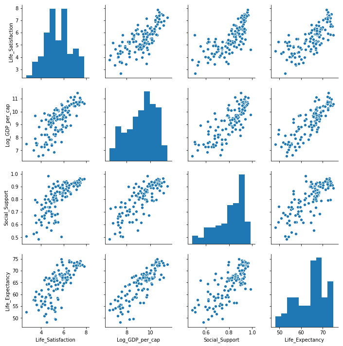
Distribution of Life satisfaction, Income, Social Support and Healthy Life Expectancy globally
The 2016 World Happiness Report[10] noted how for the world as a whole, the distribution of world happiness is very normally distributed about the median answer of 5, with the population-weighted mean being 5.4 but when the global population is split into ten geographic regions, the resulting distributions vary greatly in both shape and average values. Only two regions—the Middle East and North Africa, and Latin America and the Caribbean— have more unequally distributed happiness than does the world as a whole.
Therefore taking this into account it is important to look at the data on a regional basis. The second pairplot uses the hue semantic to colour the points by region and shows the distributions for each variables for each region on the diagonal. The distribution plots show very different shapes for each variable when broken down by regions. Sub-Saharan Africa stands out as a region that has far different levels of life satisfaction, income and life expectancy than most other regions.
Regions such as Western Europe, North America and Australia and New Zealand have distributions that are centred around much higher values than regions such as Sub-Saharan Africa and South Asia. The distributions for North America, Australia and New Zealand are very narrow as these regions contain a very small number of countries compared to the other regions.
On a regional level the distributions look more normally distributed for all the four variables but with different locations and spreads. This means that any simulation of the variables must take the separate distributions into account.
The pairplots show a distinction between the different geographic regions for most variables. Sub-Saharan Africa stands out as a region that has far different levels of life satisfaction, income and life expectancy than most other regions.
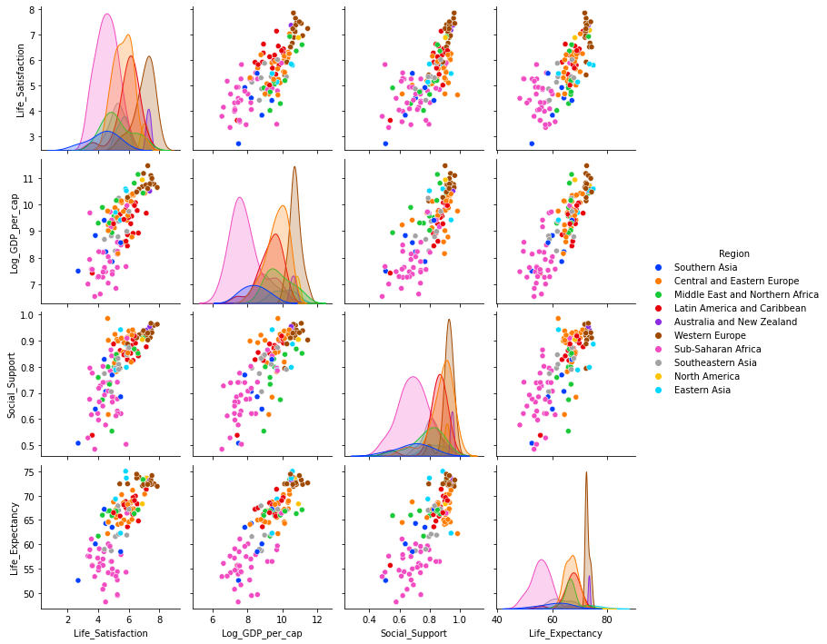
Distribution of Life satisfaction, Income, Social Support and Healthy Life Expectancy by Regions
A closer look at the distributions of each variable in 2018:
The histograms for each variable are plotted again individually to see the distributions more clearly for each variable.
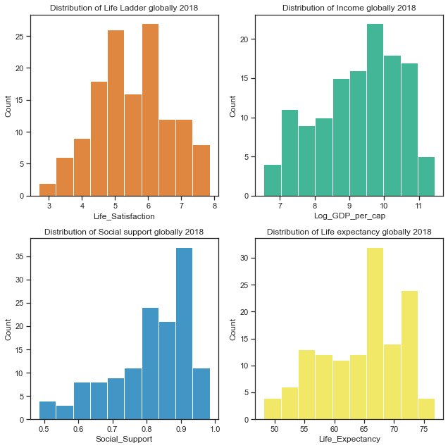
Distribution of Life satisfaction, Income, Social Support and Healthy Life Expectancy globally 2018
The distribution of Life Ladder variable looks to be normally distributed while there is some left skew in the other variables. Normally distributed data is considered the easiest to work with as normal distributions can be compared by looking at their means and standard deviations. Many statistical methods assume variables are normally distributed and others work better with normality
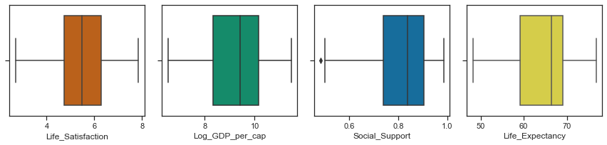
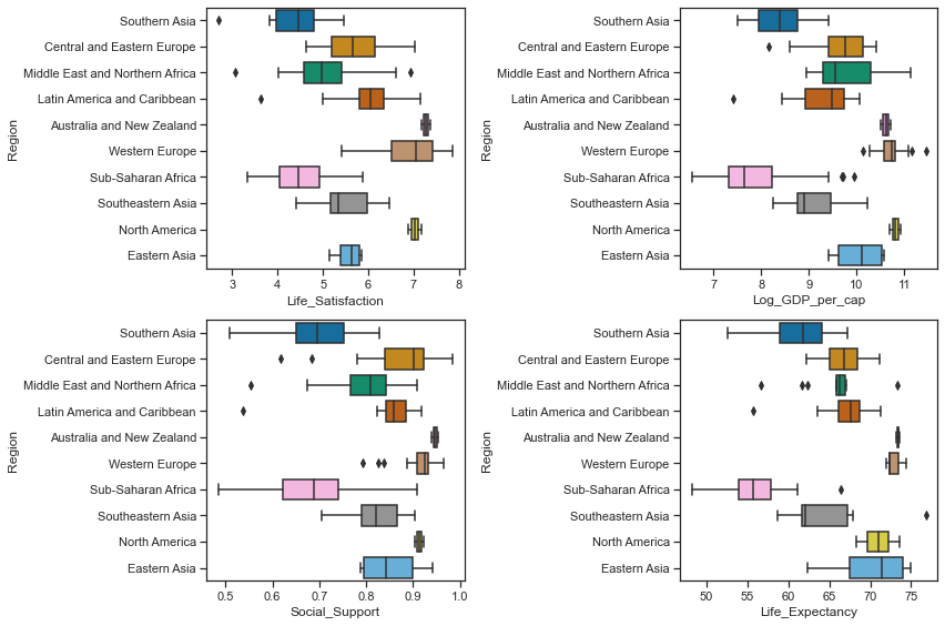
Boxplots to show the central tendency, symmetry and skew of the data as well as any outliers
Boxplots can show the central tendency, symmetry and skew of the data as well as any outliers. The rectangular boxes are bounded by the hinges representing the lower (1st) quartile and upper (3rd quartile). The median of 50th percentile is shown by the line through the box. The whiskers show the minimum and maximum values of the data excluding any outliers. A distribution is symmetric if the median is in the centre of the box and the whiskers are the same length. While none of the variables look symmetric, the distribution of Life ladder is less asymmetric than the other variables. A skewed distribution has the median closer to the shorter whisker as is the case for Healthy Life Expectancy, Social support and Log GDP per capita. A positive/right skewed distribution has a longer top whisker than bottom while a negatively skewed / left skewed distribution has a longer lower whisker as is the case for Log GDP per capita, Social support and Healthy life expectancy.
Boxplots to show the central tendancy, symmetry, skew and outliers.
Central Tendency, Skew and outliers of Life Satisfaction, Income, Social Support and Life Expectancy by region
As the pairplot showed earlier, there are wide variations between regions and for this region I looked at the distributions of each variable on a geographic regional basis. The mean and standard deviation statistics showed how the central tendency and spread of the distributions vary across regions. There is quite a difference in the statistics on a regional basis which is lost in the overall statistics.
Central Tendency, Skew and outliers of Life Satisfaction, Income, Social Support and Life Expectancy by region
When the distributions of each of the variables representing life satisfaction, gdp per capita, social support and life expectancy at birth are broken down by regional level, they tell a very different story to the distributions of the variables at a global level. There are some regions that overlap with each other and there are regions at complete opposite ends of the spectrum. I think this further clarifies the need to look at the variables on a regional level when simulating the data.
For example the boxplots show that the median values of Log GPD per capita fall into roughly 3 groups (similar to the boxplots for social support) by regions with Western Europe, North America and Australia and New Zealand having the highest scores, while Southern Asia and Sub Saharan Africa have the lowest median scores and are the most variable along with the Middle East and Nortern Africa region. There is no overlap at all between the measurements for the richer regions (such as Western Europe, Australia and North America) and the poorer regions (Sub_saharan Africa and Southern Asia). The above boxplots by geographic regions show that there is great variations between regions in the distribution of GDP per capita. The boxplots also show some outliers where there are a few countries from each geographic regions which are more similar to countries in another geographic region than in their own region.
Clustering to see groups in the countries.
Colouring the points by regions in the plots above showed that some regions had very similar distributions to other regions and very disimilar to other regions. For instance Southern Asia and Sub_Saharan Africa are always close to each other and their distribution barely overlap if at all with regions such as Western Europe, North America and Austrlia and New Zealand. Therefore I had a quick look at using Kmeans clustering to see how it would cluster the points rather than simulating data for the 10 regions. I did not do a thorough clustering analysis here, I justed wanted to see how k-means would cluster the countries into clear groups of regions and chose 3 clusters based on the plots earlier.
include some plots here
Correlations in the data:
The covariance and correlation statistics can be used to determine if there is a linear relationship between variables and if one variable tends to occur with large or small values of another variable. Covariance is a measure of the joint variability of two random variables while the Pearson correlation coefficient is the normalised version of the covariance and it shows by it’s magnitude the strength of the linear relationship between two random variables. The covariance is a measure of how much two variables vary with each other and in what direction a variable changes when another variable changes. Pandas cov function can be used to get the covariances between pairs of variables. The covariances below are all positive which means that when one of the variables is above it’s mean, the other variable is also likely to be above it’s mean.
The correlation coefficients are easier to interpret than the covariances. If there is a strong positive relationship between two variables then the value of the correlation coefficient will be close to 1 while a strong negative relationship between two variables will have a value close to -1. If the correlation coefficient is zero this indicates that there is no linear relationship between the variables. Pandas corr function is used to get the correlations between pairs of variables. There seems to be a strong positive correlation between each of the pairings between the four variables with the strongest relationship between Healthy Life Expectancy and Log GDP per capita.
As noted the World Happiness Report researchers found that differences in social support, incomes and healthy life expectancy are the three most important factors in determining the overall happiness score. Income in the form of GDP per capita for a country has a strong and positive correlation with the averages country scores of the response to the Cantril Ladder question.
The covariance and correlation statistics suggest a strong linear relationship between the pairs of variables and the regression plots confirm this. Life satisfactions are positively correlated with income levels (Log GDP per capita), social support and healthy life expectancy. Income and life expectancy are very highly correlated.
Measures such as the covariance and correlation can show how the data variables might be related to each. Scatterplots can be used to see how two variables might be related to each other and the strength and directions of any such relationships that exist. Correlation is not the same as causation while lack of an obvious correlation does not mean there is no causation. Correlation between two variables could be due to a confounding or third variable that is not directly measured. Correlations can also be caused by random chance - these are called spurious correlations. These are all things to consider when looking at data and when attempting to simulate data.
Seaborn has regplot or lmplot functions that can be used to visualize a linear relationship between variables as determined through regression. Statistical models are used to estimate a simple relationship between sets of observations that can be quickly visualised. These can be more informative than looking at the numbers alone. The regression plots showed a positive linear relationship between the pairs of variables.
The covariance and correlation statistics suggest a strong linear relationship between the pairs of variables and the regression plots confirm this. Life satisfactions are positively correlated with income levels (Log GDP per capita), social support and healthy life expectancy. Income and life expectancy are very highly correlated.
include some regplots here
Section 3 - Synthesise/simulate a data set as closely matching their properties as possible.
Having collected some data for the real-world phenomenon of the World Happiness Scores, I looked at the type of variables involved, their distributions and the relationships between the variables.
After studying the distributions of the real dataset the next step was to simulate the data mainly using numpy.random.
While it might be relatively straightforward to simulate a single variable, modelling the real-world correlations between the variables would be more challenging. The distributions of the variables do vary between regions, particularly between the lesser developed countries and the countries of the more developed world.
In the next section of the project I looked more closely at the distributions of each of the variables before simulating some data with similar properties to the actual variables in the real sample dataset.
The aim of the World Happiness Scores is to see what countries or regions rank the highest in overall happiness and how each of the six factors (economic production, social support, life expectancy, freedom, absence of corruption, and generosity) contribute to happiness levels. The World Happiness Report researchers studied how the different factors contribute to the happiness scores and the extent of each effect. While these factors have no impact on the total score reported for each country, they were analysed to explain why some countries rank higher than others and they describe the extent to which these factors contribute in evaluating the happiness in each country.
As the differences in social support, incomes and healthy life expectancy are the three most important factors in determining the overall happiness score, this is what I focus on in this project.
The following variables were then simulated:
-
Regions and Countries
-
Life Ladder / Life Satisfaction
-
Log GDP per capita
-
Social Support
-
Healthy Life Expectancy at birth
Simulate Regions and countries.
There are countries from 10 geographic regions in the sample dataset for 2018. While the region was not in the actual dataset for 2018, I added it in from a dataset for a previous year (2015) and this allowed me to see the how the values for each variable in the dataset differ by region.
A countplot shows the distribution of countries in the real dataset over the 10 regions.
include actual countplot here
I then used the numpy.random.choice function to generates a random sample of regions from a one dimensional array of made-up regions using the proportions from the real dataset.
I made up some country names by appending a digit to the string ‘Country_’.
The countries and regions for the simulated dataset were then added to a dataframe. A countplot of the simulated countries and regions showed a similar distribution to the actual dataset.
Simulate Life Satisfaction / Life Ladder variable:
The Life Ladder scores and rankings are based on answers to the Cantril Ladder question from the Gallup World Poll where the participants rate their own lives on a scale of 0 to 10 with the best possible life for them being a 10 and the worst a 0. The rankings are from nationally representative samples for the years between 2016 and 2018 and are based entirely on the survey scores using weights to make the estimates representative.
The World Happiness Report shows how levels of GDP, life expectancy, generosity, social support, freedom, and corruption - contribute to making life evaluations higher in each country than they are in Dystopia, a hypothetical country that has values equal to the world’s lowest national averages for each of the six factors. The report itself looks at life evaluations for the 2016 to 2018 period and the rankings across all countries in the study. Here are the statistics for the Life Ladder variable for the 2018 dataset.
Life Ladder / Life Satisfaction is a non-negative real number with statistics as follows. The minimum possible value is 0 and the maximum is 10 although the range of values in the actual dataset is smaller. The values in the dataset are national averages of the answers to Cantril Ladder question. The range of values vary across regions.
The distribution plots for the Life Ladder variable does suggest that it is normally distributed but there are some tests that can be used to clarify this. A blogpost on tests for normality[21] at machinelearningmastery.com outlines how it is important when working with a sample of data to know whether to use parametric or nonparametric statistical methods. If methods used assume a Gaussian distribution when it is not the case then findings can be incorrect or misleading. In some cases it is enough to assume the data is normal enough to use parametric methods or to transform the data to be normal enough.
Parametric statistical methods assume that the data has a known and specific distribution, often a Gaussian distribution. If a data sample is not Gaussian, then the assumptions of parametric statistical tests are violated and nonparametric statistical methods must be used.[21]
Normality tests can be used to check if your data sample is from a Gaussian distribution or not.
- Statistical tests calculate statistics on the data to quantify how likely it is that the data was drawn from a normal distribution.
- Graphical methods plot the data to qualitatively evaluate if the data looks Gaussian.
Tests for normality include the Shapiro_Wilk Normality Test, the D’Agostino and Pearson’s Test, the Anderson-Darling Test.
The histograms above show the characteristic bell-shape curve of the normal distribution and indicates that the Life Ladder variable is gaussian or approximately normally distributed.
The Quantile-Quantile Plot (QQ plot) is another plot that can be used to check if the distribution of a data sample. It generates its own sample of the idealised distribution that you want to compare your sample of data to. The idealised samples are divided into groups and each data point in the sample is paired with a similar member from the idealised distribution at the same cumulative distribution.
A scatterplot is drawn with the idealised values on the x-axis and the data sample on the y-axis. The resulting points are plotted as a scatter plot with the idealized value on the x-axis and the data sample on the y-axis. If the result is a straight line of dots on the diagonal from the bottom left to the top right this indicates a perfect match for the distribution whereas if the dots deviate far from the diagonal line.
See section on normality test for tests carried out to see if the Life Ladder variable was normally distributed. This section includes QQ plots, the Shapiro-Wilk Normality Test, D’Agostino’s K^2 Test, the Anderson-Darling Test
The sample of Life Ladder for 2018 does appear to be normally distributed based on the above tests. Therefore I went ahead and simulated data for this variable using the normal distribution using the sample mean and standard deviation statistics.
I used the numpy.random.normal function to simulate the Life Ladder variable.
This takes 3 arguments - loc for the mean or centre of the distributon, scale for the spread or width of the distribution - the standard deviation, and size for the number of samples to draw from the distribution.
Without setting a seed the actual values will be different each time but the shape of the distribution should be the same.
The distribution of the Life Satisfaction (Life Ladder) variable looks quite normal when taken over all the countries in the dataset. When shown for each of the 3 clustered regions, the distributions are all still normal looking but with very different shapes and locations.
Some of of the other variables are not normally distributed at the dataset level but do look gaussian at the clustered region level I will be simulating the other variables this way.
Social Support:
The variable ‘Social support’ was the result of a question in the Gallop World Poll with the national average of the binary responses for each country to the GWP question “If you were in trouble, do you have relatives or friends you can count on to help you whenever you need them, or not?”.
The distribution from the dataset shows that it is left skewed. The scatterplots above showed that it is positively correlated with life satisfaction, income levels and healthy life expectancy. The boxplots showed that the median values fall into roughly 3 groups by regions with Western Europe, North America and Australia and New Zealand having the highest scores, while Southern Asia and Sub Saharan Africa have the lowest median scores and a wider spread.
Like Life ladder variable, the values are the result of national averages to questions in the Gallup World Poll. In this case the question had a binary answer 0 or 1 and therefore the actual values in the dataset range between 0 and 1. Social Support is a non-negative real values. The statistics vary from region to region.
The distribution of Social Support for all the countries in 2018 is a left-skewed distribution with a long tail to the left. When this is broken down by cluster groups of regions, the distribution of each cluster looks more normal shaped although the centres of the distribution and the spread vary widely. Cluster region 0 (green) has social support values centred around different values.
Simulating Social Support variable using non-parametric methods:
When I first looked at simulating the social support variable I considered non-parametric ways of working with the data such as the bootstrap resampling method. Bootstrapping is a statistical technique for estimating quantities about a population by averaging estimates from multiple small data samples. Samples are constructed by drawing observations from a large data sample one at a time and then returning the observation so that it could be drawn again. Therefore any given observation could be included in the sample more than once while some observations might never be drawn. I referred to a blogpost on Machinelearningmastery.com[23] which outlines the steps to implement it using the scikit-learn resample function[24] which takes as arguments the data array, whether or not to sample with replacement, the size of the sample, and the seed for the pseudorandom number generator used prior to the sampling.
Bootstrapping is the practice of estimating properties of an estimator (such as its variance) by measuring those properties when sampling from an approximating distribution. One standard choice for an approximating distribution is the empirical distribution function of the observed data. In the case where a set of observations can be assumed to be from an independent and identically distributed population, this can be implemented by constructing a number of resamples with replacement, of the observed dataset (and of equal size to the observed dataset). The basic idea of bootstrapping is that inference about a population from sample data can be modelled by resampling the sample data and performing inference about a sample from resampled data. As the population is unknown, the true error in a sample statistic against its population value is unknown. In bootstrap-resamples, the ‘population’ is in fact the sample, and this is known; hence the quality of inference of the ‘true’ sample from resampled data (resampled → sample) is measurable. Wikipedia wiki on Bootstrapping[25]
The process for building one sample is:
- choose the size of the sample
- While the size of the sample is less than the chosen size
- Randomly select an observation from the dataset
- Add it to the sample The number of repetitions must be large enough that meaningful repetitions can be calculated on the sample.
Based on the information above I use sampling with replacement to simulate the Social support variable using the sample size the same as the original dataset which is 136 observations. numpy.random.choice function can be used for this purpose. The mean of the Social support variable in the dataset can be considered as a single estimate of the mean of the population of social support while the standard deviation is an estimate of the variability. The simplest bootstrap method would involve taking the original data set of N(136) Social support values and sampling from it to form a new sample - the ‘resample’ or bootstrap sample that is also of size 136. If the bootstrap sample is formed using sampling with replacement from the original data sample with a large enough size then there should be very little chance that the bootstrap sample will be the exact same as the original sample. This process is repeated many times (thousands) and the mean computed for each bootstrap sample to get the bootstrap estimates which can then be plotted on a histogram which is considered an estimate of the shape of the distribution.
Sampling with replacement using np.random.choice:
Here I use a loop to draw multiple random samples with replacements from the dataset. Additionally the means for each sample can be calculated and then all the means from the different samples are plotted to show their distribution but for this project I just need a simulated data set.
The main use of the bootstrap is making inferences about an estimate for a population parameter on sample data. For the purposes of this project I just needed to simulate a single dataset. However by calculating the bootstrap means and comparing them to the dataset I was attempting to replicate shows that it is a suitable method here when the data does not follow a particular distribution.
Simulating Log GDP per capita
The GDP per capita in the World Happiness Report dataset are in purchasing power parity at constant 2011 international dollar prices which are mainly from the World Development Indicators in 2018. Purchasing power parity is necessary when looking to compare GDP per capita between countries which is what the World Happiness Report seeks to do. Nominal GDP would be fine when just looking at a single country. The log of the GDP figures is taken.
Per capita GDP is the Total Gross Domestic Product for a country divided by its population and breaks down a country’s GDP per person. As the World Happiness Report states this is considered a universal measure for gauging the prosperity of nations.
The earlier plots showed that the distribution of log GPD per capita in the dataset is not normally distributed. Per capita GDP is generally a unimodal but skewed distribution. There are many regional variations in income across the world. The distribution of Log GPD per capita appears somewhat left skewed.
The scatterplots above showed that it is positively correlated with life satisfaction, social support and healthy life expectancy.
The log of GDP per capita is used to represent the Gross Domestic Product per capita. It is a non-negative real value. Because the log of the GDP per capita figures are used the range is between 6 and 12 although this varies from region to region. The
When the distribution of Log GDP per capita is broken down by cluster groups of regions, the distribution of each cluster looks more normal shaped although the centres of the distribution and the spread vary widely as with the other variables.
According to the World Happiness Report, Healthy life expectancies at birth are based on the data extracted from the World Health Organization’s (WHO) Global Health Observatory data repository. Some interpolation and exterpolation was used to get the data for the years covered in the 2018 report. As some countries were not covered in the WHO data, other sources were used by the researchers.
The values are non-negative real numbers between 48 and 77 years but this varies from year to year as the statistics showed.
Looking at the Life Expectancy variable by cluster group, the distribution looks normal for the cluster region 1 while the other two groups are less so. There seems to be two peaks in the distribution for cluster group 0 which probably needs to be broken out more.
Create a dataset with the simulated variables.
Once the individual variables had been simulated, the next step was to assemble the variables into a dataframe and ensure that the overall distributions and relationships were similar to an actual dataset. Because of the variations between the three groups I first created a dataframe for each group and then concatenate the three dataframes together.
4. Conclusion
The aim of the project was to create a data set by simulating a real-world phenomenon of our choosing. Then rather than collect data related to the phenomenon, model and synthesis such data using Python and the numpy.random package.
In this notebook I first analysed an actual dataset for the phenomenon of World Happiness in order to understand the type of variables and the type of distributions they were likely to have come from and also to see how they were related to each other.
I then simulated the dataset, mainly using the numpy.random package but exploring some functionality from the scikit-learn package.
Finally I compared the results of the simulation to a real world dataset.
I believe the synthesised dataset closely matches the actual dataset. The results will change each time the code is run as the random seed is not set. In reality data samples would also vary from sample to sample due to randomness.
The dataset was a little more complicated that it first appeared to be, given the regional variation and also variation within regions. Given that the number of datapoints for a dataset such as this is limited, the number of datapoints that could be simulated is limited but I am satisfied with the results. Overall this project was a very good learning experience. It was also very eye-opening to see the levels of inequality across the globe.
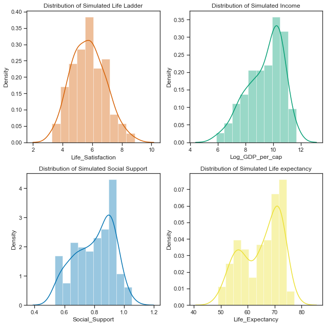
Simulated Histograms.
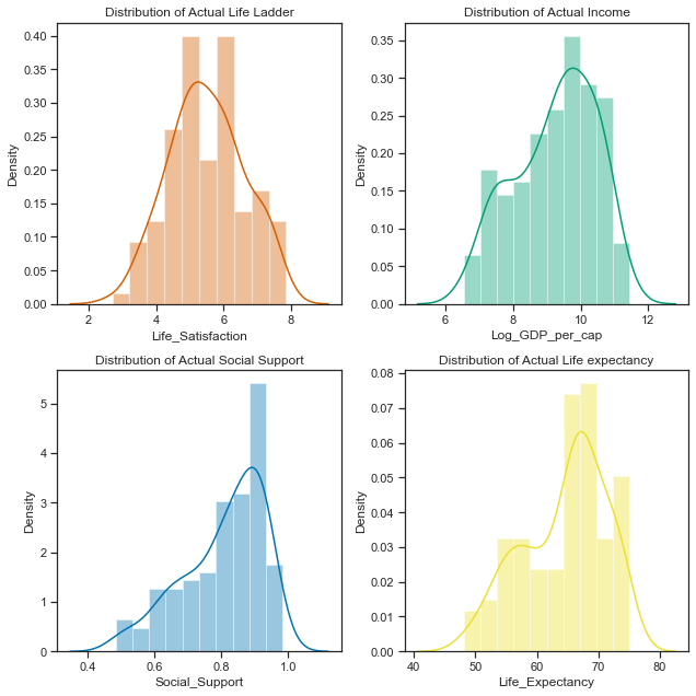
Actual Histograms.