Having collected some data for the real-world phenomenon of the World Happiness Scores, I looked at the type of variables involved, their distributions and the relationships between the variables. In this section I will look more closely at the distributions of each of the variables and then simulate some data that hopefully will have properties that match the actual variables in the real sample dataset.
The aim of the World Happiness Scores is to see what countries or regions rank the highest in overall happiness and how each of the six factors (economic production, social support, life expectancy, freedom, absence of corruption, and generosity) contribute to happiness levels. The World Happiness Report researchers studied how the different factors contribute to the happiness scores and the extent of each effect. While these factors have no impact on the total score reported for each country, they were analysed to explain why some countries rank higher than others and they describe the extent to which these factors contribute in evaluating the happiness in each country.
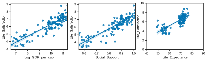
As the differences in social support, incomes and healthy life expectancy are the three most important factors in determining the overall happiness score, this is what I focus on in this project.
Therefore I will simulate the following variables:
-
Regions and Countries
-
Life Ladder / Life Satisfaction
-
Log GDP per capita
-
Social Support
-
Healthy Life Expectancy at birth
Simulate Regions and countries.
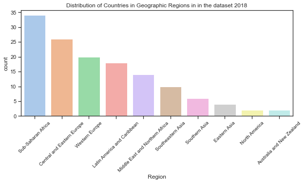
There are countries from 10 geographic regions in the sample dataset for 2018. While the region was not in the actual dataset for 2018, I added it in from a dataset for a previous year (2015). This allowed me to see the how the values for each variable in the dataset differ by region.
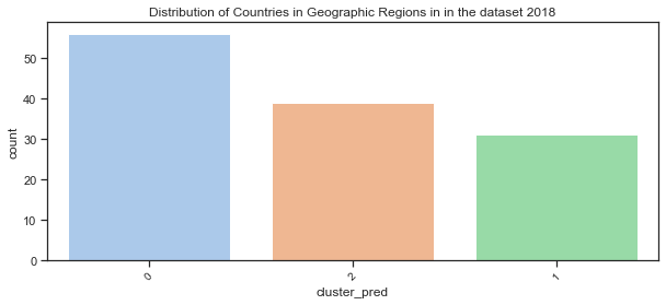
Look at the clustered groups for 2018:
The rough clustering earlier divided the countries into 3 clustered regions. Of the clustered countries, 10 values were lost due to missing values. If I had more time then the missing values could be imputed based on previous years but for now there is at least 100 which is sufficient for this project.
#clusters for 2018 data
c18=clusters.loc[clusters.loc[:,'Year']==2018]
len(c18) # only 126 countries due to missing values in some rows
Cy=clusters # all the data for all years
# the number of clusters for all years
len(Cy)
> 1094
Look at the distribution of countries across the geographic regions.
Below I look at the actual proportions of countries in each of the 10 geographic regions which are then plotted. The countplot shows the distribution of countries in the real dataset over the 10 regions. To avoid the axes labels overlapping, I have followed advice on a blogpost drawing from data[20] to rotate the axes labels. Also to show the plot by descending order of the region with the most countries.
# see how many countries in each Region
df18.Region.value_counts()
# find how many values in total
print(f"There are {len(df18.Region)} countries in the dataset. ")
# calculate the proportion of countries in each region
prob=(df18.Region.value_counts()/len(df18.Region)).round(3)
#print(f"These countries are split over 10 geographic regions as follows: \n{df18.Region.value_counts()/len(df18.Region)}.3f %", sep="\n")
# make sure they sum to 1.
prob.sum()

>1.0
>There are 136 countries in the dataset.
# set up the matplotlib plot
plt.rcParams["figure.figsize"] = (10,4)
# set the tick size
plt.rcParams["xtick.labelsize"] = 10
sns.set_palette("pastel")
# https://stackoverflow.com/q/46623583 order countplot by count.
chart= sns.countplot(x=df18.Region, order= df18['Region'].value_counts().index)
# rotate axes labels to avoid overlap - see <https://www.drawingfromdata.com/how-to-rotate-axis-labels-in-seaborn-and-matplotlib>
chart.set_xticklabels(chart.get_xticklabels(), rotation=45)
plt.title("Distribution of Countries in Geographic Regions in in the dataset 2018");
Distribution of countries by clustered region.
Here I will use the dataframe c18 created above which has the clustered regions added. All other data in it is the same as the original dataframes. The dataframe clusters contains all the data from df_yearss but with the addition of the predicted clusters.
# see the top of the dataframe
clusters.head()
| Year | Life_Satisfaction | Log_GDP_per_cap | Social_Support | Life_Expectancy | RegionCode | cluster_pred | |
|---|---|---|---|---|---|---|---|
| 3 | 2011 | 3.831719 | 7.415019 | 0.521104 | 51.919998 | 7 | 1 |
| 4 | 2012 | 3.782938 | 7.517126 | 0.520637 | 52.240002 | 7 | 1 |
| 5 | 2013 | 3.572100 | 7.522238 | 0.483552 | 52.560001 | 7 | 1 |
| 6 | 2014 | 3.130896 | 7.516955 | 0.525568 | 52.880001 | 7 | 1 |
| 7 | 2015 | 3.982855 | 7.500539 | 0.528597 | 53.200001 | 7 | 1 |
# find how many values in total
print(f"There are {len(c18.cluster_pred)} countries in the dataset. ")
# calculate the proportion of countries in each region
CRprob=(c18.cluster_pred.value_counts()/len(c18.cluster_pred)).round(3)
print(f"These countries are split over 10 geographic regions as follows: \n{c18.cluster_pred.value_counts()/len(c18.cluster_pred)}.3f %", sep="\n")
# mnake sure they sum to 1.
CRprob.sum()
  There are 126 countries in the dataset.
  These countries are split over 10 geographic regions as follows:
  0    0.444444
  2    0.309524
  1    0.246032
  Name: cluster_pred, dtype: float64.3f %

  1.0
Plot the distribution of countries in the clustered groups:
sns.set_palette("pastel")
# https://stackoverflow.com/q/46623583 order countplot by count.
chart= sns.countplot(x=c18.cluster_pred, order= c18['cluster_pred'].value_counts().index)
# rotate axes labels to avoid overlap - see <https://www.drawingfromdata.com/how-to-rotate-axis-labels-in-seaborn-and-matplotlib>
chart.set_xticklabels(chart.get_xticklabels(), rotation=45)
plt.title("Distribution of Countries in Geographic Regions in in the dataset 2018");
Simulate some geographic regions.
Here I use the numpy.random.choice function to generates a random sample of regions from a one dimensional array of made-up regions using the proportions from the real dataset.
# make up some region names:
Sim_regions = ['SimReg0','SimReg1','SimReg2']
# assign countries to region based on proportions in actual dataset.
p=[c18.cluster_pred.value_counts()/len(c18.cluster_pred)]
# simulate regions using the probabilities based on proportion in actual dataset
CR= np.random.choice(Sim_regions, 136, p=[p[0][0],p[0][1],p[0][2]])
CR
array(['SimReg2', 'SimReg1', 'SimReg2', ..., 'SimReg1', 'SimReg0',
           'SimReg0'], dtype='<U7')
Make up some country names:
Here I am just going to create some country names by appending a digit to the string ‘Country_’. I don’t have the imagination to start creating over 100 new countries!
# create a list of countries by appending number to 'country'
countries =[]
# use for loop and concatenate number to string
for i in range(136):
    countryname = 'Sim_Country_'+str(i)
    # append countryname  to list of countries
    countries.append(countryname)
Create a dataframe to hold the simulated data:
I now have countries and regions for the simulated dataset which I will add to a dataframe.
# create a dataframe to hold the simulated variables.
sim_df = pd.DataFrame(data={'Sim_Country':countries, 'Sim_Region':CR})
sim_df
| Sim_Country | Sim_Region | |
|---|---|---|
| 0 | Sim_Country_0 | SimReg2 |
| 1 | Sim_Country_1 | SimReg1 |
| 2 | Sim_Country_2 | SimReg2 |
| 3 | Sim_Country_3 | SimReg0 |
| ... | ... | ... |
| 132 | Sim_Country_132 | SimReg1 |
| 133 | Sim_Country_133 | SimReg1 |
| 134 | Sim_Country_134 | SimReg0 |
| 135 | Sim_Country_135 | SimReg0 |
136 rows × 2 columns
Plot of the distribution of simulated regions:
# set the figure size
plt.rcParams["figure.figsize"] = (10,4)
sns.set_palette("muted")
# countplot of simulated region, order by counts
sns.countplot(x=sim_df.Sim_Region, order= sim_df['Sim_Region'].value_counts().index)
# add title
plt.title("Distribution of Simulated Regions in the Simulated dataset");
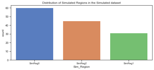
The countplot above shows the simulated regions in the simulated dataset, ordered by the count of the countries in each region. Comparing it to the actual dataset shows that the split looks good.
Simulate Life Satisfaction / Life Ladder variable:
The Life Ladder scores and rankings are based on answers to the Cantril Ladder question from the Gallup World Poll where the participants rate their own lives on a scale of 0 to 10 with the best possible life for them being a 10 and the worst a 0. The rankings are from nationally representative samples for the years between 2016 and 2018 and are based entirely on the survey scores using weights to make the estimates representative.
The World Happiness Report shows how levels of GDP, life expectancy, generosity, social support, freedom, and corruption - contribute to making life evaluations higher in each country than they are in Dystopia, a hypothetical country that has values equal to the world’s lowest national averages for each of the six factors. The report itself looks at life evaluations for the 2016 to 2018 period and the rankings across all countries in the study. Here are the statistics for the Life Ladder variable for the 2018 dataset.
Life Ladder / Life Satisfaction is a non-negative real number with statistics as follows. The minimum possible value is 0 and the maximum is 10 although the range of values in the actual dataset is smaller. The values in the dataset are national averages of the answers to Cantril Ladder question. The range of values vary across regions.
Descriptive statistics of the Life Ladder variable in the dataset for 2018:
df18['Life_Satisfaction'].describe()
count    136.000000
mean       5.502134
std        1.103461
min        2.694303
25%        4.721326
50%        5.468088
75%        6.277691
max        7.858107
Name: Life_Satisfaction, dtype: float64
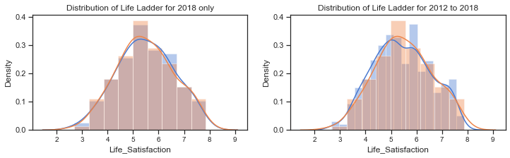
Plot of the distribution of Life Ladder for 2018:
The distribution of Life Ladder is plotted below. The plot on the left shows the distribution for the dataframe containing 2018 data only and the plot on the right shows the distribution for the dataframe containing all years.
f,axes=plt.subplots(1,2, figsize=(12,3))
# distribution of the Life Ladder for 2018
sns.distplot(df18['Life_Satisfaction'], label="Life Ladder 2018", ax=axes[0])
# distribution of life ladder from the dataframe with the clusters. some missing values
sns.distplot(c18['Life_Satisfaction'], label="Life Ladder - 2018", ax=axes[0])
axes[0].set_title("Distribution of Life Ladder for 2018 only")
#axes[0].legend()
# kdeplot of the life ladder for all years in the extended dataset (WHR Table2.1)
sns.distplot(df_years['Life_Satisfaction'], label="Life Ladder - all years", ax=axes[1])
sns.distplot(c18['Life_Satisfaction'], label="Life Ladder - 2018",ax=axes[1])
axes[1].set_title("Distribution of Life Ladder for 2012 to 2018");
#axes[1].legend();
The distribution plots for the Life Ladder variable does suggest that it is normally distributed but there are some tests that can be used to clarify this. A blogpost on tests for normality[21] at machinelearningmastery.com outlines how it is important when working with a sample of data to know whether to use parametric or nonparametric statistical methods. If methods used assume a Gaussian distribution when it is not the case then findings can be incorrect or misleading. In some cases it is enough to assume the data is normal enough to use parametric methods or to transform the data to be normal enough.
Parametric statistical methods assume that the data has a known and specific distribution, often a Gaussian distribution. If a data sample is not Gaussian, then the assumptions of parametric statistical tests are violated and nonparametric statistical methods must be used.[21]
Normality tests can be used to check if your data sample is from a Gaussian distribution or not.
- Statistical tests calculate statistics on the data to quantify how likely it is that the data was drawn from a normal distribution.
- Graphical methods plot the data to qualitatively evaluate if the data looks Gaussian.
Tests for normality include the Shapiro_Wilk Normality Test, the D’Agostino and Pearson’s Test, the Anderson-Darling Test.
The histograms above show the characteristic bell-shape curve of the normal distribution and indicates that the Life Ladder variable is gaussian or approximately normally distributed.
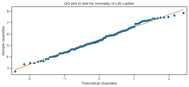
The Quantile-Quantile Plot (QQ plot) is another plot that can be used to check if the distribution of a data sample. It generates its own sample of the idealised distribution that you want to compare your sample of data to. The idealised samples are divided into groups and each data point in the sample is paired with a similar member from the idealised distribution at the same cumulative distribution.
A scatterplot is drawn with the idealised values on the x-axis and the data sample on the y-axis. The resulting points are plotted as a scatter plot with the idealized value on the x-axis and the data sample on the y-axis. If the result is a straight line of dots on the diagonal from the bottom left to the top right this indicates a perfect match for the distribution whereas if the dots deviate far from the diagonal line.
QQ plot of Life Ladder:
Here a QQ plot is created for the Life Ladder sample compared to a Gaussian distribution (the default).
# import the qqplot function
from statsmodels.graphics.gofplots import qqplot
# Life Ladder observations from the dataset. can use c18 dataframe or dfh
data = c18['Life_Satisfaction']
# plot a q-q plot, draw the standardised line
qqplot(data, line='s')
plt.title("QQ plot to test for normality of Life Ladder");
Tests for normality:
The QQ plot does seem to indicate to me that the Life Ladder is normally distributed. The scatter plots of points do mostly follow the diagonal pattern for a sample from a Gaussian distribution. I will use some of the normality tests as outlined on the blogpost on tests for normality[21]. These tests assume the sample was drawn from a Gaussian distribution and test this as the null hypothesis. A test-statistic is calculated and a p-value to interpret the test statistic. A threshold level called alpha is used to interpret the test. This is typically 0.05. If the p-value is less than or equal to alpha, then reject the null hypothesis. If the p-value is greater than alpha then fail to reject the null hypothesis. In general a larger p-value indicates that the sample was likely to have been drawn from a Gaussian distribution. A result above 5% doesn’t mean the null hypothesis is true but that it is very likely true given the evidence available.
Shapiro-Wilk Normality Test
# adapted from https://machinelearningmastery.com/a-gentle-introduction-to-normality-tests-in-python/
# import the shapiro test from scipy stats
from scipy.stats import shapiro
# calculate the test statistic and the p-value to interpret the test on the Life Ladder sample
stat, p = shapiro(df18['Life_Satisfaction'])
# interpret the test
alpha= 0.05
print('stat=%.3f, p=%.3f' % (stat, p))
alpha = 0.05
if p > alpha:
    print('The sample of Life Satisfaction/ Life Ladder looks Gaussian (fail to reject H0)')
else:
    print('The sample of Life Ladder does not look Gaussian (reject H0)')
  stat=0.991, p=0.520
  The sample of Life Satisfaction/ Life Ladder looks Gaussian (fail to reject H0)
D’Agostino’s K^2 Test
This test calculates the kurtosis and skewness of the data to see if the data distribution is not normal like. The skew is a measure of asymmetry in the data while hurtosis how much of the distribution is in the tails.
# D'Agostino and Pearson's Test adapted from https://machinelearningmastery.com/a-gentle-introduction-to-normality-tests-in-python/
# import from scipy.stats
from scipy.stats import normaltest
# normality test
stat, p = normaltest(df18['Life_Satisfaction'])
print('Statistics=%.3f, p=%.3f' % (stat, p))
# interpret
alpha = 0.05
if p > alpha:
    print('The sample of Life Ladder looks Gaussian (fail to reject H0)')
else:
    print('The sample of Life Ladder does not look Gaussian (reject H0)')
Statistics=2.435, p=0.296
The sample of Life Ladder looks Gaussian (fail to reject H0)
Anderson-Darling Test:
This is a statistical test that can be used to evaluate whether a data sample comes from one of among many known data samples adn can be used to check whether a data sample is normal. The test is a modified version of the Kolmogorov-Smirnov test[22] which is a nonparametric goodness-of-fit statistical test. The Anderson-Darling test returns a list of critical values rather than a single p-value. The test will check against the Gaussian distribution (dist=’norm’) by default.
# Anderson-Darling Test - adapted from https://machinelearningmastery.com/a-gentle-introduction-to-normality-tests-in-python/

from scipy.stats import anderson
# normality test
result = anderson(df18['Life_Satisfaction'])
print('Statistic: %.3f' % result.statistic)
p = 0
# checking for a range of critical values
for i in range(len(result.critical_values)):
    sl, cv = result.significance_level[i], result.critical_values[i]
    if result.statistic < result.critical_values[i]:
        # fail to reject the null that the data is normal if test statistic is less than the critical value.
        print('%.3f: %.3f, data looks normal (fail to reject H0)' % (sl, cv))
    else:
        # reject the null that the data is normal if test statistic is greater than the critical value.
        print('%.3f: %.3f, data does not look normal (reject H0)' % (sl, cv))
Statistic: 0.235
15.000: 0.560, data looks normal (fail to reject H0)
10.000: 0.638, data looks normal (fail to reject H0)
5.000: 0.766, data looks normal (fail to reject H0)
2.500: 0.893, data looks normal (fail to reject H0)
1.000: 1.062, data looks normal (fail to reject H0)
The sample of Life Ladder for 2018 does appear to be normally distributed based on the above tests. Therefore I can go ahead and simulate data for this variable using the normal distribution using the sample mean and standard deviation statistics.
Simulate Life ladder variable:
I will now simulate ‘Life Ladder’ using the numpy.random.normal function. This takes 3 arguments - loc for the mean or centre of the distributon, scale for the spread or width of the distribution - the standard deviation, and size for the number of samples to draw from the distribution.
Without setting a seed the actual values will be different each time but the shape of the distribution should be the same.
print(f" The mean of the sample dataset for 2018 is {c18['Life_Satisfaction'].mean():.3f} ")
print(f" The standard deviation of the sample dataset for 2018 is {c18['Life_Satisfaction'].std():.3f} ")
c18.shape
  The mean of the sample dataset for 2018 is 5.500
  The standard deviation of the sample dataset for 2018 is 1.098

  (126, 7)
df_years.loc[df_years.loc[:,'Year']==2016]
| Year | Country | Region | Life_Satisfaction | Log_GDP_per_cap | Social_Support | Life_Expectancy | RegionCode | |
|---|---|---|---|---|---|---|---|---|
| 8 | 2016 | Afghanistan | Southern Asia | 4.220169 | 7.497038 | 0.559072 | 53.000000 | 7 |
| 19 | 2016 | Albania | Central and Eastern Europe | 4.511101 | 9.337532 | 0.638411 | 68.099998 | 2 |
| 26 | 2016 | Algeria | Middle East and Northern Africa | 5.340854 | 9.541166 | 0.748588 | 65.500000 | 5 |
| 43 | 2016 | Argentina | Latin America and Caribbean | 6.427221 | 9.830088 | 0.882819 | 68.400002 | 4 |
| ... | ... | ... | ... | ... | ... | ... | ... | ... |
| 1665 | 2016 | Vietnam | Southeastern Asia | 5.062267 | 8.672080 | 0.876324 | 67.500000 | 6 |
| 1676 | 2016 | Yemen | Middle East and Northern Africa | 3.825631 | 7.299221 | 0.775407 | 55.099998 | 5 |
| 1688 | 2016 | Zambia | Sub-Saharan Africa | 4.347544 | 8.203072 | 0.767047 | 54.299999 | 1 |
| 1701 | 2016 | Zimbabwe | Sub-Saharan Africa | 3.735400 | 7.538829 | 0.768425 | 54.400002 | 1 |
142 rows × 8 columns
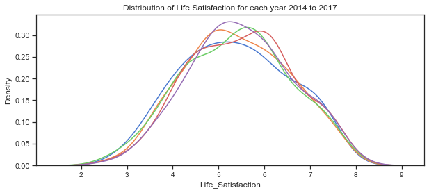
Creating subsets of the data for each in order to be able to see how the distribution varies from year to year.
# subset of the data for each year
c17= Cy.loc[Cy.loc[:,'Year']==2017]
c16= Cy.loc[Cy.loc[:,'Year']==2016]
c15= Cy.loc[Cy.loc[:,'Year']==2015]
c14= Cy.loc[Cy.loc[:,'Year']==2014]
# plot the distribution of life satisfaction variable for each of the years 2014 to 2018
sns.kdeplot(c14['Life_Satisfaction'], label="2014")
sns.kdeplot(c15['Life_Satisfaction'], label="2015")
sns.kdeplot(c16['Life_Satisfaction'], label="2016")
sns.kdeplot(c17['Life_Satisfaction'], label="2017")
sns.kdeplot(c18['Life_Satisfaction'], label="2018")
plt.title("Distribution of Life Satisfaction for each year 2014 to 2017");
Plot some simulated data.
Here some data is simulated for the Life Satisfaction/Ladder variable is simulated using the mean and standard deviation for the 2018 data. As the variable appears to be normally distributed it would be ok to do this. However as mnay of the other varaibles are not normally distributed at the dataset level but do look gaussian at the clustered region level I will be simulating the other variables this way.
sns.kdeplot(c18['Life_Satisfaction'], label="Life Satisfaction 2018", shade="True")
# simulate data based on statistics from the 2018 sample dataset
# simulate life ladder using sample mean and standard deviation
for i in range(10):
        x= np.random.normal(c18['Life_Satisfaction'].mean(),c18['Life_Satisfaction'].std(),130)
        sns.kdeplot(x)
# plot the distribution of the actual dataset

# plot the simulated data
plt.title("Actual data versus the Simulated data for Life Ladder 2018")
plt.legend();
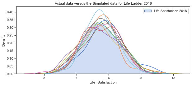
The above plots of the distribution of Life_Satisfaction illustrate how the distribution changes slightly for each simulation due to the randomness.
Next plot the distribution for the 4 clustered regions.
c18.groupby('cluster_pred').count()
| Year | Life_Satisfaction | Log_GDP_per_cap | Social_Support | Life_Expectancy | RegionCode | |
|---|---|---|---|---|---|---|
| cluster_pred | ||||||
| 0 | 56 | 56 | 56 | 56 | 56 | 56 |
| 1 | 31 | 31 | 31 | 31 | 31 | 31 |
| 2 | 39 | 39 | 39 | 39 | 39 | 39 |
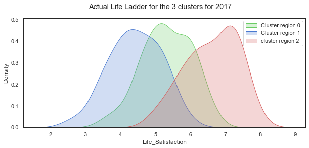
The distributions of Life Ladder for each of the 3 clustered regions.
# set up the matploptlib figure,
# https://seaborn.pydata.org/examples/distplot_options.html?highlight=tight_layout#distribution-plot-options
sns.set(style="white", palette="muted", color_codes=True)

# plot for countries in these regions, set axes to use, labels to use
sns.kdeplot(c18.loc[c18.loc[:,'cluster_pred']==0]['Life_Satisfaction'], label="Cluster region 0", color="g", shade=True)
sns.kdeplot(c18.loc[c18.loc[:,'cluster_pred']==1]['Life_Satisfaction'], label="Cluster region 1", color="b", shade=True)
sns.kdeplot(c18.loc[c18.loc[:,'cluster_pred']==2]['Life_Satisfaction'], label="cluster region 2", color="r", shade=True)
#sns.distplot(clusters.loc[clusters.loc[:,'cluster_pred']==3]['Life Ladder'], ax=axes[3], label="cluster region 3", color="y")
# add title
plt.suptitle("Actual Life Ladder for the 3 clusters for 2017");
plt.legend();
# separate out the clustered regions for all years from 2011 to 2018
cluster0 =clusters.loc[clusters.loc[:,'cluster_pred']==0]
cluster1 =clusters.loc[clusters.loc[:,'cluster_pred']==1]
cluster2 =clusters.loc[clusters.loc[:,'cluster_pred']==2]
## separate out the clustered regions for 2018 data
c18_0 =c18.loc[c18.loc[:,'cluster_pred']==0]
c18_1 =c18.loc[c18.loc[:,'cluster_pred']==1]
c18_2 =c18.loc[c18.loc[:,'cluster_pred']==2]
The distribution of the Life Satisfaction (Life Ladder) variable looks quite normal when taken over all the countries in the dataset. When shown for each of the 3 clustered regions, the distributions are all still normal looking but with very different shapes and locations.
Mean and Standard deviation for each region group:
# cluster 0
print(f" The mean of the sample dataset for 2018 is {cluster0['Life_Satisfaction'].mean():.3f} ")
print(f" The standard deviation of the sample dataset for 2018 is {cluster0['Life_Satisfaction'].std():.3f} ")
c18.shape
 The mean of the sample dataset for 2018 is 5.410
 The standard deviation of the sample dataset for 2018 is 0.741

 (126, 7)
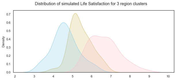
Simulate for each cluster based on their statistics
LLc0= np.random.normal(c18_0['Life_Satisfaction'].mean(),c18_0['Life_Satisfaction'].std(),31)
LLc1= np.random.normal(c18_1['Life_Satisfaction'].mean(),c18_1['Life_Satisfaction'].std(),39)
LLc2= np.random.normal(c18_2['Life_Satisfaction'].mean(),c18_2['Life_Satisfaction'].std(),56)
# set up the matploptlib figure,
# https://seaborn.pydata.org/examples/distplot_options.html?highlight=tight_layout#distribution-plot-options
sns.set(style="white", palette="muted", color_codes=True)
# life satisfaction distribution for cluster region 0
sns.kdeplot(LLc0,color="y", shade=True)
# life satisfaction distribution for cluster region 1
sns.kdeplot(LLc1, color="skyblue", shade=True)
# life satisfaction distribution for cluster region 2
sns.kdeplot(LLc2, color="pink", shade=True)
# add title
plt.suptitle("Distribution of simulated Life Satisfaction for 3 region clusters");
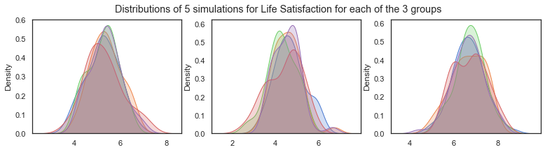
Illustrating how the distributions changed for each simulation due to random variation.
f,axes=plt.subplots(1,3, figsize=(13,3))
for i in range(5):
        sns.kdeplot(np.random.normal(c18_0['Life_Satisfaction'].mean(),c18_0['Life_Satisfaction'].std(),31), shade=True, ax=axes[0])

for i in range(5):
        sns.kdeplot(np.random.normal(c18_1['Life_Satisfaction'].mean(),c18_1['Life_Satisfaction'].std(),39), shade=True, ax=axes[1])
for i in range(5):
        sns.kdeplot(np.random.normal(c18_2['Life_Satisfaction'].mean(),c18_2['Life_Satisfaction'].std(),59), shade=True, ax=axes[2])

plt.suptitle("Distributions of 5 simulations for Life Satisfaction for each of the 3 groups")
Text(0.5, 0.98, 'Distributions of 5 simulations for Life Satisfaction for each of the 3 groups')
Simulating Social Support
Social Support:
The variable ‘Social support’ was the result of a question in the Gallop World Poll with the national average of the binary responses for each country to the GWP question “If you were in trouble, do you have relatives or friends you can count on to help you whenever you need them, or not?”.
The distribution from the dataset shows that it is left skewed. The scatterplots above showed that it is positively correlated with life satisfaction, income levels and healthy life expectancy. The boxplots below show that the median values fall into roughly 3 groups by regions with Western Europe, North America and Australia and New Zealand having the highest scores, while Southern Asia and Sub Saharan Africa have the lowest median scores and a wider spread.
Like Life ladder variable, the values are the result of national averages to questions in the Gallup World Poll. In this case the question had a binary answer 0 or 1 and therefore the actual values in the dataset range between 0 and 1. Social Support is a non-negative real values. The statistics vary from region to region.
df18['Social_Support'].describe()
count    136.000000
mean       0.810544
std        0.116332
min        0.484715
25%        0.739719
50%        0.836641
75%        0.905608
max        0.984489
Name: Social_Support, dtype: float64
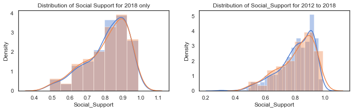
Plot of the distribution of Social Support for 2018:
The distribution of Life Ladder is plotted below. The plot on the left shows the distribution for the dataframe containing 2018 data only and the plot on the right shows the distribution for the dataframe containing all years.
f,axes=plt.subplots(1,2, figsize=(12,3))
# distribution of the Social support for 2018
sns.distplot(df18['Social_Support'], label="Social Support 2018", ax=axes[0])
# distribution of social support from the dataframe with the clusters. some missing values
sns.distplot(c18['Social_Support'], label="Social Support - 2018", ax=axes[0])
axes[0].set_title("Distribution of Social Support for 2018 only")
#axes[0].legend()
# kdeplot of the Social Support for all years in the extended dataset (WHR Table2.1)
sns.distplot(df_years['Social_Support'].dropna(), label="Social_Support - all years", ax=axes[1])
sns.distplot(c18['Social_Support'], label="Social_Support - 2018",ax=axes[1])
axes[1].set_title("Distribution of Social_Support for 2012 to 2018");
#axes[1].legend();
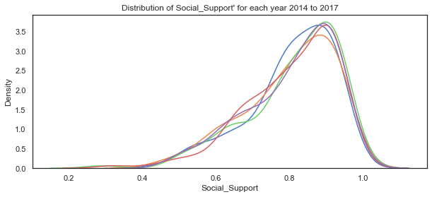
# plot the distribution of life satisfaction variable for each of the years 2014 to 2018
sns.kdeplot(c14['Social_Support'], label="2014")
sns.kdeplot(c15['Social_Support'], label="2015")
sns.kdeplot(c16['Social_Support'], label="2016")
sns.kdeplot(c17['Social_Support'], label="2017")
sns.kdeplot(c18['Social_Support'], label="2018")
plt.title("Distribution of Social_Support' for each year 2014 to 2017");
# set up the matploptlib figure,
# https://seaborn.pydata.org/examples/distplot_options.html?highlight=tight_layout#distribution-plot-options
sns.set(style="white", palette="muted", color_codes=True)

# plot for countries in these regions, set axes to use, labels to use
sns.kdeplot(c18.loc[c18.loc[:,'cluster_pred']==0]['Social_Support'], label="Cluster region 0", color="g", shade=True)
sns.kdeplot(c18.loc[c18.loc[:,'cluster_pred']==1]['Social_Support'], label="Cluster region 1", color="b", shade=True)
sns.kdeplot(c18.loc[c18.loc[:,'cluster_pred']==2]['Social_Support'], label="cluster region 2", color="r", shade=True)
#sns.distplot(clusters.loc[clusters.loc[:,'cluster_pred']==3]['Life Ladder'], ax=axes[3], label="cluster region 3", color="y")
# add title
plt.suptitle("Actual Social Support variable for the 3 clusters for 2017");
plt.legend();
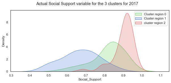
The distribution of Social Support for all the countries in 2018 is a left-skewed distribution with a long tail to the left. When this is broken down by cluster groups of regions, the distribution of each cluster looks more normal shaped although the centres of the distribution and the spread vary widely. Cluster region 0 (green) has social support values centred around different values.
Mean and standard deviation for Social Support by clustered group:
c18.groupby('cluster_pred').mean()
| Year | Life_Satisfaction | Log_GDP_per_cap | Social_Support | Life_Expectancy | RegionCode | |
|---|---|---|---|---|---|---|
| cluster_pred | ||||||
| 0 | 2018.0 | 5.322920 | 9.294176 | 0.820008 | 64.951786 | 3.946429 |
| 1 | 2018.0 | 4.415971 | 7.732756 | 0.669998 | 54.945161 | 1.290323 |
| 2 | 2018.0 | 6.614540 | 10.401640 | 0.900387 | 71.515385 | 4.102564 |
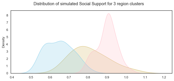
Simulate data for the Social Support variable for each of the cluster groups:
SSc0= np.random.normal(c18_0['Social_Support'].mean(),c18_0['Social_Support'].std(),31)
SSc1= np.random.normal(c18_1['Social_Support'].mean(),c18_1['Social_Support'].std(),39)
SSc2= np.random.normal(c18_2['Social_Support'].mean(),c18_2['Social_Support'].std(),56)
Plot the distributions of the simulated Social Support variable for the 3 groups:
# set up the matploptlib figure,
# https://seaborn.pydata.org/examples/distplot_options.html?highlight=tight_layout#distribution-plot-options
sns.set(style="white", palette="muted", color_codes=True)
# life satisfaction distribution for cluster region 0
sns.kdeplot(SSc0,color="y", shade=True)
# life satisfaction distribution for cluster region 1
sns.kdeplot(SSc1, color="skyblue", shade=True)
# life satisfaction distribution for cluster region 2
sns.kdeplot(SSc2, color="pink", shade=True)
# add title
plt.suptitle("Distribution of simulated Social Support for 3 region clusters");
Simulating Social Support variable using non-parametric methods:
When I first looked at simulating the social support variable I considered non-parametric ways of working with the data such as the bootstrap resampling method. Bootstrapping is a statistical technique for estimating quantities about a population by averaging estimates from multiple small data samples. Samples are constructed by drawing observations from a large data sample one at a time and then returning the observation so that it could be drawn again. Therefore any given observation could be included in the sample more than once while some observations might never be drawn. I referred to a blogpost on Machinelearningmastery.com[23] which outlines the steps to implement it using the scikit-learn resample function[24] which takes as arguments the data array, whether or not to sample with replacement, the size of the sample, and the seed for the pseudorandom number generator used prior to the sampling.
Bootstrapping is the practice of estimating properties of an estimator (such as its variance) by measuring those properties when sampling from an approximating distribution. One standard choice for an approximating distribution is the empirical distribution function of the observed data. In the case where a set of observations can be assumed to be from an independent and identically distributed population, this can be implemented by constructing a number of resamples with replacement, of the observed dataset (and of equal size to the observed dataset). The basic idea of bootstrapping is that inference about a population from sample data can be modelled by resampling the sample data and performing inference about a sample from resampled data. As the population is unknown, the true error in a sample statistic against its population value is unknown. In bootstrap-resamples, the ‘population’ is in fact the sample, and this is known; hence the quality of inference of the ‘true’ sample from resampled data (resampled → sample) is measurable. Wikipedia wiki on Bootstrapping[25]
The process for building one sample is:
- choose the size of the sample
- While the size of the sample is less than the chosen size
- Randomly select an observation from the dataset
- Add it to the sample The number of repetitions must be large enough that meaningful repetitions can be calculated on the sample.
Based on the information above I use sampling with replacement to simulate the Social support variable using the sample size the same as the original dataset which is 136 observations. numpy.random.choice function can be used for this purpose. The mean of the Social support variable in the dataset can be considered as a single estimate of the mean of the population of social support while the standard deviation is an estimate of the variability. The simplest bootstrap method would involve taking the original data set of N(136) Social support values and sampling from it to form a new sample - the ‘resample’ or bootstrap sample that is also of size 136. If the bootstrap sample is formed using sampling with replacement from the original data sample with a large enough size then there should be very little chance that the bootstrap sample will be the exact same as the original sample. This process is repeated many times (thousands) and the mean computed for each bootstrap sample to get the bootstrap estimates which can then be plotted on a histogram which is considered an estimate of the shape of the distribution.
Sampling with replacement using np.random.choice:
Here I use a loop to draw multiple random samples with replacements from the dataset. Additionally the means for each sample can be calculated and then all the means from the different samples are plotted to show their distribution but for this project I just need a simulated data set.
# using the Social support data from the dataset.
social=df18['Social_Support']
# create a list to store the means of the samples, set the number of simulations
mean_social_sim, sims = [], 20
# use loop to create 100 samples - takes very long to do 1000

# plot the distribution of social support variable from the dataset, add title
sns.kdeplot(social, label="Actual Data", shade=True)
for _ in range(sims):
    # draw a random sample from social with replacement and store it in social_sample
    social_sample=np.random.choice(social, replace=True, size=len(social))

    # plot the distribution of each sample
    sns.kdeplot(social_sample)
    # add title
    plt.title("Simulating using random sample with replacement")
    social_mean = np.mean(social_sample)
    # append the mean of each sample to mean_social
    mean_social_sim.append(social_mean)
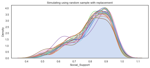
The main use of the bootstrap is making inferences about an estimate for a population parameter on sample data. For the purposes of this project I just need to simulate a single dataset. However by calculating the bootstrap means and comparing them to the dataset I am attempting to replicate shows that it is a suitable method here when the data does not follow a particular distribution.
df18['Social_Support'].describe()
count    136.000000
mean       0.810544
std        0.116332
min        0.484715
25%        0.739719
50%        0.836641
75%        0.905608
max        0.984489
Name: Social_Support, dtype: float64
np.mean(mean_social_sim)
0.8080325175953262
Simulating Log GDP per capita
The GDP per capita in the World Happiness Report dataset are in purchasing power parity at constant 2011 international dollar prices which are mainly from the World Development Indicators in 2018. Purchasing power parity is necessary when looking to compare GDP per capita between countries which is what the World Happiness Report seeks to do. Nominal GDP would be fine when just looking at a single country. The log of the GDP figures is taken.
Per capita GDP is the Total Gross Domestic Product for a country divided by its population and breaks down a country’s GDP per person. As the World Happiness Report states this is considered a universal measure for gauging the prosperity of nations.
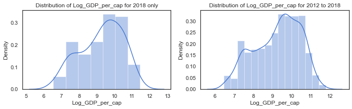
The earlier plots showed that the distribution of log GPD per capita in the dataset is not normally distributed. Per capita GDP is generally a unimodal but skewed distribution. There are many regional variations in income across the world. The distribution of Log GPD per capita appears somewhat left skewed.
The scatterplots above showed that it is positively correlated with life satisfaction, social support and healthy life expectancy.
The log of GDP per capita is used to represent the Gross Domestic Product per capita. It is a non-negative real value. Because the log of the GDP per capita figures are used the range is between 6 and 12 although this varies from region to region. The
df['Log_GDP_per_cap'].describe()
count    1676.000000
mean        9.222456
std         1.185794
min         6.457201
25%         8.304428
50%         9.406206
75%        10.193060
max        11.770276
Name: Log_GDP_per_cap, dtype: float64
f,axes=plt.subplots(1,2, figsize=(12,3))

# distribution of social support from the dataframe with the clusters. some missing values
sns.distplot(c18['Log_GDP_per_cap'].dropna(), label="Log_GDP_per_cap - 2018", ax=axes[0])
axes[0].set_title("Distribution of Log_GDP_per_cap for 2018 only")
#axes[0].legend()
# kdeplot of the Social Support for all years in the extended dataset (WHR Table2.1)
sns.distplot(clusters['Log_GDP_per_cap'].dropna(), label="Log_GDP_per_cap - all years", ax=axes[1])
axes[1].set_title("Distribution of Log_GDP_per_cap for 2012 to 2018");
#axes[1].legend();
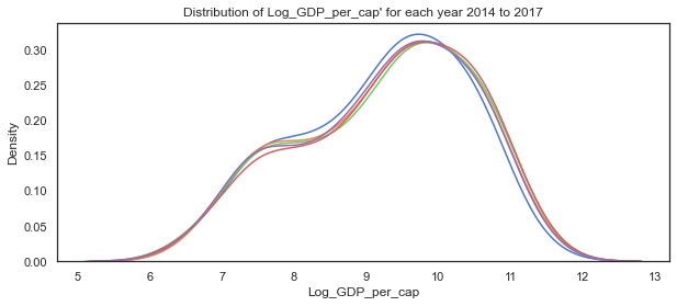
# plot the distribution of Log GDP per capita variable for each of the years 2014 to 2018
sns.kdeplot(c14['Log_GDP_per_cap'], label="2014")
sns.kdeplot(c15['Log_GDP_per_cap'], label="2015")
sns.kdeplot(c16['Log_GDP_per_cap'], label="2016")
sns.kdeplot(c17['Log_GDP_per_cap'], label="2017")
sns.kdeplot(c18['Log_GDP_per_cap'], label="2018")
plt.title("Distribution of Log_GDP_per_cap' for each year 2014 to 2017");
# set up the matploptlib figure,
# https://seaborn.pydata.org/examples/distplot_options.html?highlight=tight_layout#distribution-plot-options
sns.set(style="white", palette="muted", color_codes=True)

# plot for countries in these regions, set axes to use, labels to use
sns.kdeplot(c18.loc[c18.loc[:,'cluster_pred']==0]['Log_GDP_per_cap'], label="Cluster region 0", color="g", shade=True)
sns.kdeplot(c18.loc[c18.loc[:,'cluster_pred']==1]['Log_GDP_per_cap'], label="Cluster region 1", color="b", shade=True)
sns.kdeplot(c18.loc[c18.loc[:,'cluster_pred']==2]['Log_GDP_per_cap'], label="cluster region 2", color="r", shade=True)
#sns.distplot(clusters.loc[clusters.loc[:,'cluster_pred']==3]['Life Ladder'], ax=axes[3], label="cluster region 3", color="y")
# add title
plt.suptitle("Actual Log_GDP_per_cap variable for the 3 clusters for 2017");
plt.legend();
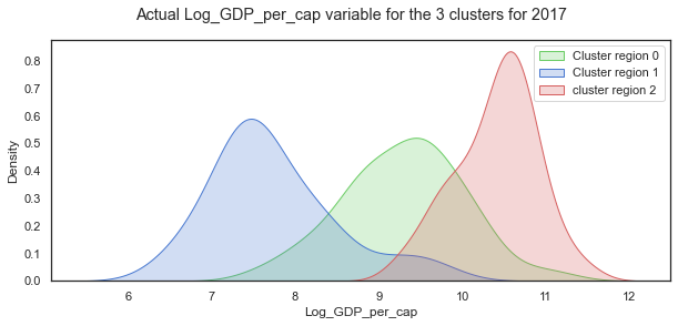
When the distribution of Log GDP per capita is broken down by cluster groups of regions, the distribution of each cluster looks more normal shaped although the centres of the distribution and the spread vary widely as with the other variables.
Mean and standard deviation for Log GDP per capita by clustered group:
c18.groupby('cluster_pred').mean()
| Year | Life_Satisfaction | Log_GDP_per_cap | Social_Support | Life_Expectancy | RegionCode | |
|---|---|---|---|---|---|---|
| cluster_pred | ||||||
| 0 | 2018.0 | 5.322920 | 9.294176 | 0.820008 | 64.951786 | 3.946429 |
| 1 | 2018.0 | 4.415971 | 7.732756 | 0.669998 | 54.945161 | 1.290323 |
| 2 | 2018.0 | 6.614540 | 10.401640 | 0.900387 | 71.515385 | 4.102564 |
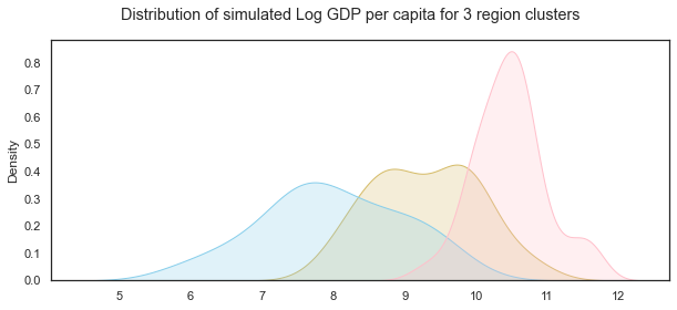
Simulate data for the Log GDP per capita variable for each of the cluster groups:
GDPc0= np.random.normal(c18_0['Log_GDP_per_cap'].mean(),c18_0['Log_GDP_per_cap'].std(),31)
GDPc1= np.random.normal(c18_1['Log_GDP_per_cap'].mean(),c18_1['Log_GDP_per_cap'].std(),39)
GDPc2= np.random.normal(c18_2['Log_GDP_per_cap'].mean(),c18_2['Log_GDP_per_cap'].std(),56)
Plot the distributions of the simulated Log GDP per capita variable for the 3 groups:
# set up the matploptlib figure,
# https://seaborn.pydata.org/examples/distplot_options.html?highlight=tight_layout#distribution-plot-options
sns.set(style="white", palette="muted", color_codes=True)
# life satisfaction distribution for cluster region 0
sns.kdeplot(GDPc0,color="y", shade=True)
# life satisfaction distribution for cluster region 1
sns.kdeplot(GDPc1, color="skyblue", shade=True)
# life satisfaction distribution for cluster region 2
sns.kdeplot(GDPc2, color="pink", shade=True)
# add title
plt.suptitle("Distribution of simulated Log GDP per capita for 3 region clusters");
Healthy Life Expectancy
According to the World Happiness Report, Healthy life expectancies at birth are based on the data extracted from the World Health Organization’s (WHO) Global Health Observatory data repository. Some interpolation and exterpolation was used to get the data for the years covered in the 2018 report. As some countries were not covered in the WHO data, other sources were used by the researchers.
The values are non-negative real numbers between 48 and 77 years but this varies from year to year as the statistics showed.
df18['Life_Expectancy'].describe()
count    132.000000
mean      64.670832
std        6.728247
min       48.200001
25%       59.074999
50%       66.350002
75%       69.075001
max       76.800003
Name: Life_Expectancy, dtype: float64
c18.columns
Index(['Year', 'Life_Satisfaction', 'Log_GDP_per_cap', 'Social_Support',
       'Life_Expectancy', 'RegionCode', 'cluster_pred'],
      dtype='object')
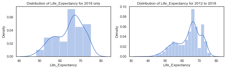
f,axes=plt.subplots(1,2, figsize=(12,3))

# distribution of Life_Expectancy from the dataframe with the clusters. some missing values
sns.distplot(c18['Life_Expectancy'].dropna(), label="Life_Expectancy - 2018", ax=axes[0])
axes[0].set_title("Distribution of Life_Expectancy for 2018 only")
#axes[0].legend()
# kdeplot of the Life_Expectancy from 2012 to 2018)
sns.distplot(clusters['Life_Expectancy'].dropna(), label="Life_Expectancy - all years", ax=axes[1])
axes[1].set_title("Distribution of Life_Expectancy for 2012 to 2018");
#axes[1].legend();
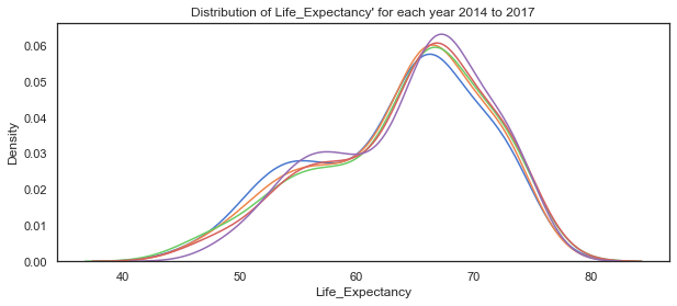
# plot the distribution of Life_Expectancy variable for each of the years 2014 to 2018
sns.kdeplot(c14['Life_Expectancy'], label="2014")
sns.kdeplot(c15['Life_Expectancy'], label="2015")
sns.kdeplot(c16['Life_Expectancy'], label="2016")
sns.kdeplot(c17['Life_Expectancy'], label="2017")
sns.kdeplot(c18['Life_Expectancy'], label="2018")
plt.title("Distribution of Life_Expectancy' for each year 2014 to 2017");
# set up the matploptlib figure,
# https://seaborn.pydata.org/examples/distplot_options.html?highlight=tight_layout#distribution-plot-options
sns.set(style="white", palette="muted", color_codes=True)

# plot for countries in these regions, set axes to use, labels to use
sns.kdeplot(c18.loc[c18.loc[:,'cluster_pred']==0]['Life_Expectancy'], label="Cluster region 0", color="g", shade=True)
sns.kdeplot(c18.loc[c18.loc[:,'cluster_pred']==1]['Life_Expectancy'], label="Cluster region 1", color="b", shade=True)
sns.kdeplot(c18.loc[c18.loc[:,'cluster_pred']==2]['Life_Expectancy'], label="cluster region 2", color="r", shade=True)
#sns.distplot(clusters.loc[clusters.loc[:,'cluster_pred']==3]['Life Ladder'], ax=axes[3], label="cluster region 3", color="y")
# add title
plt.suptitle("Actual Life_Expectancy variable for the 3 clusters for 2018");
plt.legend();
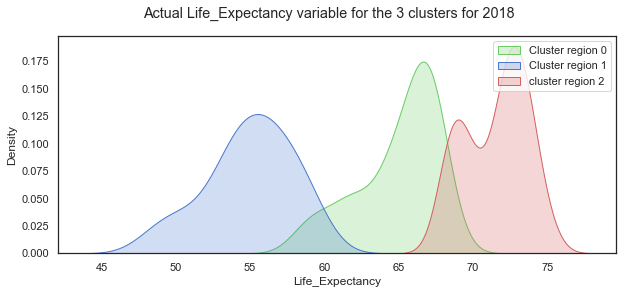
Looking at the Life Expectancy variable by cluster group, the distribution looks normal for the cluster region 1 while the other two groups are less so. There seems to be two peaks in the distribution for cluster group 0 which probably needs to be broken out more.
Mean and standard deviation for Healthy Life Expectancy at birth by clustered group:
c18.groupby('cluster_pred').mean()
| Year | Life_Satisfaction | Log_GDP_per_cap | Social_Support | Life_Expectancy | RegionCode | |
|---|---|---|---|---|---|---|
| cluster_pred | ||||||
| 0 | 2018.0 | 5.322920 | 9.294176 | 0.820008 | 64.951786 | 3.946429 |
| 1 | 2018.0 | 4.415971 | 7.732756 | 0.669998 | 54.945161 | 1.290323 |
| 2 | 2018.0 | 6.614540 | 10.401640 | 0.900387 | 71.515385 | 4.102564 |
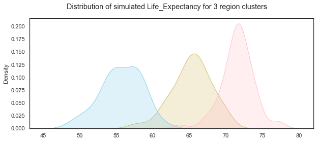
Simulate data for the Life Expectancy variable for each of the cluster groups:
LEc0= np.random.normal(c18_0['Life_Expectancy'].mean(),c18_0['Life_Expectancy'].std(),31)
LEc1= np.random.normal(c18_1['Life_Expectancy'].mean(),c18_1['Life_Expectancy'].std(),39)
LEc2= np.random.normal(c18_2['Life_Expectancy'].mean(),c18_2['Life_Expectancy'].std(),56)
Plot the distributions of the simulated Healthy Life Expectancy at birth variable for the 3 groups:
# set up the matploptlib figure,
# https://seaborn.pydata.org/examples/distplot_options.html?highlight=tight_layout#distribution-plot-options
sns.set(style="white", palette="muted", color_codes=True)
# life satisfaction distribution for cluster region 0
sns.kdeplot(LEc0,color="y", shade=True)
# life satisfaction distribution for cluster region 1
sns.kdeplot(LEc1, color="skyblue", shade=True)
# life satisfaction distribution for cluster region 2
sns.kdeplot(LEc2, color="pink", shade=True)
# add title
plt.suptitle("Distribution of simulated Life_Expectancy for 3 region clusters");
Create a dataset with the simulated variables.
Now that the individual variables have been simulated, the next step is to assemble the variables into a dataframe and ensure that the overall distributions and relationships are similar to an actual dataset. Because of the variations between the three groups I will create a dataframe for each group and then concatenate the three dataframes together.
Simulated Dataframe for Group0:
Here I create 31 countries and add the simulated data created earlier using numpy.random functions.
# create a list of countries by appending number to 'country'
G0_countries =[]
# use for loop and concatenate number to string
for i in range(31):
    countryname = 'Sim_Country_'+str(i)
    # append countryname  to list of countries
    G0_countries.append(countryname)
# create a dataframe and add the columns
G0=pd.DataFrame()
G0['Country']=G0_countries
# add columns based on simulations
G0['Life_Satisfaction']=LLc0
G0['Log_GDP_per_cap']=GDPc0
G0['Social_Support']=SSc0
G0['Life_Expectancy']=LEc0
# add group column
G0['Group']='Group0'
G0
| Country | Life_Satisfaction | Log_GDP_per_cap | Social_Support | Life_Expectancy | Group | |
|---|---|---|---|---|---|---|
| 0 | Sim_Country_0 | 5.306706 | 8.921793 | 0.787441 | 66.048883 | Group0 |
| 1 | Sim_Country_1 | 5.651307 | 8.654395 | 0.809210 | 66.436883 | Group0 |
| 2 | Sim_Country_2 | 5.661618 | 9.308995 | 0.693635 | 63.622131 | Group0 |
| 3 | Sim_Country_3 | 4.861526 | 10.605480 | 0.782290 | 64.910602 | Group0 |
| ... | ... | ... | ... | ... | ... | ... |
| 27 | Sim_Country_27 | 5.131967 | 8.575882 | 0.721815 | 65.468924 | Group0 |
| 28 | Sim_Country_28 | 6.445590 | 8.746669 | 1.001303 | 61.517664 | Group0 |
| 29 | Sim_Country_29 | 5.824301 | 9.300203 | 0.848021 | 62.704594 | Group0 |
| 30 | Sim_Country_30 | 5.016133 | 9.535686 | 0.969046 | 64.939119 | Group0 |
31 rows × 6 columns
Simulated dataframe for group 1
Here I create a dataframe for the 39 group 1 simulated data points.
# create a list of countries by appending number to 'country'
G1_countries =[]
# use for loop and concatenate number to string
for i in range(39):
    countryname = 'Sim_Country_'+str(i)
    # append countryname  to list of countries
    G1_countries.append(countryname)
# create a dataframe and add the columns
G1=pd.DataFrame()
G1['Country']=G1_countries
# add columns based on simulations
G1['Life_Satisfaction']=LLc1
G1['Log_GDP_per_cap']=GDPc1
G1['Social_Support']=SSc1
G1['Life_Expectancy']=LEc1
# add group column
G1['Group']='Group1'
G1
| Country | Life_Satisfaction | Log_GDP_per_cap | Social_Support | Life_Expectancy | Group | |
|---|---|---|---|---|---|---|
| 0 | Sim_Country_0 | 4.671344 | 6.724028 | 0.641005 | 50.339410 | Group1 |
| 1 | Sim_Country_1 | 4.761840 | 7.475304 | 0.676521 | 54.053141 | Group1 |
| 2 | Sim_Country_2 | 5.851653 | 8.594777 | 0.591575 | 52.256857 | Group1 |
| 3 | Sim_Country_3 | 4.299704 | 9.815454 | 0.723505 | 54.739286 | Group1 |
| ... | ... | ... | ... | ... | ... | ... |
| 35 | Sim_Country_35 | 4.904859 | 8.355346 | 0.576573 | 58.568376 | Group1 |
| 36 | Sim_Country_36 | 5.592356 | 6.747997 | 0.658175 | 59.476083 | Group1 |
| 37 | Sim_Country_37 | 4.909638 | 7.444697 | 0.721786 | 51.673735 | Group1 |
| 38 | Sim_Country_38 | 4.673152 | 7.425028 | 0.586048 | 55.680735 | Group1 |
39 rows × 6 columns
Simulated dataframe for group 2
Here I create a dataframe for the 56 group 1 simulated data points.
# create a list of countries by appending number to 'country'
G2_countries =[]
# use for loop and concatenate number to string
for i in range(56):
    countryname = 'Sim_Country_'+str(i)
    # append countryname  to list of countries
    G2_countries.append(countryname)
# create a dataframe and add the columns
G2=pd.DataFrame()
G2['Country']=G2_countries
# add columns based on simulations
G2['Life_Satisfaction']=LLc2
G2['Log_GDP_per_cap']=GDPc2
G2['Social_Support']=SSc2
G2['Life_Expectancy']=LEc2
# add group column
G2['Group']='Group2'
G2
| Country | Life_Satisfaction | Log_GDP_per_cap | Social_Support | Life_Expectancy | Group | |
|---|---|---|---|---|---|---|
| 0 | Sim_Country_0 | 6.650582 | 10.486408 | 0.957040 | 71.204546 | Group2 |
| 1 | Sim_Country_1 | 5.948507 | 10.530889 | 0.832581 | 70.661832 | Group2 |
| 2 | Sim_Country_2 | 7.115427 | 9.467759 | 0.945339 | 69.148849 | Group2 |
| 3 | Sim_Country_3 | 5.896939 | 11.135984 | 0.843904 | 73.312323 | Group2 |
| ... | ... | ... | ... | ... | ... | ... |
| 52 | Sim_Country_52 | 6.862937 | 10.019423 | 0.928102 | 71.754594 | Group2 |
| 53 | Sim_Country_53 | 5.862264 | 10.268521 | 0.907081 | 71.617507 | Group2 |
| 54 | Sim_Country_54 | 6.288760 | 11.645804 | 0.942329 | 76.936191 | Group2 |
| 55 | Sim_Country_55 | 6.509125 | 10.598213 | 0.901340 | 70.859460 | Group2 |
56 rows × 6 columns
Create one dataframe from the three group dataframes:
Now I add the three dataframes together using the pandas pd.concat function.
# using the pandas concat function to add the dataframes together.
result=pd.concat([G0,G1,G2])
result.head()
| Country | Life_Satisfaction | Log_GDP_per_cap | Social_Support | Life_Expectancy | Group | |
|---|---|---|---|---|---|---|
| 0 | Sim_Country_0 | 5.306706 | 8.921793 | 0.787441 | 66.048883 | Group0 |
| 1 | Sim_Country_1 | 5.651307 | 8.654395 | 0.809210 | 66.436883 | Group0 |
| 2 | Sim_Country_2 | 5.661618 | 9.308995 | 0.693635 | 63.622131 | Group0 |
| 3 | Sim_Country_3 | 4.861526 | 10.605480 | 0.782290 | 64.910602 | Group0 |
| 4 | Sim_Country_4 | 5.348437 | 9.782862 | 0.785385 | 66.617080 | Group0 |
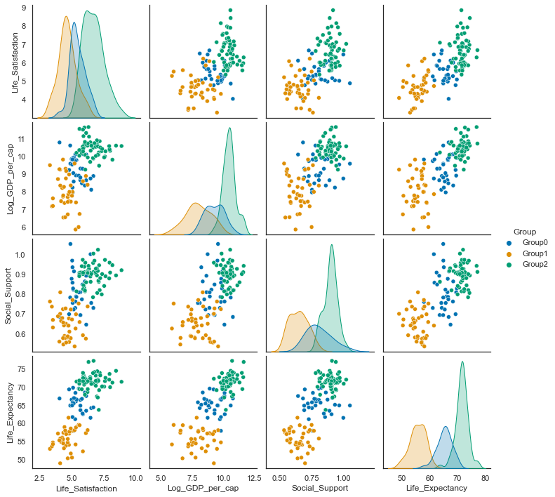
sns.pairplot(result, hue='Group', palette="colorblind");
data2018 =c18.drop(['Year', 'RegionCode'], axis=1)
data2018.groupby('cluster_pred').count()
| Life_Satisfaction | Log_GDP_per_cap | Social_Support | Life_Expectancy | |
|---|---|---|---|---|
| cluster_pred | ||||
| 0 | 56 | 56 | 56 | 56 |
| 1 | 31 | 31 | 31 | 31 |
| 2 | 39 | 39 | 39 | 39 |
result.groupby('Group').describe()
| Life_Satisfaction | Log_GDP_per_cap | ... | Social_Support | Life_Expectancy | |||||||||||||||||
|---|---|---|---|---|---|---|---|---|---|---|---|---|---|---|---|---|---|---|---|---|---|
| count | mean | std | min | 25% | 50% | 75% | max | count | mean | ... | 75% | max | count | mean | std | min | 25% | 50% | 75% | max | |
| Group | |||||||||||||||||||||
| Group0 | 31.0 | 5.427230 | 0.576599 | 4.029621 | 5.049565 | 5.269363 | 5.799328 | 6.668034 | 31.0 | 9.285359 | ... | 0.870293 | 1.053083 | 31.0 | 65.301443 | 2.677880 | 57.921714 | 63.916421 | 65.468924 | 66.804120 | 69.822780 |
| Group1 | 39.0 | 4.623613 | 0.684148 | 3.280790 | 4.271048 | 4.548910 | 4.955297 | 6.220091 | 39.0 | 7.982179 | ... | 0.698752 | 0.808642 | 39.0 | 55.698451 | 2.796176 | 48.970274 | 54.109545 | 55.680735 | 57.816293 | 61.551827 |
| Group2 | 56.0 | 6.662692 | 0.790043 | 5.351351 | 5.998424 | 6.644296 | 7.096606 | 8.860939 | 56.0 | 10.469700 | ... | 0.928630 | 1.023850 | 56.0 | 71.560481 | 2.236689 | 63.705882 | 70.587843 | 71.637011 | 72.599097 | 77.238667 |
3 rows × 32 columns
data2018
data2018['cluster_pred']=data2018["cluster_pred"].replace(0,'Group2')
data2018['cluster_pred']=data2018["cluster_pred"].replace(1,'Group0')
data2018['cluster_pred']=data2018["cluster_pred"].replace(2,'Group1')
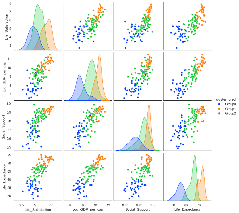
sns.pairplot(data2018, hue='cluster_pred', palette="bright", hue_order=['Group0','Group1','Group2']);
Simulated Life Satisfaction / Life Ladder variable:
Compare statistics from actual data for 2018 to simulated data:
data2018.groupby('cluster_pred').mean()
| Life_Satisfaction | Log_GDP_per_cap | Social_Support | Life_Expectancy | |
|---|---|---|---|---|
| cluster_pred | ||||
| Group0 | 4.415971 | 7.732756 | 0.669998 | 54.945161 |
| Group1 | 6.614540 | 10.401640 | 0.900387 | 71.515385 |
| Group2 | 5.322920 | 9.294176 | 0.820008 | 64.951786 |
result.groupby('Group').mean()
| Life_Satisfaction | Log_GDP_per_cap | Social_Support | Life_Expectancy | |
|---|---|---|---|---|
| Group | ||||
| Group0 | 5.427230 | 9.285359 | 0.811026 | 65.301443 |
| Group1 | 4.623613 | 7.982179 | 0.649658 | 55.698451 |
| Group2 | 6.662692 | 10.469700 | 0.898550 | 71.560481 |
Plot actual vs simulated Life Satisfaction:
# set up the subplots, style and palette
sns.set(style="ticks", palette="colorblind")
f,axes=plt.subplots(2,2, figsize=(9,9))
# plot the distributions of each of the main variables. first simulated and then actual for 2018
sns.kdeplot(result['Life_Satisfaction'], ax=axes[0,0], shade=True, label="simulated")
sns.kdeplot(data2018['Life_Satisfaction'], ax=axes[0,0], shade=True,label="actual")
# set axes title
axes[0,0].set_title("Distribution of Life Ladder")
# plot the distributions of each of the main variables. first simulated and then actual for 2018
sns.kdeplot(result['Log_GDP_per_cap'], ax=axes[0,1], shade=True, label="simulated")
sns.kdeplot(data2018['Log_GDP_per_cap'].dropna(), ax=axes[0,1], shade=True, label="actual")
# axes title
axes[0,1].set_title("Distribution of Log GDP per capita")
# plot the distributions of each of the main variables. first simulated and then actual for 2018
sns.kdeplot(result['Social_Support'].dropna(), ax=axes[1,0], shade=True, label="simulated")
sns.kdeplot(data2018['Social_Support'].dropna(), ax=axes[1,0], shade=True, label="simulated")
axes[1,0].set_title("Distribution of Social Support");
# plot the distributions of each of the main variables. first simulated and then actual for 2018
sns.kdeplot(result['Life_Expectancy'], ax=axes[1,1],shade=True, label="Simulated");
sns.kdeplot(data2018['Life_Expectancy'], ax=axes[1,1],shade=True, label="Simulated");
axes[1,1].set_title("Distribution of Simulated Life expectancy");
plt.tight_layout();
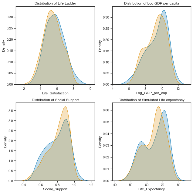
They are not perfect matches but it will do for now! Every time a numpy.random function is run it will produce different numbers from the same distribution unless the seed is set. Now I will just check the correlations and any relationships in the data.
Comparing Relationships between the variables.
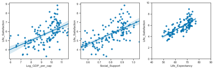
Relationships between the simulated variables:
# set up the matplotlib figure
f,axes=plt.subplots(1,3, figsize=(12,4))
# regression plot with x as a predictor of y variable. set the axes.
sns.regplot(y ="Life_Satisfaction",x="Log_GDP_per_cap", data=result, ax=axes[0])
sns.regplot(y ="Life_Satisfaction",x="Social_Support", data=result, ax=axes[1])
sns.regplot(y ="Life_Satisfaction",x="Life_Expectancy", data=result, ax=axes[2])
axes[2].set_ylim(0,10); axes[2].set_xlim(40,90)
plt.tight_layout();
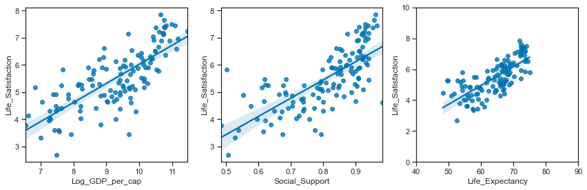
Relationships between the actual variables:
# set up the matplotlib figure
f,axes=plt.subplots(1,3, figsize=(12,4))
# regression plot with x as a predictor of y variable. set the axes.
sns.regplot(y ="Life_Satisfaction",x="Log_GDP_per_cap", data=data2018, ax=axes[0])
sns.regplot(y ="Life_Satisfaction",x="Social_Support", data=data2018, ax=axes[1])
sns.regplot(y ="Life_Satisfaction",x="Life_Expectancy", data=data2018, ax=axes[2])
axes[2].set_ylim(0,10); axes[2].set_xlim(40,90)
plt.tight_layout();
# set up the subplots, style and palette
sns.set(style="ticks", palette="colorblind")
f,axes=plt.subplots(2,2, figsize=(9,9))
# plot the distributions of each of the main variables. At global level first. Look at Regional after
sns.distplot(result['Life_Satisfaction'].dropna(), ax=axes[0,0], bins=10, color="r");
# set axes title
axes[0,0].set_title("Distribution of Simulated Life Ladder");
sns.distplot(result['Log_GDP_per_cap'].dropna(), ax=axes[0,1], bins=10, color="g");
axes[0,1].set_title("Distribution of Simulated Income");
sns.distplot(result['Social_Support'].dropna(), ax=axes[1,0], bins=10, color="b");
axes[1,0].set_title("Distribution of Simulated Social Support");
sns.distplot(result['Life_Expectancy'].dropna(), ax=axes[1,1], bins=10, color="y");
axes[1,1].set_title("Distribution of Simulated Life expectancy");
plt.tight_layout();
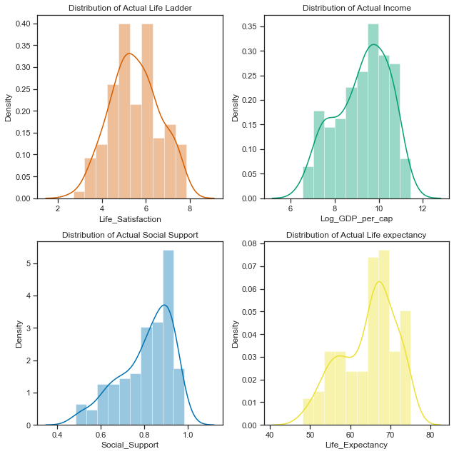
# set up the subplots, style and palette
sns.set(style="ticks", palette="colorblind")
f,axes=plt.subplots(2,2, figsize=(9,9))
# plot the distributions of each of the main variables. At global level first. Look at Regional after
sns.distplot(data2018['Life_Satisfaction'].dropna(), ax=axes[0,0], bins=10, color="r");
# set axes title
axes[0,0].set_title("Distribution of Actual Life Ladder");
sns.distplot(data2018['Log_GDP_per_cap'].dropna(), ax=axes[0,1], bins=10, color="g");
axes[0,1].set_title("Distribution of Actual Income");
sns.distplot(data2018['Social_Support'].dropna(), ax=axes[1,0], bins=10, color="b");
axes[1,0].set_title("Distribution of Actual Social Support");
sns.distplot(data2018['Life_Expectancy'].dropna(), ax=axes[1,1], bins=10, color="y");
axes[1,1].set_title("Distribution of Actual Life expectancy");
plt.tight_layout();
data2018
| Life_Satisfaction | Log_GDP_per_cap | Social_Support | Life_Expectancy | cluster_pred | |
|---|---|---|---|---|---|
| 10 | 2.694303 | 7.494588 | 0.507516 | 52.599998 | Group0 |
| 21 | 5.004403 | 9.412399 | 0.683592 | 68.699997 | Group1 |
| 28 | 5.043086 | 9.557952 | 0.798651 | 65.900002 | Group2 |
| 45 | 5.792797 | 9.809972 | 0.899912 | 68.800003 | Group1 |
| ... | ... | ... | ... | ... | ... |
| 1654 | 5.005663 | 9.270281 | 0.886882 | 66.500000 | Group2 |
| 1667 | 5.295547 | 8.783416 | 0.831945 | 67.900002 | Group2 |
| 1690 | 4.041488 | 8.223958 | 0.717720 | 55.299999 | Group0 |
| 1703 | 3.616480 | 7.553395 | 0.775388 | 55.599998 | Group0 |
126 rows × 5 columns
The simulated data:
The final simulated dataframe containing the 6 variables is called result.
result
| Country | Life_Satisfaction | Log_GDP_per_cap | Social_Support | Life_Expectancy | Group | |
|---|---|---|---|---|---|---|
| 0 | Sim_Country_0 | 5.306706 | 8.921793 | 0.787441 | 66.048883 | Group0 |
| 1 | Sim_Country_1 | 5.651307 | 8.654395 | 0.809210 | 66.436883 | Group0 |
| 2 | Sim_Country_2 | 5.661618 | 9.308995 | 0.693635 | 63.622131 | Group0 |
| 3 | Sim_Country_3 | 4.861526 | 10.605480 | 0.782290 | 64.910602 | Group0 |
| ... | ... | ... | ... | ... | ... | ... |
| 52 | Sim_Country_52 | 6.862937 | 10.019423 | 0.928102 | 71.754594 | Group2 |
| 53 | Sim_Country_53 | 5.862264 | 10.268521 | 0.907081 | 71.617507 | Group2 |
| 54 | Sim_Country_54 | 6.288760 | 11.645804 | 0.942329 | 76.936191 | Group2 |
| 55 | Sim_Country_55 | 6.509125 | 10.598213 | 0.901340 | 70.859460 | Group2 |
126 rows × 6 columns
Using the multivariate normal distribution function.
An alternative way to simulating the dataset could be to use the multivariate normal distribution function. While the variables are not all normally distributed at the dataset level, when broken down by the regions they do appear to be gaussian with each groups distributions having very different centres and spreads to each other.
There is a numpy.random.multivariate function that can generated correlated data.
I found a thread at stack overflow referencing how to use the multivariate function to [generate correlated data] (https://stackoverflow.com/a/16026231)[26] Here I filter the data for each group and calculate the covariance on the first three variables.
data2018.groupby('cluster_pred').describe()
| Life_Satisfaction | Log_GDP_per_cap | ... | Social_Support | Life_Expectancy | |||||||||||||||||
|---|---|---|---|---|---|---|---|---|---|---|---|---|---|---|---|---|---|---|---|---|---|
| count | mean | std | min | 25% | 50% | 75% | max | count | mean | ... | 75% | max | count | mean | std | min | 25% | 50% | 75% | max | |
| cluster_pred | |||||||||||||||||||||
| Group0 | 31.0 | 4.415971 | 0.730419 | 2.694303 | 3.997857 | 4.379262 | 4.924668 | 5.819827 | 31.0 | 7.732756 | ... | 0.739598 | 0.864215 | 31.0 | 54.945161 | 2.912598 | 48.200001 | 53.450001 | 55.299999 | 57.100000 | 59.599998 |
| Group1 | 39.0 | 6.614540 | 0.740771 | 5.004403 | 6.109656 | 6.665904 | 7.205219 | 7.858107 | 39.0 | 10.401640 | ... | 0.930485 | 0.965962 | 39.0 | 71.515385 | 2.043286 | 68.300003 | 69.450001 | 72.300003 | 73.199997 | 75.000000 |
| Group2 | 56.0 | 5.322920 | 0.704197 | 3.561047 | 4.840304 | 5.296465 | 5.902972 | 6.626592 | 56.0 | 9.294176 | ... | 0.882849 | 0.984489 | 56.0 | 64.951786 | 2.692346 | 58.500000 | 63.574999 | 65.950001 | 67.025000 | 68.199997 |
3 rows × 32 columns
# select clusters for each group
group0 =data2018.loc[data2018.cluster_pred=='Group0']
group1 =data2018.loc[data2018.cluster_pred=='Group1']
group2 =data2018.loc[data2018.cluster_pred=='Group2']
# get the covariances for each cluster group
group0cov = group0.iloc[:,:4].cov()
group1cov = group1.iloc[:,:4].cov()
group2cov = group2.iloc[:,:4].cov()
# get the mean of the variables for each group:
group0mean=group0.iloc[:,:4].mean()
group1mean=group1.iloc[:,:4].mean()
group2mean=group2.iloc[:,:4].mean()
Group0
# use number of samples based on number of countries in the grup
num_samples=31
# using group0 means of each variable
mu=group0mean
# using group0 covariances for each grouo
r=group0cov
# generate the random samples using `multivariate` function
g0=np.random.multivariate_normal(mu,r,size=num_samples)
Group1
# use number of samples based on number of countries in the grup
num_samples=39
# using group0 means of each variable
mu=group1mean
# using group0 covariances for each grouo
r=group1cov
# generate the random samples using `multivariate` function
g1=np.random.multivariate_normal(mu,r,size=num_samples)
g1.shape
(39, 4)
Group2
# use number of samples based on number of countries in the grup
num_samples=56
# using group0 means of each variable
mu=group1mean
# using group0 covariances for each grouo
r=group1cov
# generate the random samples using `multivariate` function
g2=np.random.multivariate_normal(mu,r,size=num_samples)
g2.shape
(56, 4)
# create dataframe from multivariate normal, u
MV0 =pd.DataFrame(g0)
# using countries from earlier as simulated earlier
MV0['Country']=G0_countries
# add a group column
MV0['Group']='group0'
# create dataframe
MV1 =pd.DataFrame(g1)
# using countries from earlier as simulated earlier
MV1['Country']=G1_countries
# add a group column
MV1['Group']='group1'
# create dataframe
MV2 =pd.DataFrame(g2)
# using countries from earlier as simulated earlier
MV2['Country']=G2_countries
# add a group column
MV2['Group']='group2'
# concat the three dataframes
MV = pd.concat([MV0,MV1,MV2])
# get the column names
MV.columns
# https://pandas.pydata.org/pandas-docs/stable/reference/api/pandas.DataFrame.rename.html#pandas-dataframe-rename
# rename the columns
MV=MV.rename(columns={0: "Life_Satisfaction", 1: "Log_GDP_per_cap",2:"Social_Support",3:"Life_Expectancy"})
MV
| Life_Satisfaction | Log_GDP_per_cap | Social_Support | Life_Expectancy | Country | Group | |
|---|---|---|---|---|---|---|
| 0 | 4.784215 | 10.202274 | 0.753394 | 57.429434 | Sim_Country_0 | group0 |
| 1 | 6.244088 | 8.875449 | 0.754857 | 49.449422 | Sim_Country_1 | group0 |
| 2 | 4.650546 | 6.575641 | 0.638315 | 60.905908 | Sim_Country_2 | group0 |
| 3 | 4.671591 | 9.285341 | 0.579979 | 55.996092 | Sim_Country_3 | group0 |
| ... | ... | ... | ... | ... | ... | ... |
| 52 | 6.859352 | 10.595678 | 0.956506 | 73.005038 | Sim_Country_52 | group2 |
| 53 | 5.800952 | 10.107949 | 0.875437 | 69.808952 | Sim_Country_53 | group2 |
| 54 | 6.320052 | 9.724057 | 0.870894 | 70.904885 | Sim_Country_54 | group2 |
| 55 | 7.067898 | 10.041613 | 0.896035 | 70.222111 | Sim_Country_55 | group2 |
126 rows × 6 columns
MV.corr()
| Life_Satisfaction | Log_GDP_per_cap | Social_Support | Life_Expectancy | |
|---|---|---|---|---|
| Life_Satisfaction | 1.000000 | 0.874035 | 0.882631 | 0.804469 |
| Log_GDP_per_cap | 0.874035 | 1.000000 | 0.908389 | 0.894697 |
| Social_Support | 0.882631 | 0.908389 | 1.000000 | 0.861688 |
| Life_Expectancy | 0.804469 | 0.894697 | 0.861688 | 1.000000 |
data2018.iloc[:,:4].corr()
| Life_Satisfaction | Log_GDP_per_cap | Social_Support | Life_Expectancy | |
|---|---|---|---|---|
| Life_Satisfaction | 1.000000 | 0.762152 | 0.731221 | 0.740537 |
| Log_GDP_per_cap | 0.762152 | 1.000000 | 0.792845 | 0.852848 |
| Social_Support | 0.731221 | 0.792845 | 1.000000 | 0.757044 |
| Life_Expectancy | 0.740537 | 0.852848 | 0.757044 | 1.000000 |
# set up the matplotlib figure
f,axes=plt.subplots(1,3, figsize=(12,3))
# regression plot with x as a predictor of y variable. set the axes.
sns.regplot(y ="Life_Satisfaction",x="Log_GDP_per_cap", data=MV, ax=axes[0])
sns.regplot(y ="Life_Satisfaction",x="Social_Support", data=MV, ax=axes[1])
sns.regplot(y ="Life_Satisfaction",x="Life_Expectancy", data=MV, ax=axes[2])
# change the axis limited for Life expectancy
axes[2].set_ylim(0,10); axes[2].set_xlim(40,90);