Having identified a real-world phenomenon to simulate, the next step is to investigate the types of variables involved, their likely distributions, and their relationships with each other. To do so I need data.
Available Data and research
The World Happines Report is produced by the United Nations Sustainable Development Solutions Network in partnership with the Ernesto Illy Foundation. The first World Happiness Report was published in 2012, the latest in 2019. The World Happiness Report is a landmark survey of the state of global happiness that ranks 156 countries by how happy their citizens perceive themselves to be. Each year the report has focused in on a different aspect of the report such as how the new science of happiness explains personal and national variations in happiness and how well-being is a critical component of how the world measures its economic and social development. Over the years it looked at changes in happiness levels in the countries studies and the underlying reasons, the measurement and consequences of inequality in the distribution of well-being among countries and regions. The 2017 report emphasized the importance of the social foundations of happiness while the 2018 report focused on migration. The latest World Happiness Report (2019) focused on happiness and the community and happiness has evolved over the past dozen years. It focused on the technologies, social norms, conflicts and government policies that have driven those changes.
Increasingly, happiness is considered to be the proper measure of social progress and the goal of public policy. Happiness indicators are being used by governments, organisations and civil society to help with decision making. Experts believe that measurements of well-being can be used to assess the progress of nations. The World Happiness reports review the state of happiness in the world and show how the new science of happiness explains personal and national variations in happiness.
The underlying source of the happiness scores in the World Happiness Report is the Gallup World Poll - a set of nationally representative undertaken in many countries across the world. The main life evaluation question asked in the poll is based on the Cantril ladder. Respondents are asked to think of a ladder, with the best possible life for them being a 10, and the worst possible life being a 0. They are then asked to rate their own current lives on that 0 to 10 scale. The rankings are from nationally representative samples, for the years 2016-2018. The overall happiness scores and ranks were calculated after a study of the underlying variables.
Happiness and life satisfaction are considered as central research areas in social sciences.
The variables on which the national and international happiness scores are calculated are very real and quantifiable. These include socio-economic indicators such as gdp, life expectancy as well as other life evaluation questions regarding freedom, perception of corruption, family or social support. Differences in social support, incomes and healthy life expectancy are the three most important factors in determining the overall happiness score according to the World Happiness Reports.
The variables used reflect what has been broadly found in the research literature to be important in explaining national-level differences in life evaluations. Some important variables, such as unemployment or inequality, do not appear because comparable international data are not yet available for the full sample of countries. The variables are intended to illustrate important lines of correlation rather than to reflect clean causal estimates, since some of the data are drawn from the same survey sources, some are correlated with each other (or with other important factors for which we do not have measures), and in several instances there are likely to be two-way relations between life evaluations and the chosen variables (for example, healthy people are overall happier, but as Chapter 4 in the World Happiness Report 2013 demonstrated, happier people are overall healthier).
The World Happiness Reports and data are available from the Worldhappiness website. The latest report is The World Happiness Report 2019[7]. The World Happiness Report is available for each year from 2012 to 2019 containing data for the prior year. For each year there is an excel file with several sheets including one sheet with annual data for different variables over a number of years and other sheets containing the data for the calculation of the World Happiness score for that year. Some of the data such as Log GDP per capita are forecast from the previous years where the data was not yet available at the time of the report. Kaggle also hosts part of the World Happiness datasets for the reports from 2015 to 2019.
The full datasets are available online in excel format by following a link under the Downloads section on the World Happiness Report[8] website to https://s3.amazonaws.com/happiness-report/2019/Chapter2OnlineData.xls.
Kaggle Datasets[9] also has some datasets in csv format.
I have downloaded both the latest csv and excel files to the /data folder in this repository. The data from the excel file is the most comprehensive as it includes data for several years from 2008 to 2019. There are two main excel sheets in the 2019 data. The sheet named Figure2.6 contains the main variables used as predictors of the happiness score in the 2019 World Happiness Report. The data is contained in columns A to K while the remaining columns contain actual tables and figures used in the World Happiness annual report. A second sheet called Table2.1 contains all the available data from 2008 up to 2019 and provides more detail.
The happiness scores and the world happiness ranks are recorded in Figure 2.6 of the 2019 report with a breakdown of how much each individual factor impacts or explains the happiness of each country studied rather than actual measurements of the variables. The actual variables themselves are in Table 2.1 of the World Happiness Report. There are some other variables included in the report which have a smaller effect on the happiness scores.
In this project I will focus on the main determinants of the Happiness scores as reported in the World Happiness reports. These are income, life expectancy, social support, freedom, generosity and corruption. The happiness scores and the world happiness ranks are recorded in Figure 2.6 of the 2019 report with a breakdown of how much each individual factor impacts or explains the happiness of each country studied rather than actual measurements of the variables. The columns in df6 dataframe correspond to the columns in Figure 2.6 data from the World Happiness Report of 2019. The values in the columns describe the extent to which the 6 factors contribute in evaluating the happiness in each country.
The actual values of these variables are in Table 2.1 data of the World Happiness Report. There are some other variables included in the report which have a smaller effect on the happiness scores.
-
Life Ladder
-
Log GDP per capita / Income
-
Social Support / Family
-
Healthy Life Expectancy at birth
-
Freedom to make life choices
-
Generosity
-
Perceptions of Corruption
-
Life Ladder The variable named Life Ladder is a Happiness score or subjective well-being from the Gallup World Poll It is the national average response to the question of life evaluations. The English wording of the question is “Please imagine a ladder, with steps numbered from 0 at the bottom to 10 at the top. The top of the ladder represents the best possible life for you and the bottom of the ladder represents the worst possible life for you. On which step of the ladder would you say you personally feel you stand at this time?” This measure is also referred to as Cantril life ladder. [10](Statistical Appendix 1 for Chapter 2 of World Happiness Report 2019, by John F. Helliwell, Haifang Huang and Shun Wang) The values in the dataset are real numbers representing national averages. They could vary between 0 and 10 but in reality the range is much smaller in between these numbers.
-
Log GDP per capita:
GDP per capita is a measure of a country’s economic output that accounts for its number of people. It divides the country’s gross domestic product by its total population. That makes it a good measurement of a country’s standard of living. It tells you how prosperous a country feels to each of its citizens.11
Gross Domestic Product per capita is an approximation of the value of goods produced per person in the country, equal to the country’s GDP divided by the total number of people in the country. It is usually expressed in local currency or a standard unit of currency in international markets such as the US dollar. GDP per capita is an important indicator of economic performance and can be used for cross-country comparisons of average living standards. To compare GDP per capita between countries, purchasing power parity (PPP) is used to create parity between different economies by comparing the cost of a basket of similar goods.
GDP per capita can be used to compare the prosperity of countries with different population sizes.
There are very large differences in income per capita across the world. As average income increases over time the distribution of gdp per capita gets wider. Therefore the log of income per capita is taken when the growth is approximately proportional. When $x (t)$ grows at a proportional rate, $log x (t)$ grows linearly. [12]Introduction to Economic Growth Lecture MIT.
Per capita GDP is a unimodal but skewed distribution. The log of GDP per capita = log (Total GDP per capita/ population) is a more symmetrical distribution. [13]Sustainable Development Econometrics Lecture
The natural log is often used in economics as it can make it easier to see the trends in the data and the log of the values can fit a normal distribution.
- Healthy Life Expectancy at Birth.
Healthy life expectancies at birth are based on the data extracted from the World Health Organization’s (WHO) Global Health Observatory data repository.
Healthy life expectancy (HALE) is a form of health expectancy that applies disability weights to health states to compute the equivalent number of years of good health that a newborn can expect. The indicator Healthy Life Years (HLY) at birth measures the number of years that a person at birth is still expected to live in a healthy condition. HLY is a health expectancy indicator which combines information on mortality and morbidity. [14]Eurostat.
Overall, global HALE at birth in 2015 for males and females combined was 63.1 years, 8.3 years lower than total life expectancy at birth. In other words, poor health resulted in a loss of nearly 8 years of healthy life, on average globally. Global HALE at birth for females was only 3 years greater than that for males. In comparison, female life expectancy at birth was almost 5 years higher than that for males. HALE at birth ranged from a low of 51.1 years for African males to 70.5 years for females in the WHO European Region. The equivalent “lost” healthy years (LHE = total life expectancy minus HALE) ranged from 13% of total life expectancy at birth in the WHO African Region to 10% the WHO Western Pacific Region. [15]www.who.int.
- Social Support is the national average of the binary responses (either 0 or 1) to the GWP question “If you were in trouble, do you have relatives or friends you can count on to help you whenever you need them, or not?”. [10](Statistical Appendix 1 for Chapter 2 of World Happiness Report 2019, by John F. Helliwell, Haifang Huang and Shun Wang)
Load Python Libraries:
Here I load the python libraries and set up some formatting for the notebook.
# import python libraries using common alias names
import numpy as np
import pandas as pd
import seaborn as sns
import matplotlib.pyplot as plt
# display matplotlib plots inline
%matplotlib inline

# check what version of packages are installed.
print("NumPy version",np.__version__, "pandas version ",pd.__version__, "seaborn version",sns.__version__  )  # '1.16.2'

# set print options with floating point precision if 4, summarise long arrays using threshold of 5, suppress small results
np.set_printoptions(precision=4, threshold=5, suppress=True)  # set floating point precision to 4
 # set options to display max number of rows
pd.options.display.max_rows=8
# I did change the max number of rows to display when developing the project to see more rows as necessary.
NumPy version 1.18.5 pandas version 1.2.3 seaborn version 0.11.0
import warnings
warnings.filterwarnings('ignore')
#!ls data # see what files are in the data folder of this repository
Prepare the dataset for analysis
Here I load some real-world dataset for the World Happiness Report into python. The data is available in the data folder of this repository which is what I use for this project. The dataset can also be read in directly from the URL.
Data for other years is also available by following the links from the World Happiness Report website.
# read the data directly from the url or alternatively from the data folder in this repository
url="https://s3.amazonaws.com/happiness-report/2019/Chapter2OnlineData.xls"
# The entire data from Table2.1 sheet
WH = pd.read_excel(url, sheet_name='Table2.1')
# The data from the sheet Figure2.6, columns A to K
whr18 = pd.read_excel(url,sheet_name='Figure2.6', usecols="A:K")
# import the data from the data folder in this repository
Table2_1 = pd.read_excel('data/Chapter2OnlineData2019.xls', sheet_name='Table2.1', usecols="A:I")
# The data from the sheet Figure2.6, selected columns between A and K
Fig2_6 = pd.read_excel('data/Chapter2OnlineData2019.xls',sheet_name='Figure2.6', usecols="A:B, F:K")
# read in only selected columns from Figure2.6
Fig2_6_x = pd.read_excel('data/Chapter2OnlineData2019.xls',sheet_name='Figure2.6', usecols="A:B")
# the 2019 data, same values as Kaggle data except not including the rank but including the whiskers or intervals
print("The shape of the data from Table2.1 is: \n",Table2_1.shape)
print("The shape of the data from Figure 2.6 is: \n",Fig2_6.shape)
The shape of the data from Table2.1 is:
 (1704, 9)
The shape of the data from Figure 2.6 is:
 (156, 8)
I have read in the data from the excel sheet by selecting certain columns. There are 1704 rows in the excel sheet Table 2.1 and 156 rows in sheet Figure2.6.
Table 2.1 contains the data on which the happiness scores in Figure 2.6 of the World Happiness Report for 2019 are calculated. When the Table2.1 data is filtered for 2018 data there are only 136 rows. The report does note that where values were not yet available at the time, values were interpolated based on previous years.
Here I am going to merge the two spreadsheets and just filter for the columns I need. I then need to cleanup the dataframe names throoughout this project.
#Table2_1.columns
# look at columnes for Figure 2.6 data
#Fig2_6.columns
To make the dataframe easier to work and also to merge the two dataframes I will rename the columns.
# only contains the country and happiness score for 2018
Fig2_6_x.columns
Index(['Country', 'Happiness score'], dtype='object')
# rename the columns
Table2_1.rename(columns={'Country name':'Country', 'Life Ladder':'Life_Satisfaction','Log GDP per capita':'Log_GDP_per_cap',
                         'Social support':'Social_Support', 'Healthy life expectancy at birth':'Life_Expectancy','Freedom to make life choices':'Freedom',
                        'Perceptions of corruption':'Corruption_perceptions'}, inplace=True)
# look at the columns
#Table2_1.columns
# merge the two dataframes that came from the two spreadsheets on the Country variable.
merged= pd.merge(Fig2_6_x,Table2_1, on="Country",how="right")
# as the figure 2.6 data is for 2018 only and I am only interested in the Happiness Score I will chnage the column name and drop all the other columsn from Figure 2.6
merged =merged.rename(columns={'Happiness score':'Happiness_Score_2018'})
Adding Region information:
The World Happiness Report report does note somewhere that for the world as a whole, the distribution of happiness is normally distributed but when the global population is split into ten geographic regions, the resulting distributions vary greatly in both shape and average values.
Therefore I think it is important to look at the geographic regions when studying the properties of this dataset. The region data is not available in the data available from the World Happiness Report but it was included in the csv file for 2015 and 2016 on Kaggle in addition to the country. (For some reason the datasets for later years on Kaggle had a single Country or region variable that only contained the country).
The following segment of code is used to add the geographic regions to the data files I am using for this project. First I had to rename the columns containing the country and then using pandas merge to join the dataframes based on the country names being equal to get the geographic regions into my dataset. This dataframe was then written to csv file.
For merging dataframes I referred to the pandas documentation and a blogpost by Chris Albon,pandas merge with a right join[16].
A Region variable has been added to the data in order to look at the distributions across regions.
# read in the kaggle dataset for 2015 as this contains the Regions as well as the country names.
k15 = pd.read_csv("data/2015.csv")
# extract the country and regions from the 2015 file:
Regions = k15.loc[:,['Country','Region']]
#Regions.shape # 158 rows
# see how many unique regions and countries
Regions.describe(include="object")
#merge the dataframes on country variable
merged=pd.merge(Regions, merged,on='Country',how='right')
#merged.describe()
# There should now be two non-numeric variables in the dataset. Country name and Region
#merged.describe(include="object")
# a peak at the dataset
print("\t DataFrame merged")
merged.head(3)
DataFrame merged
| Country | Region | Happiness_Score_2018 | Year | Life_Satisfaction | Log_GDP_per_cap | Social_Support | Life_Expectancy | Freedom | Generosity | Corruption_perceptions | |
|---|---|---|---|---|---|---|---|---|---|---|---|
| 0 | Afghanistan | Southern Asia | 3.2033 | 2008 | 3.723590 | 7.168690 | 0.450662 | 50.799999 | 0.718114 | 0.177889 | 0.881686 |
| 1 | Afghanistan | Southern Asia | 3.2033 | 2009 | 4.401778 | 7.333790 | 0.552308 | 51.200001 | 0.678896 | 0.200178 | 0.850035 |
| 2 | Afghanistan | Southern Asia | 3.2033 | 2010 | 4.758381 | 7.386629 | 0.539075 | 51.599998 | 0.600127 | 0.134353 | 0.706766 |
I now have a dataframe merged containing the data from Table 2.1 in the World Happiness Report of 2019 with the geographic regions added as well as the 2018 Happiness Score from the Figure 2.6 data.
However some countries were missing a region value as these countries were not included in the 2015 dataset. In this case I looked up the geographic region and added them to the dataframe to replace the NaN values.
# write to csv
merged.to_csv("data/merged.csv")
# create a dataframe called df from the merged dataframe
df=merged
Add the missing region values:
# find how many rows have missing values for Region
df['Region'].isna().sum()
# print the rows with missing Region valuesBelize
df.loc[df.loc[:,'Region'].isna()]
# update the value of Region for the following countries
df.loc[df['Country']=="Taiwan Province of China",['Region']]="Southeastern Asia"
df.loc[df['Country']=="Namibia",['Region']]="Sub-Saharan Africa"
df.loc[df['Country']=="Somalia",['Region']]="Sub-Saharan Africa"
df.loc[df['Country']=="Hong Kong S.A.R. of China",['Region']]="Southeastern Asia"
df.loc[df['Country']=="South Sudan",['Region']]="Sub-Saharan Africa"
df.loc[df['Country']=="Gambia",['Region']]="Sub-Saharan Africa"
df.loc[df['Country']=="Belize",['Region']]="Latin America and Caribbean"
df.loc[df['Country']=="Cuba",['Region']]="Latin America and Caribbean"
df.loc[df['Country']=="Guyana",['Region']]="Latin America and Caribbean"
# checking to make sure all regions have values now
df['Region'].isna().sum()
0
I added in a region code but this is no longer of use. I will leave it in for now but will remove it later.
To create the region code I looked at the proportion of the overall number of countries that are in each region and then created a new column with the region number. The numbers assigned are not ordered as such - I just started with 1 for the region with the greatest number of countries.
To do this I will add a new column for the RegionCode that has the Region name to start and then replace the string with the Region name in this new column with an integer from 1 to 10. (There is probably a better way of doing this - where did not work for me when there was 10 options to choose from).
First I look at how the countries are split between geographic regions and then assign a number from 1 to 10 for the region with the highest number of countries although there is no order as such.
# just looking again at the proportion of countries over the 10 regions
df.Region.value_counts()/len(df.Region)
Sub-Saharan Africa             0.221244
Central and Eastern Europe     0.200117
Latin America and Caribbean    0.151995
Western Europe                 0.135563
                                 ...
Southern Asia                  0.045775
Eastern Asia                   0.029343
North America                  0.015258
Australia and New Zealand      0.014085
Name: Region, Length: 10, dtype: float64
# add a new column called RegionCode with the Region
df['RegionCode']=df['Region']
df.head()
# replace the new regionCode with a number for each region as follows:
df['RegionCode']=df["RegionCode"].replace("Sub-Saharan Africa",1)
df['RegionCode']=df["RegionCode"].replace("Central and Eastern Europe",2)
df['RegionCode']=df["RegionCode"].replace("Western Europe",3)
df['RegionCode']=df["RegionCode"].replace("Latin America and Caribbean",4)
df['RegionCode']=df["RegionCode"].replace("Middle East and Northern Africa",5)
df['RegionCode']=df["RegionCode"].replace("Southeastern Asia",6)
df['RegionCode']=df["RegionCode"].replace("Southern Asia",7)
df['RegionCode']=df["RegionCode"].replace("Eastern Asia",8)
df['RegionCode']=df["RegionCode"].replace("Australia and New Zealand",9)
df['RegionCode']=df["RegionCode"].replace("North America",10)

# convert to integer - might use this later for correlations.
#df["RegionCode"] = pd.to_numeric(dfh["RegionCode"])
Write the datasets with the Regions added to csv files:
# write the dataframes to a csv files:
df.to_csv("data/Table2_1.csv")
Read in the prepared datasets for analysis:
Note that Table 2.1 data includes some rows where there are some missing values as there were some countries added to the World Happiness Report in recent years for which the data was not available.
Also some of the data in Table 2.1 was not available for 2018 at the time of the 2019 report being published. Some imputation was used or some interpolation from previous years values.
Statistical Appendix 1 for Chapter 2[10] of the World Happiness Report for 2019 outlines how imputation is used for missing values when trying to decompose a country’s average ladder score into components explained by the 6 hypothesized underlying determinants (GDP per person, healthy life expectancy, social support, perceived freedom to make life choice, generosity and perception of corruption).
All the data I am using to figure out the distribution of variables have now been prepared
- df6: This contains the data from Figure 2.6 of the World Happiness Report with region values added
- df: This contains the data from Table 2.1 of the World Happiness Report with region values added
- df18: This contains the data from Table 2.1 filtered for 2018.
# read in the Table 2.1 data back in, set the index_col to be the first column
df = pd.read_csv("data/Table2_1.csv", index_col=0)
# look at top and bottom rows to see it all looks ok
df.tail(2)
df.head(2)
# Create a dataframe with 2018 data from the Table 2.1 of the World Happiness Report 2019:
df18=df.loc[df.loc[:,'Year']==2018]
print("\n \t The dataframe df18 containing the Table 2.1 data from the 2019 World Happiness Report.\n")
df18.head(2)
The dataframe df18 containing the Table 2.1 data from the 2019 World Happiness Report.
| Country | Region | Happiness_Score_2018 | Year | Life_Satisfaction | Log_GDP_per_cap | Social_Support | Life_Expectancy | Freedom | Generosity | Corruption_perceptions | RegionCode | |
|---|---|---|---|---|---|---|---|---|---|---|---|---|
| 10 | Afghanistan | Southern Asia | 3.2033 | 2018 | 2.694303 | 7.494588 | 0.507516 | 52.599998 | 0.373536 | -0.084888 | 0.927606 | 7 |
| 21 | Albania | Central and Eastern Europe | 4.7186 | 2018 | 5.004403 | 9.412399 | 0.683592 | 68.699997 | 0.824212 | 0.005385 | 0.899129 | 2 |
# see the dimensions of the dataframes
print(df.shape,df18.shape) #
(1704, 12) (136, 12)
Subset the datasets to work with variables of interest.
Here I first create a smaller dataframe from df18 called dfh containing the variables of interest. This is just to make the dataframes easier to work with and print. The initial work on this project was done looking only at 2018 data. However there are few missing values that were not available at the time. Therefore I create another dataframe containing only the relevent variables for each year from 2012 to 2018.
Below I subset the larger file (from Table 2.1 data in World Happiness Report 2019 which contains data for several years prior to 2018) to include only the main variables of interest for this project.
# drop year column as this only contains 2018 anyway.
## create a data frame dfh that contains only a subset of the columns from df
df18 = df18.loc[:,['Country','Region','Life_Satisfaction','Log_GDP_per_cap','Social_Support','Life_Expectancy', 'RegionCode']]
df18.head()
| Country | Region | Life_Satisfaction | Log_GDP_per_cap | Social_Support | Life_Expectancy | RegionCode | |
|---|---|---|---|---|---|---|---|
| 10 | Afghanistan | Southern Asia | 2.694303 | 7.494588 | 0.507516 | 52.599998 | 7 |
| 21 | Albania | Central and Eastern Europe | 5.004403 | 9.412399 | 0.683592 | 68.699997 | 2 |
| 28 | Algeria | Middle East and Northern Africa | 5.043086 | 9.557952 | 0.798651 | 65.900002 | 5 |
| 45 | Argentina | Latin America and Caribbean | 5.792797 | 9.809972 | 0.899912 | 68.800003 | 4 |
| 58 | Armenia | Central and Eastern Europe | 5.062449 | 9.119424 | 0.814449 | 66.900002 | 2 |
# using .loc to create a dataframe containing only the required columns for this project
dfx= df.loc[:,['Year','Country','Region','Life_Satisfaction','Log_GDP_per_cap','Social_Support','Life_Expectancy', 'RegionCode']]
# using .loc to subset only the rows contains years from 2011 to 2018.
df_years = dfx.loc[dfx.loc[:,'Year'].isin([2018,2017,2016,2015,2014,2013,2012,2011])]
# look at the columns
df_years.columns
print("\t DataFrame called df_years \n")
df_years.head()
DataFrame called df_years
| Year | Country | Region | Life_Satisfaction | Log_GDP_per_cap | Social_Support | Life_Expectancy | RegionCode | |
|---|---|---|---|---|---|---|---|---|
| 3 | 2011 | Afghanistan | Southern Asia | 3.831719 | 7.415019 | 0.521104 | 51.919998 | 7 |
| 4 | 2012 | Afghanistan | Southern Asia | 3.782938 | 7.517126 | 0.520637 | 52.240002 | 7 |
| 5 | 2013 | Afghanistan | Southern Asia | 3.572100 | 7.522238 | 0.483552 | 52.560001 | 7 |
| 6 | 2014 | Afghanistan | Southern Asia | 3.130896 | 7.516955 | 0.525568 | 52.880001 | 7 |
| 7 | 2015 | Afghanistan | Southern Asia | 3.982855 | 7.500539 | 0.528597 | 53.200001 | 7 |
Missing values
The dataframe calleddf_years contains all the data from Table 2.1 of the 2019 World Happiness Report data for the years between 2011 and 2018. There are some missing values for some columns. I will write this to csv. To see only the rows containing missing data I use isnull().any(axis=1) as per stackoverflow[17]. There are not many missing values overall.
# to see how many observations for each year
#df_years.groupby('Year').count()
# write the csv file to csv
df_years.to_csv("data/WHR_2012_2018.csv")
# read back in the csv file.
df_years= pd.read_csv("data/WHR_2012_2018.csv", index_col=0)
df_years.head()
| Year | Country | Region | Life_Satisfaction | Log_GDP_per_cap | Social_Support | Life_Expectancy | RegionCode | |
|---|---|---|---|---|---|---|---|---|
| 3 | 2011 | Afghanistan | Southern Asia | 3.831719 | 7.415019 | 0.521104 | 51.919998 | 7 |
| 4 | 2012 | Afghanistan | Southern Asia | 3.782938 | 7.517126 | 0.520637 | 52.240002 | 7 |
| 5 | 2013 | Afghanistan | Southern Asia | 3.572100 | 7.522238 | 0.483552 | 52.560001 | 7 |
| 6 | 2014 | Afghanistan | Southern Asia | 3.130896 | 7.516955 | 0.525568 | 52.880001 | 7 |
| 7 | 2015 | Afghanistan | Southern Asia | 3.982855 | 7.500539 | 0.528597 | 53.200001 | 7 |
# look at only rows with missing values: https://stackoverflow.com/a/30447205
# any(axis=1) to check for any missing values per row, then filter with boolean mask
nulldata=df_years[df_years.isnull().any(axis=1)]
# see how rows with missing values
print(f"There are {nulldata.shape[0]} rows with missing values out of a total of {df_years.shape[0]} rows for data from 2011 to 2018.")
There are 44 rows with missing values out of a total of 1138 rows for data from 2011 to 2018.
The distribution of the data: What does the real data look like?
In order to be able to simulate data I need to know more about the data and what it looks like. I will go through each of the variables in a sub-section of their own but I will first look at the summary statistics and some visualisations of the distribution of the most important variables in the datasets. I will look a the similarities in the data and the differences in the data.
The distributions can be plotted to summarise the data visually using histograms and kernel density estimates plots. The histogram plots the distribution of the frequency counts across the bins. Distributions can have very different shapes and describe the data. Histograms can show how some of the numbers group together, the location and shape of the data. The height of the bars on a histogram indicate how much data there is, the minimum and maximum values show the range of the data. The width of the bars can be controlled by changing the bin sizes. Kernel Density Estimation[18] is a non-parametric way to estimate the probability density function of a random variable. Inferences about the population are made, based on a finite data sample.
The central tendency measures shows how common certain numbers are, how similar data points are to each other and where the most data tends to be located while the variance shows the spread of the data and how different the data points are.
Central Tendency measures:
- The most frequently occurring number in the dataset is the mode.
- The median is the middle number (s) in the data when they are ordered from smallest to largest.
- The mean is the average of the data.
- The mean can be influenced by very large or small numbers while the mode and median are not sensitive to larger numbers that do not occur very often. The mean is the balancing point of the data - the location in the data where the numbers on one side sum to the same amount as the numbers on the other side.
Variance measures:
- The range is the width of the variation in the data, between the minimum and maximum or boundaries of the data.
- The variance is the mean of the sum of the squared deviations of the data where the deviations is how far each values is from the mean.
- The standard deviation is the square root of the variance and is in the same size as the data itself.
Correlation of the data variables.
- Measures such as the covariance and correlation can show how the data variables might be related to each.
- Scatterplots can be used to see how two variables might be related to each other and the strength and directions of any such relationships that exist.
Correlation is not the same as causation while lack of an obvious correlation does not mean there is no causation. Correlation between two variables could be due to a confounding or third variable that is not directly measured. Correlations can also be caused by random chance - these are called spurious correlations. These are all things to consider when looking at data and when attempting to simulate data.
Visualising the Distribution of the dataset to see the distributions and relationships between variables.
Pair Plots of the main variables in the dataset:
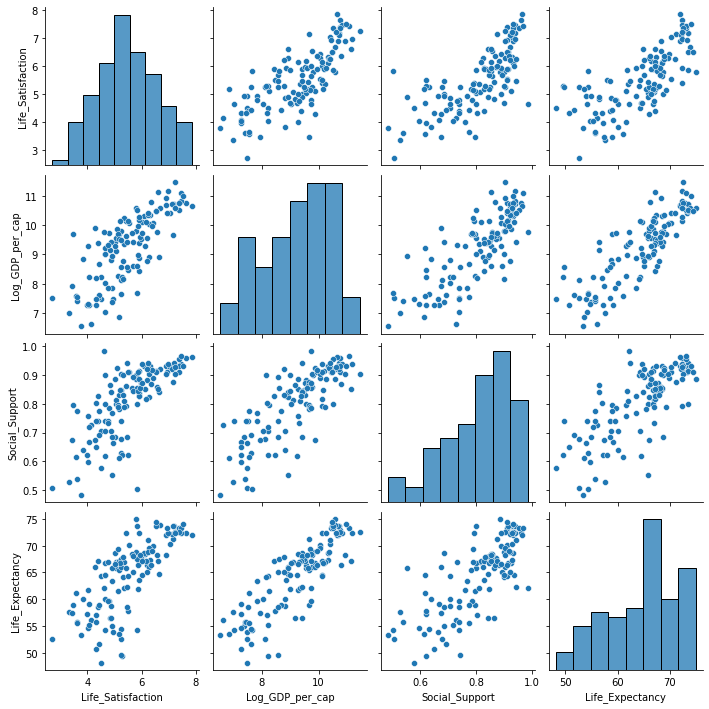
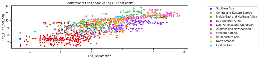
A seaborn pairplot can show if there are any obvious relationships between variables. The univariate distribution of each variable are shown on the diagonal. The pairplot below is for the data for 2018. The scatterplots in the pairplot shows a positive linear relationship between each of the variables Income (Log GDP per capita), Healthy Life Expectancy, Social support and satisfactions with life (Life Ladder). While the life ladder distribution looks more normally distributed than the other variables it has 2 distinct peaks. The other distributions are left skewed. The 2016 World Happiness Report[10] notes how for the world as a whole, the distribution of world happiness is very normally distributed about the median answer of 5, with the population-weighted mean being 5.4 but when the global population is split into ten geographic regions, the resulting distributions vary greatly in both shape and average values. Only two regions—the Middle East and North Africa, and Latin America and the Caribbean— have more unequally distributed happiness than does the world as a whole.
Therefore taking this into account it is important to look at the data on a regional basis. The second pairplot uses the hue semantic to colour the points by region and shows the distributions for each variables for each region on the diagonal. The distribution plots show very different shapes for each variable when broken down by regions. Sub-Saharan Africa stands out as a region that has far different levels of life satisfaction, income and life expectancy than most other regions.
Regions such as Western Europe, North America and Australia and New Zealand have distributions that are centred around much higher values than regions such as Sub-Saharan Africa and South Asia. The distributions for North America, Australia and New Zealand are very narrow as these regions contain a very small number of countries compared to the other regions.
On a regional level the distributions look more normally distributed for all the four variables but with different locations and spreads. This means that any simulation of the variables must take the separate distributions into account.
# pairplot of the variables, drop missing values
print("\nDistribution of Life satisfaction, Income, Social Support and Healthy Life Expectancy globally  and then by region\n")
sns.pairplot(df18.iloc[:,:6].dropna());

# could also plot the pairplot for all years from 2011 to 2018.
#sns.pairplot(df_years.iloc[:,1:7].dropna());

# pairplots showing the Region as the colour of the dots.
sns.pairplot(df18.iloc[:,:6].dropna(), hue="Region", palette="bright");
Distribution of Life satisfaction, Income, Social Support and Healthy Life Expectancy globally and then by region
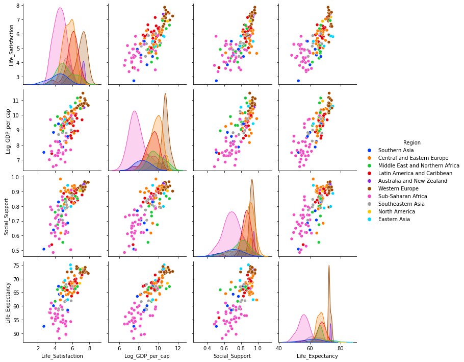
The pairplots show a distinction between the different geographic regions for most variables. Sub-Saharan Africa stands out as a region that has far different levels of life satisfaction, income and life expectancy than most other regions. The histograms for each variable are plotted again individually to see the distributions more clearly for each variable.
Distribution of each variable.
A closer look at each of the variables in the histograms below.
# set up the subplots, style and palette
sns.set(style="ticks", palette="colorblind")
f,axes=plt.subplots(2,2, figsize=(9,9))
# plot the distributions of each of the main variables. At global level first. Look at Regional after
sns.histplot(df18['Life_Satisfaction'].dropna(), ax=axes[0,0], bins=10, color="r");
# set axes title
axes[0,0].set_title("Distribution of Life Ladder globally 2018");
sns.histplot(df18['Log_GDP_per_cap'].dropna(), ax=axes[0,1], bins=10, color="g");
axes[0,1].set_title("Distribution of Income globally 2018");
sns.histplot(df18['Social_Support'].dropna(), ax=axes[1,0], bins=10, color="b");
axes[1,0].set_title("Distribution of Social support globally 2018");
sns.histplot(df18['Life_Expectancy'].dropna(), ax=axes[1,1], bins=10, color="y");
axes[1,1].set_title("Distribution of Life expectancy globally 2018");
plt.tight_layout();
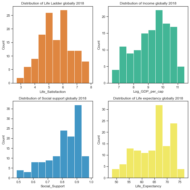
The distribution of Life Ladder variable looks to be normally distributed whiile there is some left skew in the other variables. Normally distributed data is considered the easiest to work with as normal distributions can be compared by looking at their means and standard deviations. Many statistical methods assume variables are normally distributed and others work better with normality. -Sustainable Development lectures[13]
Central Tendency and variance statistics of the variables.
Here are the summary statistics for the variables for 2018 and also over the period from 2012 to 2018 inclusive. The 2018 statistics are similar enough to the amalgamated 2012 to 2018 statistics.
# summary statistics of the dataset (2018)- just showing the main variables of interest
print("The data available for 2018 only: \n")
df18.iloc[:,0:6].describe()
The data available for 2018 only:
| Life_Satisfaction | Log_GDP_per_cap | Social_Support | Life_Expectancy | |
|---|---|---|---|---|
| count | 136.000000 | 127.000000 | 136.000000 | 132.000000 |
| mean | 5.502134 | 9.250394 | 0.810544 | 64.670832 |
| std | 1.103461 | 1.186589 | 0.116332 | 6.728247 |
| min | 2.694303 | 6.541033 | 0.484715 | 48.200001 |
| 25% | 4.721326 | 8.346278 | 0.739719 | 59.074999 |
| 50% | 5.468088 | 9.415703 | 0.836641 | 66.350002 |
| 75% | 6.277691 | 10.166517 | 0.905608 | 69.075001 |
| max | 7.858107 | 11.453928 | 0.984489 | 76.800003 |
# summary statistics of data from 2012 to 2018
print("Summary statistics for all years from 2012 to 2018 based on Table 2.1 data. \n")
df_years.iloc[:,3:7].describe()
Summary statistics for all years from 2012 to 2018 based on Table 2.1 data.
| Life_Satisfaction | Log_GDP_per_cap | Social_Support | Life_Expectancy | |
|---|---|---|---|---|
| count | 1138.000000 | 1112.000000 | 1132.000000 | 1112.000000 |
| mean | 5.426942 | 9.259777 | 0.806205 | 63.625778 |
| std | 1.127066 | 1.180980 | 0.119364 | 7.228575 |
| min | 2.661718 | 6.465948 | 0.290184 | 36.860001 |
| 25% | 4.596455 | 8.370898 | 0.741112 | 58.375001 |
| 50% | 5.358060 | 9.448528 | 0.828651 | 65.480000 |
| 75% | 6.267663 | 10.197885 | 0.903454 | 68.500000 |
| max | 7.858107 | 11.770276 | 0.987343 | 76.800003 |
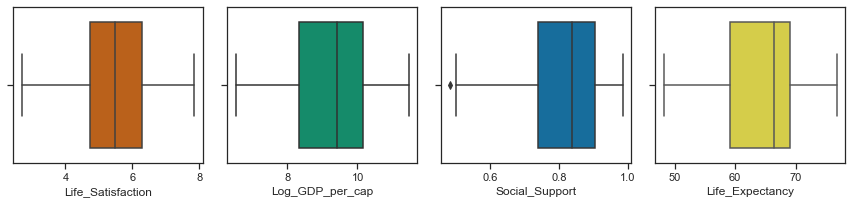
Boxplots to show the central tendancy, symmetry, skew and outliers.
Boxplots can show the central tendency, symmetry and skew of the data as well as any outliers. The rectangular boxes are bounded by the hinges representing the lower (1st) quartile and upper (3rd quartile). The median of 50th percentile is shown by the line through the box. The whiskers show the minimum and maximum values of the data excluding any outliers. A distribution is symmetric if the median is in the centre of the box and the whiskers are the same length.
While none of the variables look symmetric, the distribution of Life ladder is less asymmetric than the other variables. A skewed distribution has the median closer to the shorter whisker as is the case for Healthy Life Expectancy, Social support and Log GDP per capita. A positive/right skewed distribution has a longer top whisker than bottom while a negatively skewed / left skewed distribution has a longer lower whisker as is the case for Log GDP per capita, Social support and Healthy life expectancy.
# set up the subplots, style and palette
sns.set(style="ticks", palette="colorblind")
f,axes=plt.subplots(1,4, figsize=(12,3))
# plot the distributions of each of the main variables. At global level first. Look at Regional after
sns.boxplot(x=df18['Life_Satisfaction'], ax=axes[0], color="r");
sns.boxplot(x=df18['Log_GDP_per_cap'], ax=axes[1], color="g");
sns.boxplot(x=df18['Social_Support'], ax=axes[2],color="b");
sns.boxplot(x=df18['Life_Expectancy'], ax=axes[3],color="y");
plt.tight_layout();
Distribution of the data by geographic region.
As the pairplot showed earlier, there are wide variations between regions and for this region I will look at the distributions of each variable on a geographic regional basis. Below are the mean and standard deviation statistics showing how the central tendency and spread of the distributions vary across regions. The mean and standard deviations at a global level are then shown. There is quite a difference in the statistics on a regional basis which is lost in the overall statistics.
Mean and Standard Deviation by Region:
# look at 2018 statistics by Region, round for printing
# just look at specific columns
print("The mean and standard deviation for the variables on a regional basis. \n")
df18.iloc[:,:6].groupby(['Region']).agg([np.mean, np.std]).round(4)
The mean and standard deviation for the variables on a regional basis.
| Life_Satisfaction | Log_GDP_per_cap | Social_Support | Life_Expectancy | |||||
|---|---|---|---|---|---|---|---|---|
| mean | std | mean | std | mean | std | mean | std | |
| Region | ||||||||
| Australia and New Zealand | 7.2736 | 0.1367 | 10.6112 | 0.1552 | 0.9470 | 0.0097 | 73.4000 | 0.2828 |
| Central and Eastern Europe | 5.6472 | 0.6164 | 9.6812 | 0.6087 | 0.8722 | 0.0817 | 66.7673 | 2.2000 |
| Eastern Asia | 5.5575 | 0.3296 | 10.0508 | 0.5844 | 0.8533 | 0.0737 | 70.0500 | 5.7076 |
| Latin America and Caribbean | 5.9530 | 0.7548 | 9.2870 | 0.6722 | 0.8475 | 0.0820 | 66.9333 | 3.3755 |
| ... | ... | ... | ... | ... | ... | ... | ... | ... |
| Southeastern Asia | 5.5089 | 0.6609 | 9.1068 | 0.6375 | 0.8222 | 0.0609 | 64.6889 | 5.7106 |
| Southern Asia | 4.2989 | 0.9597 | 8.3931 | 0.6878 | 0.6888 | 0.1109 | 61.0333 | 5.1613 |
| Sub-Saharan Africa | 4.5200 | 0.6775 | 7.9125 | 0.8863 | 0.6918 | 0.0986 | 55.8273 | 3.7124 |
| Western Europe | 6.8981 | 0.6808 | 10.7237 | 0.3230 | 0.9118 | 0.0451 | 72.8105 | 0.7593 |
10 rows × 8 columns
# mean and standard deviation at the global level in the dataset for 2018
print("The mean and standard deviation at a global level for 2018: \n")
df18.iloc[:,1:6].agg([np.mean, np.std])
The mean and standard deviation at a global level for 2018:
| Life_Satisfaction | Log_GDP_per_cap | Social_Support | Life_Expectancy | |
|---|---|---|---|---|
| mean | 5.502134 | 9.250394 | 0.810544 | 64.670832 |
| std | 1.103461 | 1.186589 | 0.116332 | 6.728247 |
# mean and standard deviation at the global level in the dataset for 2012 to 2018
print("The mean and standard deviation at a global level for years from 2012 to 2018 \n")
df_years.iloc[:,1:7].agg([np.mean,np.std])
The mean and standard deviation at a global level for years from 2012 to 2018
| Life_Satisfaction | Log_GDP_per_cap | Social_Support | Life_Expectancy | |
|---|---|---|---|---|
| mean | 5.426942 | 9.259777 | 0.806205 | 63.625778 |
| std | 1.127066 | 1.180980 | 0.119364 | 7.228575 |
The statistics for 2018 and for all years from 2012 to 2018 are very similar. I am focusing on 2018 but if I need extra data I can use the dataset with all years from 2012 to 2018.
df18.groupby(['Region']).describe().round(4)
|
| Life_Satisfaction | Log_GDP_per_cap | ... | Life_Expectancy | RegionCode | |||||||||||||||||
|---|---|---|---|---|---|---|---|---|---|---|---|---|---|---|---|---|---|---|---|---|---|
| count | mean | std | min | 25% | 50% | 75% | max | count | mean | ... | 75% | max | count | mean | std | min | 25% | 50% | 75% | max | |
| Region | |||||||||||||||||||||
| Australia and New Zealand | 2.0 | 7.2736 | 0.1367 | 7.1770 | 7.2253 | 7.2736 | 7.3220 | 7.3703 | 2.0 | 10.6112 | ... | 73.500 | 73.6 | 2.0 | 9.0 | 0.0 | 9.0 | 9.0 | 9.0 | 9.0 | 9.0 |
| Central and Eastern Europe | 26.0 | 5.6472 | 0.6164 | 4.6206 | 5.1844 | 5.6662 | 6.1360 | 7.0342 | 25.0 | 9.6812 | ... | 68.425 | 71.1 | 26.0 | 2.0 | 0.0 | 2.0 | 2.0 | 2.0 | 2.0 | 2.0 |
| Eastern Asia | 4.0 | 5.5575 | 0.3296 | 5.1314 | 5.3813 | 5.6291 | 5.8052 | 5.8402 | 4.0 | 10.0508 | ... | 73.950 | 75.0 | 4.0 | 8.0 | 0.0 | 8.0 | 8.0 | 8.0 | 8.0 | 8.0 |
| Latin America and Caribbean | 18.0 | 5.9530 | 0.7548 | 3.6149 | 5.7993 | 6.0558 | 6.3491 | 7.1411 | 18.0 | 9.2870 | ... | 68.725 | 71.3 | 18.0 | 4.0 | 0.0 | 4.0 | 4.0 | 4.0 | 4.0 | 4.0 |
| ... | ... | ... | ... | ... | ... | ... | ... | ... | ... | ... | ... | ... | ... | ... | ... | ... | ... | ... | ... | ... | ... |
| Southeastern Asia | 10.0 | 5.5089 | 0.6609 | 4.4106 | 5.1653 | 5.3396 | 5.9760 | 6.4670 | 8.0 | 9.1068 | ... | 67.200 | 76.8 | 10.0 | 6.0 | 0.0 | 6.0 | 6.0 | 6.0 | 6.0 | 6.0 |
| Southern Asia | 6.0 | 4.2989 | 0.9597 | 2.6943 | 3.9636 | 4.4497 | 4.8074 | 5.4716 | 6.0 | 8.3931 | ... | 64.100 | 67.2 | 6.0 | 7.0 | 0.0 | 7.0 | 7.0 | 7.0 | 7.0 | 7.0 |
| Sub-Saharan Africa | 34.0 | 4.5200 | 0.6775 | 3.3346 | 4.0488 | 4.4510 | 4.9260 | 5.8817 | 34.0 | 7.9125 | ... | 57.900 | 66.4 | 34.0 | 1.0 | 0.0 | 1.0 | 1.0 | 1.0 | 1.0 | 1.0 |
| Western Europe | 20.0 | 6.8981 | 0.6808 | 5.4093 | 6.5157 | 7.0403 | 7.4081 | 7.8581 | 17.0 | 10.7237 | ... | 73.400 | 74.4 | 20.0 | 3.0 | 0.0 | 3.0 | 3.0 | 3.0 | 3.0 | 3.0 |
10 rows × 40 columns
print("Central Tendency, Skew and outliers of  Life Satisfaction, Income, Social Support and Life Expectancy by region \n ")
sns.set(style="ticks", palette="colorblind")
f,axes=plt.subplots(2,2, figsize=(12,8))
sns.boxplot(y="Region", x="Life_Satisfaction", data=df18, ax=axes[0,0]);
sns.boxplot(y="Region", x="Log_GDP_per_cap", data=df18, ax=axes[0,1]);
sns.boxplot(y="Region", x="Social_Support", data=df18, ax=axes[1,0]);
sns.boxplot(y="Region", x="Life_Expectancy", data=df18, ax=axes[1,1]);
plt.tight_layout();
Central Tendency, Skew and outliers of Life Satisfaction, Income, Social Support and Life Expectancy by region
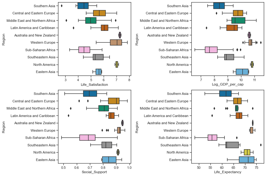
When the distributions of each of the variables representing life satisfaction, gdp per capita, social support and life expectancy at birth are broken down by regional level, they tell a very different story to the distributions of the variables at a global level. There are some regions that overlap with each other and there are regions at complete opposite ends of the spectrum. I think this further clarifies the need to look at the variables on a regional level when simulating the data.
For example the boxplots show that the median values of Log GPD per capita fall into roughly 3 groups (similar to the boxplots for social support) by regions with Western Europe, North America and Australia and New Zealand having the highest scores, while Southern Asia and Sub Saharan Africa have the lowest median scores and are the most variable along with the Middle East and Nortern Africa region. There is no overlap at all between the measurements for the richer regions (such as Western Europe, Australia and North America) and the poorer regions (Sub_saharan Africa and Southern Asia). The above boxplots by geographic regions show that there is great variations between regions in the distribution of GDP per capita. The boxplots also show some outliers where there are a few countries from each geographic regions which are more similar to countries in another geographic region than in their own region.
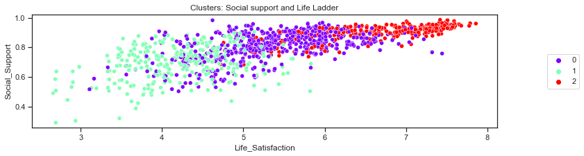
Clustering to see groups in the countries.
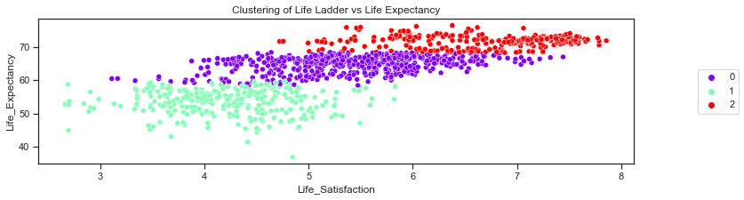
Colouring the points by regions in the plots above showed that some regions had very similar distributions to other regions and very disimilar to other regions. For instance Southern Asia and Sub_Saharan Africa are always close to each other and their distribution barely overlap if at all with regions such as Western Europe, North America and Austrlia and New Zealand. Therefore I am having a quick look at using Kmeans clustering to see how it would cluster the points rather than simulating data for the 10 regions as it is a small enough dataset.
Here I refer to a pythonprogramming blogpost on flat clustering[19]. (I just looked briefly at clustering to see if the countries could be separated into clear groups of regions and did not do a thorough clustering analysis. I chose 3 as the number of clusters to use based on the plots above but a full clustering analysis would indicate the best number of clusters).
##Adapted from code at: https://pythonprogramming.net/flat-clustering-machine-learning-python-scikit-learn/).
from sklearn.cluster import KMeans
# select the data to use. drop any missing values
x=df_years.loc[:,['Year','Life_Satisfaction','Log_GDP_per_cap','Social_Support','Life_Expectancy','RegionCode']]
x=x.dropna()
# initialise kmeans to be the KMeans algorithm (flat clustering) with the number of clusters.
kmeans=KMeans(n_clusters=3)
# fit the data
kmeans.fit(x)
# create a copy of the data
clusters=x.copy()
# add column with the predictions from the kmeans model
clusters['cluster_pred']=kmeans.fit_predict(x)
Look at the clusters to see how the regions are clustered:
clusters[['RegionCode','cluster_pred']]
| RegionCode | cluster_pred | |
|---|---|---|
| 3 | 7 | 1 |
| 4 | 7 | 1 |
| 5 | 7 | 1 |
| 6 | 7 | 1 |
| ... | ... | ... |
| 1700 | 1 | 1 |
| 1701 | 1 | 1 |
| 1702 | 1 | 1 |
| 1703 | 1 | 1 |
1094 rows × 2 columns
Plot the clusters and then plot the actual observations to visually compare with the geographic regions:
# set the figure size
plt.rcParams["figure.figsize"] = (12,3)
# use seaborn scatterplot, hue by cluster group
g= sns.scatterplot(x=clusters['Life_Satisfaction'],y=clusters['Social_Support'],hue=clusters['cluster_pred'],palette='rainbow')
# place legends outside the box - # https://stackoverflow.com/q/53733755 to move legends outside of box
g.legend(loc='center left', bbox_to_anchor=(1.10, 0.5), ncol=1);
# add title
plt.title("Clusters: Social support and Life Ladder");
# scatterplot of life ladder and social support
g =sns.scatterplot(y = df_years['Social_Support'],x= df_years['Life_Satisfaction'],hue=df_years['Region'],palette="bright")
# https://stackoverflow.com/q/53733755 to move legends outside of box
g.legend(loc='center left', bbox_to_anchor=(1.10, 0.5), ncol=1);
# add title
plt.title("Scatterplot of Social support vs Life Ladder");
clusters.columns
Index(['Year', 'Life_Satisfaction', 'Log_GDP_per_cap', 'Social_Support',
       'Life_Expectancy', 'RegionCode', 'cluster_pred'],
      dtype='object')
# plot the clusters gdp versus life ladder
g= sns.scatterplot(x=clusters['Life_Satisfaction'],y=clusters['Log_GDP_per_cap'],hue=clusters['cluster_pred'],palette='rainbow')
# legends outside of box
g.legend(loc='center left', bbox_to_anchor=(1.10, 0.5), ncol=1);
# add title
plt.title("Clustering of Life Ladder vs Log GDP");
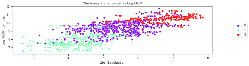
# scatterplot of actual log gdp vs life ladder
g =sns.scatterplot(y = df_years['Log_GDP_per_cap'],x= df_years['Life_Satisfaction'],hue=df_years['Region'], palette='bright')
# https://stackoverflow.com/q/53733755 to move legends outside of box
g.legend(loc='center left', bbox_to_anchor=(1.10, 0.5), ncol=1);
# add title
plt.title("Scatterplot of Life Ladder vs Log GDP per capita");
# plot the clusters Life ladder vs Life Expectancy
g=sns.scatterplot(x=clusters['Life_Satisfaction'],y=clusters['Life_Expectancy'],hue=clusters['cluster_pred'],palette='rainbow')
plt.title("Clustering of Life Ladder vs Life Expectancy");
# place legends outside box
g.legend(loc='center left', bbox_to_anchor=(1.10, 0.5), ncol=1);
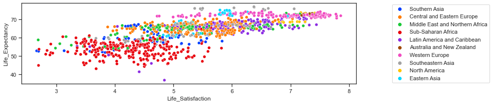
# scatterplot of life expectancy vs life ladder
g =sns.scatterplot(y = df_years['Life_Expectancy'],x= df_years['Life_Satisfaction'],hue=df_years['Region'], palette="bright")
# https://stackoverflow.com/q/53733755 to move legends outside of box
g.legend(loc='center left', bbox_to_anchor=(1.10, 0.5), ncol=1);
Relationships between the variables.
Correlation in the data:
The covariance and correlation statistics can be used to determine if there is a linear relationship between variables and if one variable tends to occur with large or small values of another variable.
Covariance is a measure of the joint variability of two random variables while the Pearson correlation coefficient is the normalised version of the covariance and it shows by it’s magnitude the strength of the linear relationship between two random variables. The covariance is a measure of how much two variables vary with each other and in what direction a variable changes when another variable changes. Pandas cov function can be used to get the covariances between pairs of variables.
The covariances below are all positive which means that when one of the variables is above it’s mean, the other variable is also likely to be above it’s mean.
The correlation coefficients are easier to interpret than the covariances. If there is a strong positive relationship between two variables then the value of the correlation coefficient will be close to 1 while a strong negative relationship between two variables will have a value close to -1. If the correlation coefficient is zero this indicates that there is no linear relationship between the variables.
Pandas corr function is used to get the correlations between pairs of variables. There seems to be a strong positive correlation between each of the pairings between the four variables with the strongest relationship between Healthy Life Expectancy and Log GDP per capita.
As noted the World Happiness Report researchers found that differences in social support, incomes and healthy life expectancy are the three most important factors in determining the overall happiness score. Income in the form of GDP per capita for a country has a strong and positive correlation with the averages country scores of the response to the Cantril Ladder question.
print("The covariance of the variables in the dataset: \n")
# pandas cov function on the 4 variables in the dataset
df18.iloc[:,:6].cov()
The covariance of the variables in the dataset:
| Life_Satisfaction | Log_GDP_per_cap | Social_Support | Life_Expectancy | |
|---|---|---|---|---|
| Life_Satisfaction | 1.217627 | 0.992087 | 0.092331 | 5.549072 |
| Log_GDP_per_cap | 0.992087 | 1.407993 | 0.112260 | 6.782165 |
| Social_Support | 0.092331 | 0.112260 | 0.013533 | 0.595622 |
| Life_Expectancy | 5.549072 | 6.782165 | 0.595622 | 45.269314 |
print("The correlation between variables in the dataset: \n")
# pandas corr function on the 4 variables
df18.iloc[:,:6].corr()
The correlation between variables in the dataset:
| Life_Satisfaction | Log_GDP_per_cap | Social_Support | Life_Expectancy | |
|---|---|---|---|---|
| Life_Satisfaction | 1.000000 | 0.760206 | 0.719267 | 0.744264 |
| Log_GDP_per_cap | 0.760206 | 1.000000 | 0.792945 | 0.852848 |
| Social_Support | 0.719267 | 0.792945 | 1.000000 | 0.751514 |
| Life_Expectancy | 0.744264 | 0.852848 | 0.751514 | 1.000000 |
print("The correlation between variables in the dataset across all years from 2011 to 2018: \n")
df_years.iloc[:,3:7].corr()
The correlation between variables in the dataset across all years from 2011 to 2018:
| Life_Satisfaction | Log_GDP_per_cap | Social_Support | Life_Expectancy | |
|---|---|---|---|---|
| Life_Satisfaction | 1.000000 | 0.778394 | 0.715501 | 0.751513 |
| Log_GDP_per_cap | 0.778394 | 1.000000 | 0.680559 | 0.840854 |
| Social_Support | 0.715501 | 0.680559 | 1.000000 | 0.632336 |
| Life_Expectancy | 0.751513 | 0.840854 | 0.632336 | 1.000000 |
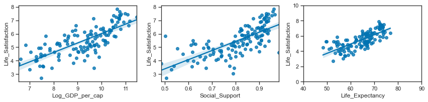
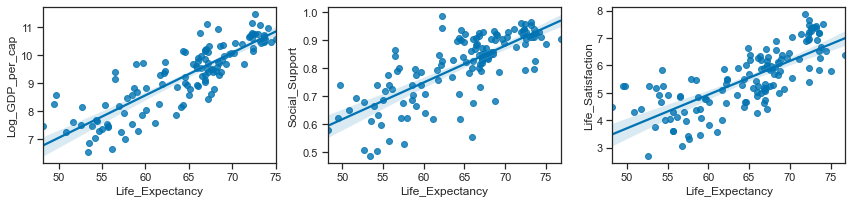
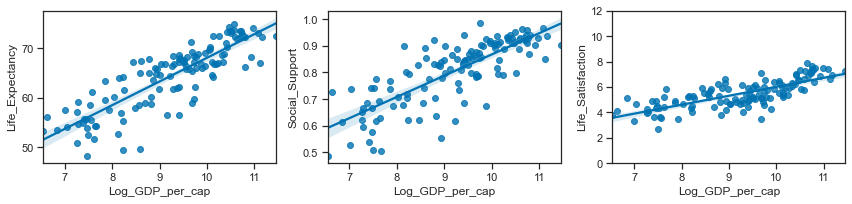
Seaborn regplot or lmplot functions can be used to visualize a linear relationship between variables as determined through regression. Statistical models are used to estimate a simple relationship between sets of observations that can be quickly visualised. These can be more informative than looking at the numbers alone. The regression plots below show a positive linear relationship between the pairs of variables.
df18.columns
Index(['Country', 'Region', 'Life_Satisfaction', 'Log_GDP_per_cap',
       'Social_Support', 'Life_Expectancy', 'RegionCode'],
      dtype='object')
# set up the matplotlib figure
f,axes=plt.subplots(1,3, figsize=(12,3))
# regression plot with x as a predictor of y variable. set the axes.
sns.regplot(y ="Life_Satisfaction",x="Log_GDP_per_cap", data=df18, ax=axes[0])
sns.regplot(y ="Life_Satisfaction",x="Social_Support", data=df18, ax=axes[1])
sns.regplot(y ="Life_Satisfaction",x="Life_Expectancy", data=df18, ax=axes[2])
# set the axis limits for this subplot.
axes[2].set_ylim(0,10); axes[2].set_xlim(40,90)
plt.tight_layout();
# set up the matplotlib figure
f,axes=plt.subplots(1,3, figsize=(12,3))
# regression plot with x as a predictor of y variable. set the axes.
sns.regplot(x ="Life_Expectancy",y="Log_GDP_per_cap", data=df18, ax=axes[0])
sns.regplot(x ="Life_Expectancy",y="Social_Support", data=df18, ax=axes[1])
sns.regplot(x ="Life_Expectancy",y="Life_Satisfaction", data=df18, ax=axes[2])
plt.tight_layout();
# set up the matplotlib figure
f,axes=plt.subplots(1,3, figsize=(12,3))
# regression plot with x as a predictor of y variable. set the axes.
sns.regplot(x ="Log_GDP_per_cap",y="Life_Expectancy", data=df18, ax=axes[0])
sns.regplot(x ="Log_GDP_per_cap",y="Social_Support", data=df18, ax=axes[1])
sns.regplot(x ="Log_GDP_per_cap",y="Life_Satisfaction", data=df18, ax=axes[2])
axes[2].set_ylim(0,12)
plt.tight_layout();
# set up the matplotlib figure
f,axes=plt.subplots(1,3, figsize=(12,3))
# regression plot with x as a predictor of y variable. set the axes.
sns.regplot(x ="Social_Support",y="Life_Expectancy", data=df18, ax=axes[0])
sns.regplot(x ="Social_Support",y="Log_GDP_per_cap", data=df18, ax=axes[1])
sns.regplot(x ="Social_Support",y="Life_Satisfaction", data=df18, ax=axes[2])
axes[2].set_ylim(0,12)
plt.tight_layout();
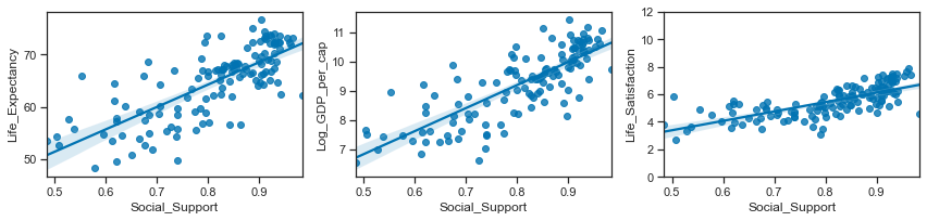
The covariance and correlation statistics suggest a strong linear relationship between the pairs of variables and the regression plots confirm this. Life satisfactions are positively correlated with income levels (Log GDP per capita), social support and healthy life expectancy. Income and life expectancy are very highly correlated.
(I might be interpreting the correlations incorrectly using the region codes. What I wanted to see was if the region the country is correlated with the variables as it would seem to be the case. Life expectancy and income are generally related to the region.)